This is the full developer documentation for led-ticker
# led-ticker
> A Python toolkit for RGB LED matrix signs — configurable feeds in TOML, extensible with plugins.

A \`message\` widget with rainbow per-character coloring — one of the built-in widgets.
## Two ways in
[Section titled “Two ways in”](#two-ways-in)
Run a sign
You have, or want, an RGB LED matrix sign. Describe what it shows in a TOML config — RSS, weather, scores, countdowns, images — **no Python required.**
* [Why led-ticker?](/why-led-ticker/) — is this the right tool for your sign?
* [Get started](/getting-started/) — install and light up a sign in minutes
* [Tutorial](/tutorial/01-setup/) — build a complete config step by step
* [Browse widgets](/widgets/) — every built-in building block
Build on it
You want to extend led-ticker. Add widgets, transitions, color providers, fonts, or lifecycle hooks through the public `led_ticker.plugin` API — without forking core.
* [Plugins](/plugins/) — how extensions install and load
* [Write a plugin](/plugins/authoring/01-scaffold/) — a guided walkthrough
## What you can put on it
[Section titled “What you can put on it”](#what-you-can-put-on-it)
Weather (plugin)

Current conditions for any location — via the weather plugin.
[Weather widget →](/widgets/weather/)
MLB scores (plugin)

Live game scores and counts — via the baseball plugin.
[MLB widget →](/widgets/mlb/)
Crypto prices (plugin)

Multi-coin CoinGecko price ticker, trend-colored.
[Crypto plugin →](/widgets/crypto-coingecko/)
Animated GIFs

Play a looping GIF, with optional overlay text.
[GIF widget →](/widgets/gif/)
Countdowns

Count down to any date or time.
[Countdown widget →](/widgets/countdown/)
…and your own

The pool widget is a real, shipped plugin.
[Pool plugin →](/plugins/available/)
[Browse all widgets →](/widgets/)
## Writing a plugin
[Section titled “Writing a plugin”](#writing-a-plugin)
`led_ticker.plugin` is the public surface plugins import from — it exposes widget, transition, emoji, font, and lifecycle-hook registration, no fork of core needed. The pool water-temperature widget shown above is a real plugin that lives in [the led-ticker-plugins monorepo](https://github.com/JamesAwesome/led-ticker-plugins) and contributes `type = "pool.monitor"`.
* [Plugins overview](/plugins/) — install, load, and the `[plugins]` config block
* [Write a plugin](/plugins/authoring/01-scaffold/) — scaffold, build, and package one
## Where to next
[Section titled “Where to next”](#where-to-next)
* **Run a sign:** [Get started](/getting-started/) · [Tutorial](/tutorial/01-setup/)
* **Pick content:** [Widgets](/widgets/) · [Transitions](/transitions/push/)
* **Extend it:** [Plugins](/plugins/) · [Write a plugin](/plugins/authoring/01-scaffold/)
* **Get the hardware:** [Building your own](/hardware/building-your-own/)
Using an AI coding agent? These docs are available as plain Markdown at [`/llms.txt`](/llms.txt) (index) and [`/llms-full.txt`](/llms-full.txt) (everything in one file).
# Inline emoji
> 40 pixel-art glyphs (20 base + heart/cat/pride color variants) you can drop into any message text via `:slug:`.
Drop `:slug:` into any message text to render a pixel-art icon inline:

:taco: :star: :flower: :sun:
Example
```toml
[[playlist.section.widget]]
type = "message"
text = ":taco: Taco Tuesday!"
```
## Available slugs
[Section titled “Available slugs”](#available-slugs)
Use `:slug:` inside any text-bearing widget to render a pixel-art icon inline. Each is an 8×8 sprite in its native colors; the surrounding text uses your `font_color`. On a `default_scale > 1` panel (bigsign), every slug auto-upgrades to a 32×32 hires sprite — same horizontal footprint, 16× more detail.
The slug list rots fast as new icons are added. The source of truth is `src/led_ticker/pixel_emoji.py` — `grep -E '^\s+"[a-z_]+":' src/led_ticker/pixel_emoji.py` lists every slug. Re-run `uv run python tools/render_emoji_previews.py` after adding a sprite to refresh the previews on this page.
> **Plugin emoji.** Some icons ship with external plugins (install the plugin to use them; the slugs in the table below are all built in):
>
> * `:baseball.ball:` (white ball with red stitching) — [`baseball`](https://github.com/JamesAwesome/led-ticker-plugins/tree/main/plugins/baseball)
> * `:pokeball.ball:` (red top, white bottom, button-banded) — [`pokeball`](https://github.com/JamesAwesome/led-ticker-plugins/tree/main/plugins/pokeball)
| Slug | Lowres (8×8) | Hires (32×32) | Description |
| ----------------- | ------------------------------------------------------ | ---------------------------------------------------- | -------------------------------------------------------- |
| `:bunny:` |  |  | Bunny silhouette |
| `:cat:` |  |  | Cat (default gray; see color variants below) |
| `:cloud:` |  |  | Cloud icon |
| `:droplet:` |  |  | Water droplet (blue teardrop) |
| `:email:` |  |  | Envelope (white) |
| `:flower:` |  |  | Pink flower |
| `:fog:` |  |  | Fog icon |
| `:heart:` |  |  | Heart (default red; see color variants below) |
| `:instagram:` |  |  | Instagram glyph (magenta gradient) |
| `:moon:` |  |  | Crescent moon |
| `:partly_cloudy:` |  |  | Sun + cloud |
| `:pride:` |  |  | Pride flag stripes (default rainbow; see variants below) |
| `:rain:` |  |  | Rain icon |
| `:snow:` |  |  | Snow icon |
| `:star:` |  |  | Yellow star (default; see color variants below) |
| `:sun:` |  |  | Sun icon |
| `:taco:` |  |  | Taco |
| `:thunder:` |  |  | Thunder icon |
## Color variants
### Heart colors
`:heart:` defaults to red. Six additional color slugs share the same shape:
| Slug | Lowres | Hires |
| ---------------- | ---------------------------------------------------- | -------------------------------------------------- |
| `:heart_red:` |  |  |
| `:heart_orange:` |  |  |
| `:heart_yellow:` |  |  |
| `:heart_green:` |  |  |
| `:heart_blue:` |  |  |
| `:heart_purple:` |  |  |
| `:heart_pink:` |  |  |
### Star colors
`:star:` defaults to yellow. Six additional color slugs share the same shape:
| Slug | Lowres | Hires |
| --------------- | -------------------------------------------------- | ------------------------------------------------ |
| `:star_red:` |  |  |
| `:star_orange:` |  |  |
| `:star_yellow:` |  |  |
| `:star_green:` |  |  |
| `:star_blue:` |  |  |
| `:star_purple:` |  |  |
| `:star_pink:` |  |  |
### Cat colors
`:cat:` defaults to gray with yellow eyes. Five other coats are available:
| Slug | Lowres | Hires |
| -------------- | ------------------------------------------------ | ---------------------------------------------- |
| `:cat_gray:` |  |  |
| `:cat_orange:` |  |  |
| `:cat_white:` |  |  |
| `:cat_black:` |  |  |
| `:cat_brown:` |  |  |
| `:cat_cream:` |  |  |
### Pride flag variants
`:pride:` defaults to the rainbow flag. Other flags:
| Slug | Lowres | Hires |
| ----------------- | ------------------------------------------------------ | ---------------------------------------------------- |
| `:pride_rainbow:` |  |  |
| `:pride_trans:` |  |  |
| `:pride_bi:` |  |  |
| `:pride_lesbian:` |  |  |
| `:pride_nb:` |  |  |
| `:pride_ace:` |  |  |
| `:pride_demi:` |  |  |
## Hires on the bigsign
When the panel is at `default_scale > 1`, slugs auto-render the higher-detail sprite — same horizontal footprint (8 logical columns), 16× more detail per cell. On `scale=1` (small sign), the lowres 8×8 sprite is used.
`:moon:` is the canonical hires example: a 32×32 sprite with circle-subtraction shading.
## Adding a new emoji
Edit `src/led_ticker/pixel_emoji.py`. Define an 8×8 pixel-data tuple (`(x, y, r, g, b)`), add it to `EMOJI_REGISTRY`. For hires, draw a 32×32 variant and add it to `HIRES_REGISTRY`. The renderer auto-handles the scale dispatch. Then run `uv run python tools/render_emoji_previews.py` to refresh the preview PNGs.
See also
* [widgets/message](/widgets/message/)
* [concepts/color-providers](/concepts/color-providers/)
# Animations
> Animate text on your sign — typewriter reveals, flair.propeller spinning entry, and flair.fisheye lens-scrolling, all composing with any font_color.
led-ticker has one animation right now: **typewriter** — a character-by-character reveal. Set `animation = "typewriter"` on a supported widget and the text types out one character at a time the moment the widget appears. The characters land in their final positions (no shifting), so the message assembles itself in place rather than scrolling in.
Animations are a separate axis from color providers. A widget can carry both simultaneously — for example `animation = "typewriter"` and `font_color = "rainbow"` — and each effect tracks its own frame counter. The characters type out in rainbow with no interference between the two systems.
Animations may also emit a per-frame `rotation` (degrees, clockwise) that the message widget renders through an offscreen rotate around the text block’s center — the flair plugin’s `propeller` effect uses this seam. On scaled displays (bigsign), the spin runs at half physical resolution from a pre-rendered snapshot that captures hires fonts and emoji at their correct size; the resting frame always renders at full detail. Animated `font_color` providers (rainbow, color\_cycle, shimmer) pause for the duration of the spin and resume at settle — the color phase keeps advancing in the background, so on settle the sweep continues exactly where it left off.

\`message\` with animation = typewriter and font\_color = rainbow
Minimal
```toml
[[playlist.section.widget]]
type = "message"
text = "Hello, world!"
animation = "typewriter"
```
## Tuning `frames_per_char`
[Section titled “Tuning frames\_per\_char”](#tuning-frames_per_char)
The cadence is `frames_per_char × 50 ms` per character — the engine ticks at 50 ms and advances the typewriter counter once per tick. The default of `3` gives about 150 ms per character, which feels snappy but still readable at roughly 7 characters per second. A value of `5` or `6` reads as deliberate and is a good choice when you want the audience to register each character dropping in. Values above `10` read as comically slow. There is no separate animation clock — everything runs on the same 50 ms engine tick.
To override `frames_per_char`, switch from the string shorthand to an inline TOML table with a `style` key:
```toml
[[playlist.section.widget]]
type = "message"
text = "Slow type"
animation = {style = "typewriter", frames_per_char = 6} # ~300ms per char
```
### Keeping the reveal inside `hold_time`
[Section titled “Keeping the reveal inside hold\_time”](#keeping-the-reveal-inside-hold_time)
Typing takes `frames_per_char × 50 ms` per character — so a 20-character message at the default `frames_per_char = 3` takes roughly 3 seconds to finish. If `hold_time` is shorter than the typing duration, the transition fires mid-reveal and the message never fully appears. `led-ticker validate` catches this (rule 61) and prints the computed typing duration alongside the effective hold time, so you can raise `hold_time` to cover the full reveal — or shorten the text.
When a reveal is nearly done at transition time, the engine waits up to roughly one second for the final characters to land before switching scenes, so a message that’s one or two characters short doesn’t cut away abruptly.
## Composing with font\_color
[Section titled “Composing with font\_color”](#composing-with-font_color)
`animation` and `font_color` are independent axes on the same widget. Both can be set at the same time, and each effect tracks its own counter. The result is that characters type out AND each character’s color comes from the provider — a rainbow sweeps across the text as it appears, rather than the whole message flashing in at once.
```toml
[[playlist.section.widget]]
type = "message"
text = "Now Enrolling"
animation = "typewriter"
font_color = "rainbow"
```
Because rainbow is a continuous-phase provider (its counter does not reset between `loop_count` repetitions), the color sweep keeps flowing even as the typewriter retypes from scratch on each loop.
## Restart-on-visit behavior
[Section titled “Restart-on-visit behavior”](#restart-on-visit-behavior)
Typewriter has `restart_on_visit = true` — the reveal counter resets every time the section shows the widget. With `loop_count = 2`, the widget retypes from scratch on each loop rather than resuming mid-word. With `loop_count = 1` and a multi-widget section in `slideshow` mode, the widget retypes fresh each time it appears in the rotation. This is the intentional, expected behavior — typewriter is designed to be a reveal, not a persistent animation state. See [frame counters](/reference/frame-counters/) for the full model of restart-on-visit versus continuous-phase behavior.
## Where it works
[Section titled “Where it works”](#where-it-works)
| Widget type | `animation = "typewriter"`? | `animation = "flair.propeller"`? | `animation = "flair.fisheye"`? |
| ----------------------------- | -------------------------------------- | -------------------------------------------------------------------- | ------------------------------------------------------------------ |
| `message` | yes | yes | yes |
| `countdown` | no | no | no |
| `gif` | yes — single-row only (see note below) | accepted but rotation is ignored [1](#user-content-fn-propeller-gif) | accepted but the lens is ignored [2](#user-content-fn-fisheye-gif) |
| `image` | yes — single-row only (see note below) | accepted but rotation is ignored [1](#user-content-fn-propeller-gif) | accepted but the lens is ignored [2](#user-content-fn-fisheye-gif) |
| `two_row` | no | no | no |
| `weather.current`, `rss.feed` | no | no | no |
On `gif` and `image` widgets, typewriter is restricted to single-row text overlays. It will raise a configuration error if `bottom_text` is also set (which activates two-row mode), if `text_align` is `"scroll"` or `"scroll_over"` (incompatible with a fixed-position reveal), or if `text` is empty.
## Tips
[Section titled “Tips”](#tips)
### `animation` is only valid on `message`, `gif`, and `image`
[Section titled “animation is only valid on message, gif, and image”](#animation-is-only-valid-on-message-gif-and-image)
Other widget types (`two_row`, the crypto and feeds widgets) have their own draw paths and ignore `animation` silently — the validator rejects it explicitly to make the no-op visible. For dynamic color on those widgets, use `font_color = "rainbow"` or a gradient.
### Typewriter is single-row only on `gif` and `image`
[Section titled “Typewriter is single-row only on gif and image”](#typewriter-is-single-row-only-on-gif-and-image)
On top of the widget-type check above, typewriter on `gif` / `image` rejects three combinations: `bottom_text` set, `text_align = "scroll"` / `"scroll_over"`, or empty `text`. Typewriter still composes with `font_color = "rainbow"` and `border = "rainbow"`.
***
## `flair.propeller` (flair pack)
[Section titled “flair.propeller (flair pack)”](#flairpropeller-flair-pack)
`flair.propeller` is a plugin animation from the [flair pack](/plugins/available/#flair-text-effects-flair-pack) (`led-ticker-flair >= 0.2.0`, core >= 4.3). The `message` widget’s text spins in-plane like a propeller the moment the widget appears — easing out over the configured number of revolutions and settling exactly flat — then holds readable for the rest of `hold_time`. Transitions wait for the spin to finish before firing.

\`message\` with \`animation = flair.propeller\` — text spins in and settles flat
### Install
[Section titled “Install”](#install)
Add one line to `config/requirements-plugins.txt`:
```text
led-ticker-flair
```
See [Plugins](/plugins/) for the install flow.
### Minimal config
[Section titled “Minimal config”](#minimal-config)
Minimal
```toml
[[playlist.section.widget]]
type = "message"
text = "PROPELLER"
center = true
font_color = [255, 200, 0]
animation = "flair.propeller"
```
### Tuning the spin
[Section titled “Tuning the spin”](#tuning-the-spin)
Switch to an inline table to control speed and direction:
```toml
[[playlist.section.widget]]
type = "message"
text = "PROPELLER"
center = true
font_color = [255, 200, 0]
animation = {style = "flair.propeller", revolutions = 3, spin_seconds = 1.5, direction = "ccw"}
```
| Knob | Default | Notes |
| -------------- | ------- | --------------------------------------------------------------------------------------- |
| `revolutions` | `2` | Integer >= 1. Number of full 360° turns before settling. |
| `spin_seconds` | `1.0` | Seconds for the full spin (ease-out). Shorter feels snappy; 2–3 s reads as deliberate. |
| `direction` | `"cw"` | `"cw"` (clockwise) or `"ccw"` (counter-clockwise) — viewed from the front of the panel. |
### How the spin interacts with `hold_time`
[Section titled “How the spin interacts with hold\_time”](#how-the-spin-interacts-with-hold_time)
`led-ticker validate` rule 62 warns when `spin_seconds` is longer than the section’s `hold_time` — a spin that outlasts the hold cuts away before the text settles, so the message never reads cleanly. Raise `hold_time` to cover `spin_seconds` plus at least a moment of readable hold. The engine waits up to about a second for the spin to settle before firing a transition; a spin that outlasts the hold by more than that cuts away mid-spin (the rule 62 warning covers this).
### Composing with `font_color` and `border`
[Section titled “Composing with font\_color and border”](#composing-with-font_color-and-border)
`flair.propeller` composes with `font_color` providers and `border` effects using the same independent-axes model as typewriter. Animated color providers (`rainbow`, `color_cycle`, `shimmer`) **freeze** for the duration of the spin and resume at settle — the color phase keeps advancing in the background, so the sweep continues exactly where it left off the moment the text lands flat. This means a propeller + rainbow combo reads as: spin in (colors frozen), land flat, rainbow resumes sweeping.
### On scaled signs (bigsign)
[Section titled “On scaled signs (bigsign)”](#on-scaled-signs-bigsign)
On signs with `default_scale > 1`, the mid-spin frames render from a pre-rendered snapshot at half physical resolution — this captures hires fonts and emoji at their correct size but at reduced detail. The resting (settled) frame always renders at full detail. `led-ticker-flair >= 0.2.0` and core >= 4.5 are required for physical-resolution hires spin frames; on core 4.3–4.4 the spin runs but hires fonts draw unrotated (validate rule 63 warns when this condition is detected).
### Pairing with `flair.spinout`
[Section titled “Pairing with flair.spinout”](#pairing-with-flairspinout)
`flair.propeller` and `flair.spinout` are designed to pair: the widget spins in at entry and spins out at exit. See [the full-cycle demo](#pairing-with-flairspinout) below for the combined config.

Full cycle — \`flair.propeller\` entry spin followed by \`flair.spinout\` transition
Full cycle (propeller in + spinout)
```toml
[transitions]
default = "flair.spinout"
duration = 1.0
[[playlist.section]]
mode = "slideshow"
hold_time = 3.5
[[playlist.section.widget]]
type = "message"
text = "FULL CYCLE"
center = true
font_color = [255, 200, 0]
animation = "flair.propeller"
[[playlist.section]]
mode = "slideshow"
hold_time = 2.5
[[playlist.section.widget]]
type = "message"
text = "REPEAT"
center = true
font_color = [255, 100, 255]
```
***
## `flair.fisheye` (flair pack)
[Section titled “flair.fisheye (flair pack)”](#flairfisheye-flair-pack)
`flair.fisheye` is a plugin animation from the [flair pack](/plugins/available/#flair-text-effects-flair-pack) (`led-ticker-flair >= 0.4.0`, core >= 4.7). A `message` widget’s scrolling text passes through a stationary “fisheye lens” centered on the panel: letters enter compressed at the edges, swell as they cross the middle, and compress again on exit. The lens is fixed — the scroll provides all the motion, so the effect runs for the whole scroll and a section can cut away at any moment.

\`message\` with \`animation = flair.fisheye\` — text scrolls through a stationary squeeze-and-bulge lens
### Install
[Section titled “Install”](#install-1)
Add one line to `config/requirements-plugins.txt`:
```text
led-ticker-flair
```
See [Plugins](/plugins/) for the install flow.
### Minimal config
[Section titled “Minimal config”](#minimal-config-1)
Minimal
```toml
[[playlist.section.widget]]
type = "message"
text = "OPEN LATE TONIGHT"
animation = "flair.fisheye"
```
### Tuning the lens
[Section titled “Tuning the lens”](#tuning-the-lens)
Stronger lens
```toml
[[playlist.section.widget]]
type = "message"
text = "FLASH SALE TODAY"
animation = {style = "flair.fisheye", magnify = 1.33, edge_squeeze = 0.45}
```

\`magnify = 1.33, edge\_squeeze = 0.45\` — a stronger lens: the center swells more and the edges compress harder than the default
| Knob | Default | Meaning |
| -------------- | ---------- | -------------------------------------------------------------------------------------------------------------------------------------------------------------------------------------------------------------------------------------------------------------------------------------------------------- |
| `magnify` | `1.3` | Center scale (both axes). There is a ceiling — `magnify × font line-height ≤ content_height` — above which the bulged text would run off the panel; a widget over the ceiling is skipped and the rest of the sign keeps running. For the default 6×12 font in a 16-row band the ceiling is about `1.33`. |
| `edge_squeeze` | `0.6` | Edge scale (`0 < edge_squeeze ≤ magnify`). Lower means more edge compression — a more dramatic lens. |
| `profile` | `"cosine"` | The edge-to-center falloff curve. `"cosine"` is the only value today. |
### What the lens does to the scroll
[Section titled “What the lens does to the scroll”](#what-the-lens-does-to-the-scroll)
The lens is width-preserving: a message takes exactly as long to scroll across as it would without the lens. But because the edges are compressed, they show **more** text than a plain scroll would — roughly two extra characters per side at the default squeeze, more with a stronger one. That is the lens working as intended, not a glitch.
### Live colors through the lens
[Section titled “Live colors through the lens”](#live-colors-through-the-lens)
Unlike `flair.propeller` (whose colors freeze during the spin), `flair.fisheye` keeps `font_color` **live**: a `rainbow` or `color_cycle` provider keeps sweeping as the text scrolls through the lens.

\`font\_color = rainbow\` with \`flair.fisheye\` — colors keep sweeping through the lens
### Static center bulge
[Section titled “Static center bulge”](#static-center-bulge)
Held (non-scrolling) text gets a fixed emphasis: the center of the message swells while the ends compress. Center a short message with `center = true` and skip the scroll — good for a shop sign or a headline.

\`center = true\`, no scroll — \`flair.fisheye\` bulges the middle of a held message
Static bulge
```toml
[[playlist.section.widget]]
type = "message"
text = "GRAND OPENING TODAY"
center = true
animation = "flair.fisheye"
```
### Inline emoji through the lens
[Section titled “Inline emoji through the lens”](#inline-emoji-through-the-lens)
`:slug:` emoji ride the lens with the text — an emoji swells as it crosses the center and compresses at the edges, just like the letters around it.

\`NOW OPEN :star: WELCOME IN :star:\` — the star bulges through the lens along with the words
With inline emoji
```toml
[[playlist.section.widget]]
type = "message"
text = "NOW OPEN :star: WELCOME IN :star:"
animation = "flair.fisheye"
```
### Also works with borders and hi-res fonts
[Section titled “Also works with borders and hi-res fonts”](#also-works-with-borders-and-hi-res-fonts)
* **Borders**: the border frames the panel un-warped while the text warps inside it.
* **Hi-res fonts**: on a scaled sign (bigsign) a hi-res font warps too, subject to the same `magnify × font line-height ≤ content_height` ceiling — a too-tall hi-res font is skipped (and the rest of the sign keeps running). On a smallsign (scale 1) a hi-res font renders normally (unwarped) and `led-ticker validate` emits a warning: the pixel-precise warp needs a scaled display.
### On scaled signs (bigsign)
[Section titled “On scaled signs (bigsign)”](#on-scaled-signs-bigsign-1)
The lens re-renders the scrolling text every frame at reduced resolution, so the whole scroll shows at half detail on the bigsign — the distortion masks it, and it matches the reduced detail you already see mid-spin with `flair.propeller`.
### Pairing with `flair.spinout`
[Section titled “Pairing with flair.spinout”](#pairing-with-flairspinout-1)
A fisheye message scrolls in through the lens; `flair.spinout` — the flair pack’s text-spin transition, documented on the [flair transitions page](/transitions/sprite/) — can spin that message out as the section changes. Set it as the transition (here as the global default) and the outgoing fisheye text spins away before the next section appears:
Fisheye scroll with a spinout exit
```toml
[transitions]
default = "flair.spinout"
duration = 1.0
[[playlist.section]]
mode = "slideshow"
hold_time = 3.0
[[playlist.section.widget]]
type = "message"
text = "GRAND OPENING TODAY"
animation = "flair.fisheye"
[[playlist.section]]
mode = "slideshow"
hold_time = 2.5
[[playlist.section.widget]]
type = "message"
text = "SEE YOU SOON"
center = true
```
See also
* [concepts/color-providers](/concepts/color-providers/)
* [reference/frame-counters](/reference/frame-counters/)
* [widgets/message](/widgets/message/)
* [transitions/sprite](/transitions/sprite/)
## Footnotes
[Section titled “Footnotes”](#footnote-label)
1. `flair.propeller` is accepted on `gif` and `image` at config-load so a section can carry both a spinning `message` and an image widget without a validation error, but the rotation has no visible effect — only `message` widgets render the spin. [↩](#user-content-fnref-propeller-gif) [↩2](#user-content-fnref-propeller-gif-2)
2. `flair.fisheye` is accepted on `gif` and `image` at config-load so a section can carry both a lens-scrolling `message` and an image widget without a validation error, but the lens has no visible effect — only `message` widgets warp. [↩](#user-content-fnref-fisheye-gif) [↩2](#user-content-fnref-fisheye-gif-2)
# Borders
> Rainbow chase, color_cycle, constant-color, color bands, or lightbulb marquee border around the panel perimeter.
A border paints a decorative outline around the entire panel perimeter. All styles paint at physical panel resolution — a pixel-ring border is always exactly one LED wide regardless of scale, even on a big / scaled sign (`default_scale > 1`) where most content is drawn in logical pixels and expanded to fill the panel (see [Display](/concepts/display/)). *For developers:* borders bypass the block-expansion path and write directly to the real underlying canvas (`SetPixel`). The five styles and their shorthands are listed in the table below. `rainbow` and `color_cycle` also accept optional `from` / `to` RGB colors to confine the animation to a specific hue arc instead of sweeping the full spectrum.

Rainbow chase border at default speed and thickness
## Border styles
[Section titled “Border styles”](#border-styles)
| Style | Shorthand | Per-pixel color? | Animates? |
| ------------- | ------------------------ | --------------------------- | --------- |
| `rainbow` | `border = "rainbow"` | yes — hue chase | yes |
| `color_cycle` | `border = "color_cycle"` | no — whole border one hue | yes |
| `constant` | `border = [r,g,b]` | no — uniform | no |
| `bands` | — | yes — per-band solid color | yes |
| `lightbulbs` | `border = "lightbulbs"` | optional — rainbow or solid | yes |
### Rainbow chase
[Section titled “Rainbow chase”](#rainbow-chase)
The rainbow chase indexes each perimeter pixel by its clockwise position around the edge, then advances the entire pattern by `speed` degrees per engine tick (50 ms). The result is a smooth hue gradient that rotates continuously. `char_offset` controls how tightly the hue cycles around the perimeter: a higher value tiles more full rainbows along the edge.
The simplest way to enable it is the string shorthand:
String shorthand
```toml
[[playlist.section.widget]]
type = "message"
text = "Hello"
border = "rainbow"
```
To tune the three knobs, switch to an inline table:
With tuning
```toml
[[playlist.section.widget]]
type = "message"
text = "Hello"
border = {style = "rainbow", thickness = 2, speed = 4, char_offset = 6}
```
**`speed`** (default `4`): degrees of hue rotation per engine tick. At 50 ms per tick, the default produces about one full revolution every 12 seconds on the bigsign’s 640-pixel perimeter. Double it to `8` for a noticeably faster sweep.
**`char_offset`** (default `6`): hue spacing between adjacent perimeter pixels. At `6` and 640 pixels, roughly 10 full rainbows tile around the bigsign edge. Reduce it toward `1` for a slow gradient wash; raise it above `10` for a tighter, flickery pattern.
**`thickness`** (default `1`): `1` is a single-pixel ring; `2` is two concentric rings. Thickness 2 reads better at viewing distance. The two rings share the same hue index sequence, so the inner ring continues where the outer ring ends rather than repeating.
#### Restricting the hue arc
[Section titled “Restricting the hue arc”](#restricting-the-hue-arc)
Add `from` and `to` RGB colors to confine the chase to a specific hue arc — the chase will tile only within those two hues rather than sweeping the full 360° spectrum. The engine always takes the shorter arc between the two hues.

red → amber arc at \`speed = 3\`, \`thickness = 2\` — chase tiles only within the warm fire band, never entering green or blue
```toml
# Warm fire arc — red to amber, 2-ring border
border = {style = "rainbow", from = [220, 30, 0], to = [255, 180, 0], speed = 3, thickness = 2}
```
`char_offset` controls how many full arc-widths tile around the perimeter — the same density semantics as the full-wheel chase, just measured in arc-degrees instead of 360°. A narrow arc (60°) with `char_offset = 6` produces roughly the same number of tiles as the full-wheel chase, because the hue spacing is relative to the arc width. Achromatic `from`/`to` colors (gray, white, black) are rejected since their hue is undefined. Same-hue `from`/`to` is also rejected — use `border = [r, g, b]` for a static color.
#### Common patterns
[Section titled “Common patterns”](#common-patterns)
**Fire / warm tones** — keep the chase in the red-to-amber band:
```toml
border = {style = "rainbow", from = [220, 30, 0], to = [255, 180, 0], speed = 3, thickness = 2}
# Red → amber chase, 2-ring border
```
**Cool ocean sweep** — blue-to-cyan arc for a cold-light feel:
```toml
border = {style = "rainbow", from = [0, 80, 255], to = [0, 220, 255], speed = 4, thickness = 1}
# Deep blue → cyan chase
```
**Rainbow chase + arc-restricted font\_color** — pair a full rainbow border with a brand-palette text color:
```toml
[[playlist.section.widget]]
type = "message"
text = "Open"
font_color = {style = "color_cycle", from = [255, 92, 38], to = [255, 183, 3], speed = 3}
border = {style = "rainbow", from = [255, 92, 38], to = [255, 183, 3], speed = 3, thickness = 2}
```
### Color cycle
[Section titled “Color cycle”](#color-cycle)
A color\_cycle border paints every perimeter pixel the same color per frame, and that color cycles through the hue wheel over time. Unlike the rainbow chase — which gives each pixel its own hue offset — color\_cycle pulses the border as a single unified color. The effect is a slow wash of light that shifts hue without any chasing motion.

\`color\_cycle\` border at \`speed = 5\`, \`thickness = 2\` — entire perimeter pulses as one hue with no per-pixel chase
String shorthand uses the full 360° wheel at the default speed:
String shorthand
```toml
[[playlist.section.widget]]
type = "message"
text = "Hello"
border = "color_cycle"
```
Tune `speed` and `thickness` via an inline table:
With tuning
```toml
[[playlist.section.widget]]
type = "message"
text = "Hello"
border = {style = "color_cycle", speed = 5, thickness = 2}
```
**`speed`** (default `5`): degrees of hue rotation per engine tick. Higher = faster pulse.
**`thickness`** (default `1`): `1` is a single-pixel ring; `2` is two concentric rings.
#### Restricting the hue arc
[Section titled “Restricting the hue arc”](#restricting-the-hue-arc-1)
Add `from` and `to` RGB colors to confine the cycle to a specific hue arc — the border will pulse between those two colors rather than sweeping the full spectrum. The engine always takes the shorter arc between the two hues.

flame → amber arc at \`speed = 2\` — border pulses only within the phoenix-warm band, never drifting into green or blue
```toml
# Flame → amber arc — stays within the §6 brand palette
border = {style = "color_cycle", from = [255, 92, 38], to = [255, 183, 3], speed = 2, thickness = 2}
```
`speed = 0` is rejected — use `border = [r, g, b]` for a static color. Achromatic `from`/`to` colors (gray, white, black) are also rejected since their hue is undefined.
#### Common patterns
[Section titled “Common patterns”](#common-patterns-1)
**Brand-palette pulse** — lock the border to your two brand hues so it never wanders off-palette:
```toml
border = {style = "color_cycle", from = [255, 92, 38], to = [255, 183, 3], speed = 2, thickness = 2}
# Flame → amber pulse, 2-ring border
```
**Contrasting border from text** — pair a color\_cycle border with a complementary arc on `font_color`:
```toml
[[playlist.section.widget]]
type = "message"
text = "Open"
font_color = {style = "color_cycle", from = [255, 200, 50], to = [255, 100, 0], speed = 4} # amber arc
border = {style = "color_cycle", from = [120, 230, 255], to = [50, 100, 255], speed = 4} # blue arc
```
### Constant
[Section titled “Constant”](#constant)
A constant border is a solid-color ring with no animation. Because it never changes frame to frame (`frame_invariant`, an internal flag), the engine’s static-text fast path applies: the border is painted once and the widget sleeps for the hold duration rather than redrawing every tick. For multi-color animated stripes, see [Bands](#bands) below.

constant magenta ring around the panel perimeter, text inside
Use an RGB list as a shorthand:
RGB shorthand
```toml
[[playlist.section.widget]]
type = "message"
text = "Hello"
border = [255, 100, 200] # constant magenta
```
To add thickness, switch to an inline table:
With thickness
```toml
[[playlist.section.widget]]
type = "message"
text = "Hello"
border = {style = "constant", color = [255, 100, 200], thickness = 2}
```
### Bands
[Section titled “Bands”](#bands)
Discrete solid-color bands marching around the perimeter — the geometry of the rainbow chase, but with a list of solid colors instead of a continuous hue ramp. Candy-cane, barber-pole, and flag-ribbon looks.

candy\_cane palette — red/white bands marching clockwise
`colors` is required (no bare-string shorthand): supply a named palette or a list of two or more RGB colors.
Named palette
```toml
[[playlist.section.widget]]
type = "message"
text = "Candy"
border = {style = "bands", colors = "candy_cane"}
```
Explicit colors (Italy), wider bands, reverse march
```toml
[[playlist.section.widget]]
type = "message"
text = "Ciao"
border = {style = "bands", colors = [[0, 146, 70], [255, 255, 255], [206, 43, 55]], band_width = 8, speed = -1}
```
#### Named palettes
[Section titled “Named palettes”](#named-palettes)
| Palette | Bands |
| ------------ | --------------------------------------------------------------------------------------------- |
| `rainbow` | red, orange, yellow, green, blue, purple — discrete bands, vs. the continuous `rainbow` chase |
| `rasta` | red, gold, green |
| `usa` | red, white, blue |
| `christmas` | red, green |
| `halloween` | orange, purple |
| `candy_cane` | red, white |

rasta palette, band\_width = 8, thickness = 2
#### Fields
[Section titled “Fields”](#fields)
| Field | Default | Meaning |
| ------------- | ------------ | ----------------------------------------------------------------------------------------------------------------------------------------------------------------------- |
| `colors` | — (required) | palette name or list of `[r, g, b]` (2+ entries), repeating in order |
| `band_width` | `6` | perimeter pixels per band |
| `speed` | `1` | pixels the pattern advances per frame; negative reverses; `0` = static |
| `thickness` | `1` | concentric rings (`2` = two-pixel border) |
| `align_rings` | `false` | at `thickness > 1`: radially align band boundaries across rings (stacked stripes; exact along edges, rings merge at corners) instead of the woven continuous-index look |
With `speed = 0` the bands are static — like a constant border, the engine’s fast path applies and the border is painted once per hold.
#### Common patterns
[Section titled “Common patterns”](#common-patterns-2)
**Stacked double-thick stripes** — at `thickness = 2` the rings share one continuous index by default, which reads as a woven texture (the GIF under [Named palettes](#named-palettes)). Add `align_rings = true` and the same config snaps into crisp stacked stripes, aligned exactly along every edge:
```toml
# woven (default) — the rasta GIF above
border = {style = "bands", colors = "rasta", band_width = 8, speed = 1, thickness = 2}
# stacked — same config plus align_rings
border = {style = "bands", colors = "rasta", band_width = 8, speed = 1, thickness = 2, align_rings = true}
```

align\_rings = true — stacked stripes, rings marching in lockstep
**Holiday static accent** — a non-moving two-color frame that costs nothing per tick (`speed = 0` rides the fast path):
```toml
border = {style = "bands", colors = "christmas", speed = 0, band_width = 10}
# Static red/green frame — swap in "halloween" or "candy_cane" by season
```
**Reverse-march flag** — a named flag palette walking counter-clockwise at double speed:
```toml
border = {style = "bands", colors = "usa", speed = -2}
# Negative speed reverses direction; |speed| sets the pace
```
## Where it works
[Section titled “Where it works”](#where-it-works)
| Widget type | `border`? |
| ----------------------------- | -------------------------- |
| `message` | yes |
| `countdown` | yes |
| `two_row` | yes |
| `gif` | yes |
| `image` | yes |
| `weather.current`, `rss.feed` | no — raises at config load |
Data widgets render custom layouts and a perimeter border is not a meaningful concept for them. The config validator catches any misplaced `border =` on these types at startup so the error surfaces immediately rather than silently doing nothing.
## Continuous-phase behavior
[Section titled “Continuous-phase behavior”](#continuous-phase-behavior)
All animated borders (`rainbow`, `color_cycle`, `bands`, `lightbulbs`) have `restart_on_visit = false` — their phase counters advance continuously and never reset between `loop_count` repetitions. If a section repeats with `loop_count = 2`, the border picks up exactly where it left off at the end of the first loop rather than snapping back to the start. The border also composes cleanly with other effects: a single scrolling line can carry `animation = "typewriter"` and `border = "rainbow"` simultaneously, and each effect tracks its own independent counter. See [frame counters](/reference/frame-counters/) for the full model of restart-on-visit versus continuous-phase behavior.
## Lightbulbs
[Section titled “Lightbulbs”](#lightbulbs)
The `lightbulbs` style paints discrete NxN bulb sprites around the perimeter — the classic Vegas-marquee aesthetic. Each bulb is a fixed-size square sprite at one of \~100 (bigsign-default) clockwise-ordered positions; the animation modes flip which bulbs are “lit” vs “unlit” per frame. Both colors paint every frame, so “off” bulbs glow dimly like physical incandescent bulbs without power — the default is a warm-white lit color over a dim warm-orange unlit color.
The simplest form is the string shorthand:
```toml
[[playlist.section.widget]]
type = "message"
text = "HELLO"
border = "lightbulbs"
```
Defaults: `mode = "chase"`, `bulb_size = 3` on big panels (auto-falls back to `1` on panels shorter than 32 physical pixels), `gap = 3`, warm-white lit / dim-warm-orange unlit colors.
### Modes
[Section titled “Modes”](#modes)
* **`chase`** — every Nth bulb (default 3rd) is lit; the lit set walks clockwise (or `direction = "ccw"`) around the perimeter, advancing one bulb position every `speed_frames` engine ticks. Classic traveling-marquee look.
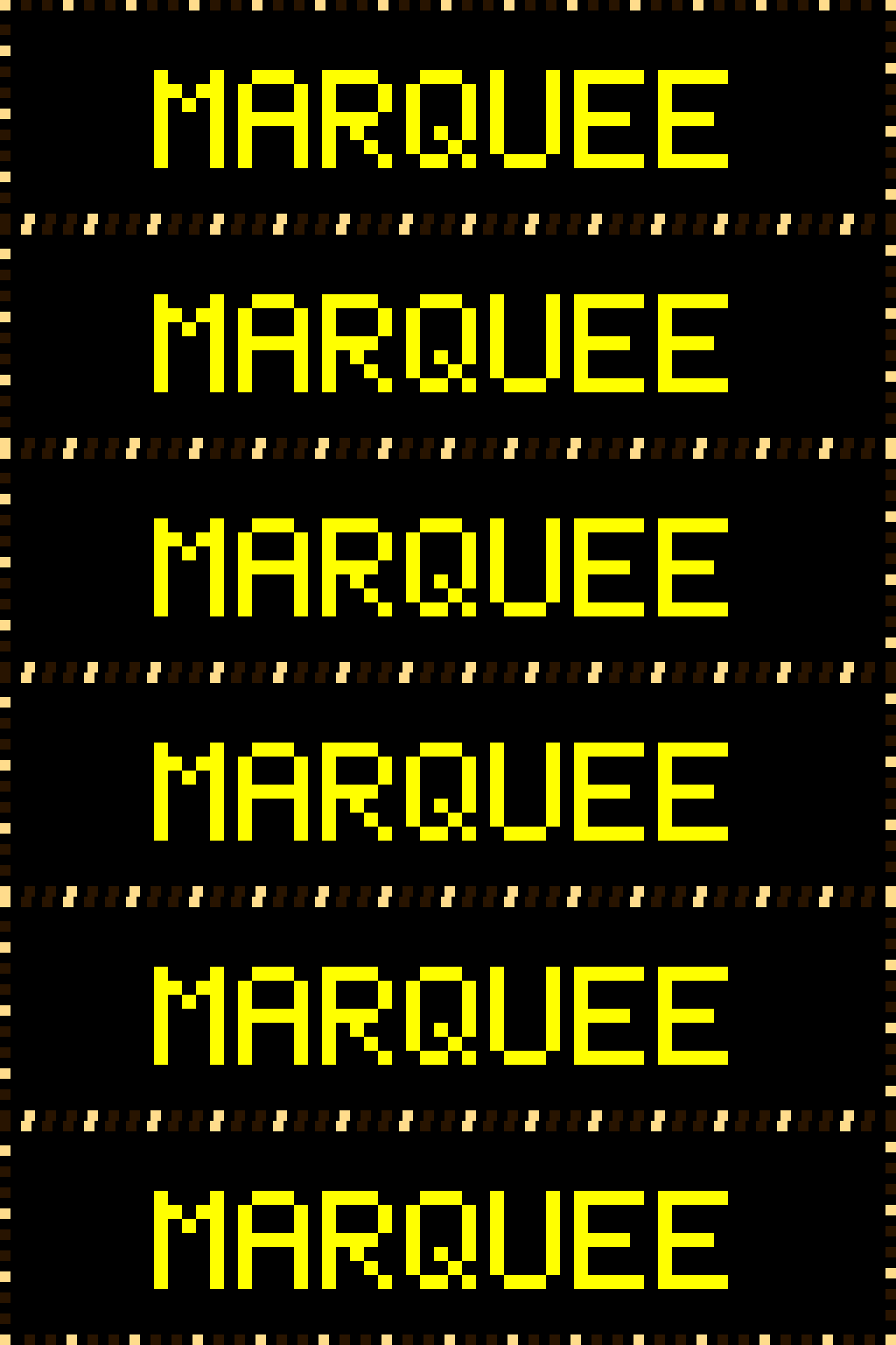
\`chase\` — warm-white marquee, the lit window travels clockwise
* **`alternate`** — even/odd bulbs flip on each phase. Half the bulbs lit at any time, switching every `speed_frames` ticks. Looks like a shimmer or twinkle without directional motion.
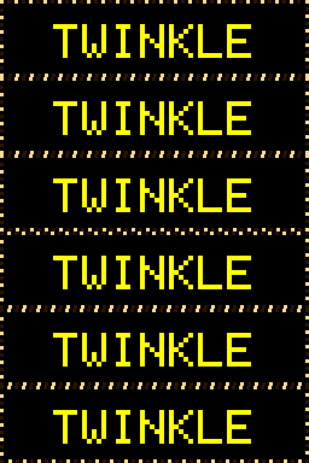
\`alternate\` — even/odd bulbs flip in place, a directionless twinkle
* **`unison`** — all bulbs share state. All lit, then all unlit, alternating every `speed_frames` ticks. Loud attention-grabber.

\`unison\` — every bulb blinks on and off together
### Full table form
[Section titled “Full table form”](#full-table-form)
```toml
border = { style = "lightbulbs",
mode = "chase", # "chase" | "alternate" | "unison"
bulb_size = 3, # optional; auto from panel height
gap = 3, # pixels between bulb edges
lit_color = [255, 220, 140], # warm white default; or "rainbow"
unlit_color = [40, 20, 0], # dim warm-orange default
speed_frames = 2, # frames per state transition
chase_density = 3, # only used by mode="chase"
direction = "cw", # "cw" | "ccw", only used by mode="chase"
hue_wraps = 1.0 } # only used when lit_color = "rainbow"
```
`speed_frames` defaults differ by mode: `2` for chase (\~100 ms per bulb step), `5` for alternate (\~250 ms per toggle), `8` for unison (\~400 ms per blink). Higher values slow the animation; the engine ticks at 50 ms.
### Rainbow bulbs
[Section titled “Rainbow bulbs”](#rainbow-bulbs)
Set `lit_color = "rainbow"` to color each lit bulb by its position around the perimeter — a full hue spectrum wrapped around the ring. The hues are **static in space**: they do not rotate over time, so with `mode = "chase"` the lit window travels across a fixed string of colored bulbs, exactly like a strand of party or Christmas lights. Unlit bulbs keep their `unlit_color` glow.
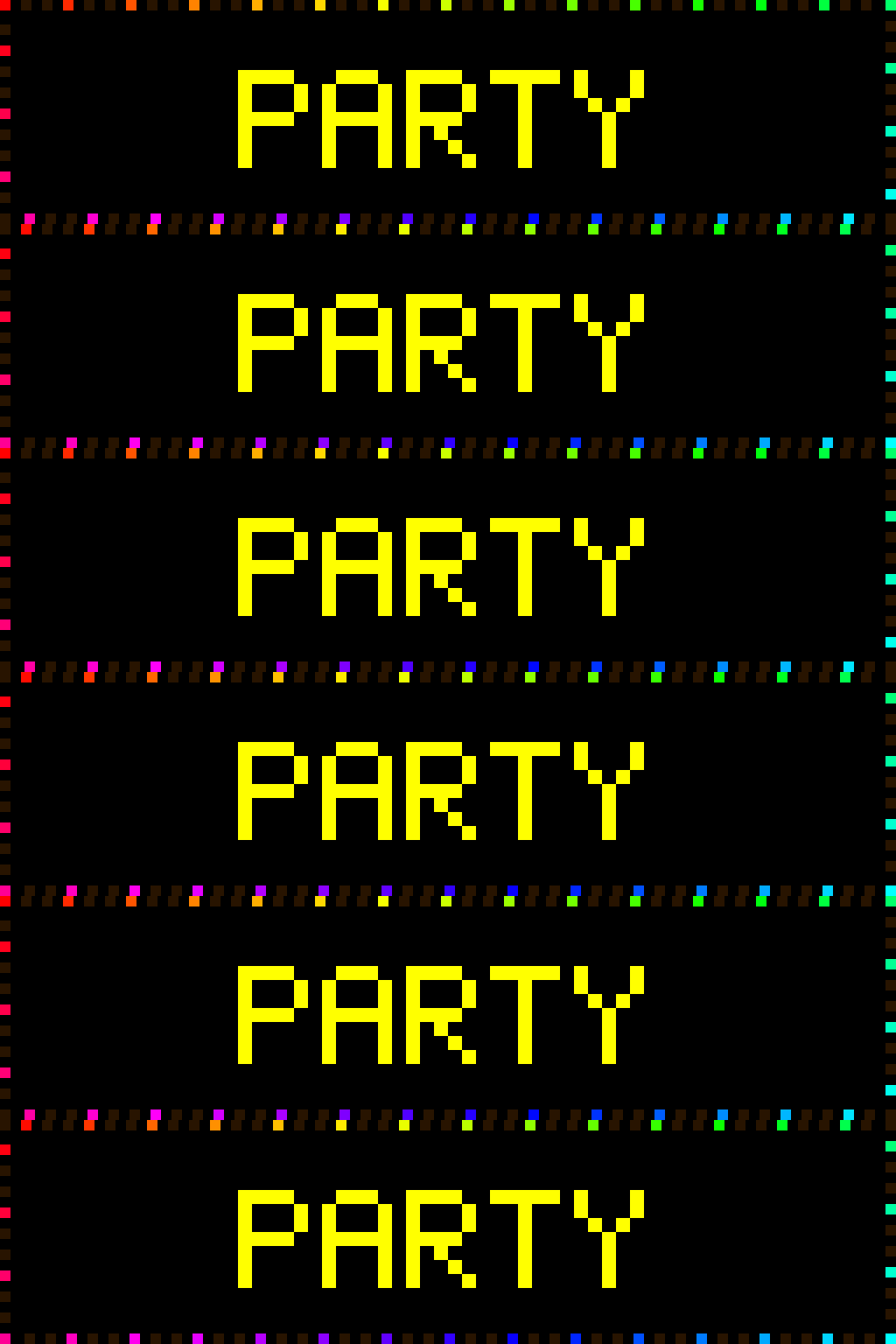
\`lit\_color = "rainbow"\` with \`mode = "chase"\` — a traveling lit window over a fixed rainbow string
```toml
[[playlist.section.widget]]
type = "message"
text = "PARTY"
border = { style = "lightbulbs", mode = "chase", lit_color = "rainbow" }
```
**`hue_wraps`** (default `1.0`): how many full spectra tile around the perimeter. `1.0` wraps one rainbow once around the whole edge, so adjacent bulbs differ only subtly. Raise it to `2` or `3` to tile multiple rainbows and widen the per-bulb color contrast.
```toml
# Two full spectra around the ring — punchier per-bulb color
border = { style = "lightbulbs", lit_color = "rainbow", hue_wraps = 2 }
```
### When to use each style
[Section titled “When to use each style”](#when-to-use-each-style)
`lightbulbs` reads as a **physical object** — a marquee of light fixtures. `rainbow` / `color_cycle` read as a **graphical effect**, a halo or outline. `bands` reads as a **themed ribbon**: use it when you want a recognizable color sequence (a flag, a holiday palette) rather than a spectrum sweep.
`lightbulbs` is unconditionally animated (`frame_invariant = False`) — image-widget fast paths correctly force per-tick redraws on it, same as the other animated borders.
#### Common patterns
[Section titled “Common patterns”](#common-patterns-3)
**Vegas / theatrical marquee** — a fast, tightly-packed traveling lit window:
```toml
border = { style = "lightbulbs", mode = "chase", speed_frames = 1, chase_density = 2 }
# Every other bulb lit, advancing one step per engine tick
```
**Rainbow party lights** — a calm static strand of colored bulbs, all lit at once:
```toml
border = { style = "lightbulbs", mode = "chase", lit_color = "rainbow", chase_density = 1 }
# chase_density = 1 lights every bulb — a steady rainbow strand
```
**Holiday / themed two-color** — pick a palette for lit and unlit, then alternate:
```toml
border = { style = "lightbulbs", mode = "alternate", lit_color = [200, 30, 30], unlit_color = [20, 120, 40] }
# Red / green holiday twinkle
```
See also
* [concepts/color-providers](/concepts/color-providers/)
* [reference/frame-counters](/reference/frame-counters/)
* [widgets/message](/widgets/message/)
# Busy light
> A persistent corner dot that lights up while you're busy, painted as an overlay over every section and transition.
The busy light is a persistent indicator — a small solid dot in a corner of the panel — that turns on while you’re “busy” and off when you’re not. It is **not** a playlist widget: it does not occupy a section or take a turn in the rotation. It paints as an **overlay** on top of whatever is currently on screen, so it stays lit continuously across every section and every transition.
The MVP source is the simplest one that needs no accounts or API keys: a local **file**. While the file exists, the light is on; remove it and the light goes off. A background task re-checks the file every few seconds. (Real calendar / Slack / Teams sources are a planned addition behind the same overlay — see [Extending it](#extending-it-real-busy-sources).)
## How it works
[Section titled “How it works”](#how-it-works)
The light is a paint callback registered on the frame’s overlay hooks. Every time the engine pushes a frame to the panel — in the main scroll/hold loop, mid-transition, or inside an image/gif `play()` loop — that single swap point runs the overlay hooks on the **real** physical canvas just before the hardware swap. Because all three render paths route through that one swap, the dot composites over everything with no special per-path handling. Painting is a handful of `SetPixel` calls in physical pixels, so the per-frame cost is negligible.
The state is read on the render side and written by the background poll task; both run in the same event loop, so the on/off flag needs no locking.
## Configuration
[Section titled “Configuration”](#configuration)
Add a top-level `[busy_light]` block (disabled by default):
Minimal
```toml
[busy_light]
enabled = true
file_path = "~/.busy"
corner = "top_right"
color = [255, 0, 0]
size = 4
```
| Field | Type | Default | Notes |
| --------------- | ----------- | ------------- | ---------------------------------------------------------------------------------------------------------------- |
| `enabled` | bool | `false` | Master switch. When `false`, nothing is built and there is zero per-frame cost. |
| `file_path` | string | `"~/.busy"` | The light is on while this file exists. `~` expands to the home directory. See [Docker](#docker) for the gotcha. |
| `poll_interval` | float | `5.0` | Seconds between file checks. Lower = snappier reaction; the file stat is cheap. |
| `corner` | string | `"top_right"` | One of `top_left`, `top_right`, `bottom_left`, `bottom_right`. |
| `color` | `[r, g, b]` | `[255,0,0]` | Three ints, each `0`–`255`. Validated at config load. |
| `size` | int | `4` | Dot side length in **physical** pixels. See [Sizing](#sizing-per-panel). |
## Toggling it
[Section titled “Toggling it”](#toggling-it)
When running from a source checkout, the file path is literal:
```bash
touch ~/.busy # light ON (within poll_interval)
rm ~/.busy # light OFF
```
### Docker
[Section titled “Docker”](#docker)
This is the one sharp edge. Under Docker — the usual deploy — `~/.busy` resolves to the **container’s** home directory, which your host shell can’t reach, so toggling `~/.busy` on the host does nothing. Point `file_path` at the **bind-mounted config dir** instead. The compose file mounts `./config:/code/config:ro`, so:
Docker
```toml
[busy_light]
enabled = true
file_path = "/code/config/.busy" # in-container path
```
```bash
touch config/.busy # on the host, from the repo dir → light ON
rm config/.busy # → light OFF
```
The `:ro` mount only stops the **container** from writing; the host can freely create and delete `config/.busy`, and the container sees the change. The poller only reads the file (`exists()`), so read-only is fine.
## Remote trigger (HTTP)
[Section titled “Remote trigger (HTTP)”](#remote-trigger-http)
Instead of a local file, the light can be flipped by an HTTP call over your LAN — ideal for triggering it from another machine such as a work laptop. Set `source = "http"`:
HTTP source
```toml
[busy_light]
enabled = true
source = "http"
http_host = "0.0.0.0"
http_port = 8081
ttl_seconds = 0 # 0 = explicit on/off; >0 = auto-clear after N seconds
```
Set the shared secret in the **`LED_TICKER_BUSY_TOKEN`** environment variable (for example in your `.env`) — secrets belong in the environment, not in `config.toml`:
```bash
LED_TICKER_BUSY_TOKEN=change-me
```
The display reads the token env-first. A `token = "…"` field in `[busy_light]` still works as a fallback, but it logs a warning at startup telling you to move it to `LED_TICKER_BUSY_TOKEN`. With neither set, the listener is open to anyone on the LAN.
The listener exposes one route (`change-me` below stands in for your `LED_TICKER_BUSY_TOKEN` value):
```bash
# turn the light on / off (GET with a query param — easiest for macros)
curl "http://PI-HOST:8081/busy?state=on&token=change-me"
curl "http://PI-HOST:8081/busy?state=off&token=change-me"
# turn on, then auto-clear after 60 seconds (per-request TTL override)
curl "http://PI-HOST:8081/busy?state=on&ttl=60&token=change-me"
# POST with a body works too
curl -X POST "http://PI-HOST:8081/busy" -H "X-Busy-Token: change-me" -d on
# read current state
curl "http://PI-HOST:8081/busy?token=change-me"
```
`PI-HOST` is your Pi’s `.local` hostname (e.g. `longboi.local`) or a DHCP-reserved IP. The token may be passed as the `token=` query param or an `X-Busy-Token:` header; a wrong/missing token returns `401`. A token in the query string can appear in logs — fine on a trusted LAN; use the header form if you’d rather not.
### Exposing the port
[Section titled “Exposing the port”](#exposing-the-port)
* **Docker deploy:** add a port mapping to that Pi’s compose service:
```yaml
services:
led-ticker:
ports:
- "8081:8081"
```
* **Source-checkout / dev:** the process binds the host port directly — no mapping needed; just make sure no host firewall blocks it.
### TTL (auto-clear)
[Section titled “TTL (auto-clear)”](#ttl-auto-clear)
A busy light can auto-clear after a set time, so you don’t have to remember to send `off`. There are two ways to set it:
* **Per request** — add `&ttl=N` (seconds) to a `state=on` call: `…/busy?state=on&ttl=60`. The light turns on and clears itself after `N` seconds unless refreshed by another `state=on`. This overrides the config default for that one request; `ttl=0` means “stay on until an explicit off”. An invalid `ttl` (non-numeric, negative, or non-finite like `inf`/`nan`) returns `400`. `ttl` is always a **query parameter** — even on a POST it goes in the URL (`POST …/busy?ttl=60` with the state in the body), never in the request body.
* **Config default** — `ttl_seconds` in `[busy_light]` applies to every `state=on` that omits `?ttl=`. `ttl_seconds = 0` (the default) means on-until-explicit-off; set e.g. `1800` for a 30-minute safety net if the sender sleeps mid-meeting and never sends `off`.
TTL applies only to the HTTP source — the file source is polled directly and never arms a deadline.
### Triggering from a Mac
[Section titled “Triggering from a Mac”](#triggering-from-a-mac)
Both methods reduce to one HTTP call, so neither needs anything installed on a managed work laptop:
* **Manual hotkey** — Keyboard Maestro, Raycast, or a Shortcut with a global key running `curl "http://PI-HOST:8081/busy?state=on&token=…"` (and an `off` twin).
* **Focus automation (hands-off)** — macOS **Shortcuts → Automation → “When \[Work] focus turns On”** → action **Get Contents of URL** (GET) `http://PI-HOST:8081/busy?state=on&token=…`; add a matching *turns Off* automation with `state=off`. macOS itself is the detector — no background app of your own.
* **Auto-detect from camera use** — for a fully hands-off “on while I’m in a meeting”, watch the camera and hit the endpoint. A ready-made [Hammerspoon](https://www.hammerspoon.org) script ships in the repo at [`deploy/busy-light-camera-watcher.lua`](https://github.com/JamesAwesome/led-ticker/blob/main/deploy/busy-light-camera-watcher.lua): it flips the light on whenever any camera turns on (Zoom, Google Meet, FaceTime) and off when they all stop. Set `PI_HOST`/`TOKEN` at the top and follow the install steps in the file header. Note: a call joined with video **off** never turns the camera on, so it won’t trigger — camera use is the signal.
## Sizing per panel
[Section titled “Sizing per panel”](#sizing-per-panel)
`size` is in physical pixels, so the right value depends on panel height:
| Panel | Height | Suggested `size` |
| ----------------- | ------ | ---------------- |
| Smallsign | 16 px | `3`–`4` |
| Bigsign / longboi | 64 px | `8`–`10` |
A `size = 4` dot is a quarter of the smallsign’s height — clearly visible. The same `4` on a 64-tall panel is a barely-visible speck, so bump it to `8`–`10` there. The dot paints **last** each frame (over the content), so it’s never hidden by what’s underneath.
## Extending it (real busy sources)
[Section titled “Extending it (real busy sources)”](#extending-it-real-busy-sources)
The overlay mechanism is generic and the busy state is a plain flag, so a real source is a drop-in: a new poller whose `update()` sets the busy flag from an API (Google Calendar free/busy, a Slack/Teams presence endpoint) using the shared HTTP session and the standard background-poll loop, registering the same kind of corner-dot paint hook. Nothing in the frame or the overlay mechanism changes — only where the on/off signal comes from. This is planned, not yet shipped.
See also
* [concepts/display](/concepts/display/)
* [reference/config-options](/reference/config-options/)
# Color providers
> Constant, rainbow, gradient, color_cycle, shimmer, and random — how font_color accepts more than just an RGB list.
`font_color` accepts six forms: a `[r, g, b]` list (constant), the string shorthands `"rainbow"`, `"color_cycle"`, `"shimmer"`, and `"random"`, or an inline table for a gradient, a ranged color cycle, or a tuned shimmer. The constant, rainbow, and color\_cycle forms cover most signs. The same field on `top_color` / `bottom_color` for `two_row` and image widgets behaves identically — pick once per widget, swap providers without changing anything else.

rainbow → color\_cycle → gradient → constant → random (shimmer not shown)
Shimmer has its own demo further down — see [Shimmer](#shimmer).
## The six providers
[Section titled “The six providers”](#the-six-providers)
| Provider | Syntax | Per-char? | Animates? |
| ---------------- | ------------------------------------------------------------ | --------- | ---------------------------------- |
| Constant | `[r, g, b]` | no | no |
| Rainbow | `"rainbow"` | **yes** | yes — hue sweeps per frame |
| ColorCycle | `"color_cycle"` | no | yes — whole-string hue rotation |
| ColorCycle range | `{style = "color_cycle", from = [...], to = [...], speed=N}` | no | yes — restricted hue arc |
| Gradient | `{style = "gradient", from = [...], to = [...]}` | **yes** | no — frozen interpolation |
| Shimmer | `"shimmer"` or `{style = "shimmer", shimmer = "gold", ...}` | **yes** | yes — bright-spot sweep with pause |
| Random | `"random"` | no | no — picks once on visit |
**Per-char** providers (rainbow, gradient, shimmer) assign a unique color to each character position and call `color_for` once per character per draw. **Whole-string** providers (constant, color\_cycle, random) compute one color per draw and apply it to the entire message.
## Constant
[Section titled “Constant”](#constant)
The simplest case — a fixed `[r, g, b]` triplet. Nothing animates; the color is stable across every frame and every loop.
```toml
[[playlist.section.widget]]
type = "message"
text = "Now Open"
font_color = [255, 200, 0]
```
## Rainbow
[Section titled “Rainbow”](#rainbow)
Per-character hue offset that advances each frame. The first character starts at a different hue than the second, and every character’s hue sweeps forward 8° per tick (default). `rainbow` is a continuous-phase provider — the sweep does not reset between `loop_count` repetitions, so the color keeps flowing rather than snapping back to the start on each pass.
```toml
[[playlist.section.widget]]
type = "message"
text = "Grand Opening"
font_color = "rainbow"
```
Fine-tune with an inline table if the defaults are too fast or too spread:
```toml
[[playlist.section.widget]]
type = "message"
text = "Grand Opening"
font_color = {style = "rainbow", speed = 4, char_offset = 20}
```
`speed` is hue degrees advanced per 50 ms tick (default 8). `char_offset` is the hue gap between consecutive characters (default 30).
## ColorCycle
[Section titled “ColorCycle”](#colorcycle)
Whole-string hue rotation — every character shares one color, and that color cycles through the spectrum over time. Subtler than rainbow; useful when you want motion without the striped look. Also continuous-phase — the cycle does not reset between loops.
```toml
[[playlist.section.widget]]
type = "message"
text = "Now Playing"
font_color = "color_cycle"
```
Speed is configurable via `{style = "color_cycle", speed = N}` (degrees per tick, default 5).
### Restricting the hue arc
[Section titled “Restricting the hue arc”](#restricting-the-hue-arc)
Add `from` and `to` RGB colors to restrict the cycle to the shorter arc between those two hues instead of sweeping the full wheel. The engine always takes the shorter path — `from = [255, 0, 0]` (red) and `to = [0, 0, 255]` (blue) sweeps through the 120° magenta/violet arc rather than the 240° yellow/green/cyan arc. Without `from`/`to`, full-wheel behavior is unchanged.
```toml
[[playlist.section.widget]]
type = "message"
text = "Now Playing"
font_color = {style = "color_cycle", from = [225, 48, 108], to = [120, 230, 255], speed = 5}
```
`from` and `to` must both be present or both absent. Achromatic colors (gray, white, black) are rejected — their hue is undefined. `speed = 0` is also rejected; use a plain `[r, g, b]` constant instead.
### Common patterns
[Section titled “Common patterns”](#common-patterns)
**Brand palette sweep** — limit the cycle to your two brand colors so the animation never wanders into off-brand hues:
```toml
font_color = {style = "color_cycle", from = [255, 92, 38], to = [255, 183, 3], speed = 3}
# Flame → amber — stays in the phoenix-warm arc
```
**Warm-cool oscillation** — a tight arc between two complementary hues creates a slow temperature-shift effect:
```toml
font_color = {style = "color_cycle", from = [255, 140, 0], to = [120, 230, 255], speed = 2}
# Amber → cyan — warm/cool pulse
```
## Gradient
[Section titled “Gradient”](#gradient)
A frozen left-to-right interpolation between two colors. `char_index` drives the interpolation; the frame counter is ignored — so the colors never shift, but each character gets its own tint. Unlike rainbow and color\_cycle, gradient does not require the per-tick render loop; the engine can take a paint-once-and-sleep fast path for otherwise-static content.
```toml
[[playlist.section.widget]]
type = "message"
text = "Fade Effect"
font_color = {style = "gradient", from = [255, 80, 80], to = [80, 80, 255]}
```
`from` and `to` are `[r, g, b]` triplets. The first character gets `from`, the last gets `to`, and all others interpolate linearly between them.
## Shimmer
[Section titled “Shimmer”](#shimmer)
A bright spot glides left-to-right across the text — one `shimmer_color` highlight sweeping over a `base_color` rest state — then pauses, then repeats. The spot fades in and out with a cosine curve so it blends smoothly rather than clipping abruptly.
```toml
[[playlist.section.widget]]
type = "message"
text = "Now Hiring"
font_color = "shimmer"
```
`"shimmer"` as a plain string uses the defaults: dim blue-gray base, white highlight, 14 chars/second, 8-char-wide spot, 0.5 s pause between sweeps. Tune with an inline table:
```toml
[[playlist.section.widget]]
type = "message"
text = "Grand Opening"
font_color = {style = "shimmer", base = [40, 40, 60], shimmer = "gold", speed = 10, width = 6, pause = 1.0}
```
| Field | Default | Description |
| --------- | -------------- | -------------------------------------------------------------------------------- |
| `base` | `[60, 60, 80]` | Rest color. `[r, g, b]` or a shorthand: `"white"`, `"gold"`, `"blue"`, `"cyan"`. |
| `shimmer` | `"white"` | Highlight color. Same formats as `base`. |
| `speed` | `14.0` | Chars per second the spot travels. Lower = slower, dreamier. |
| `width` | `8.0` | Spot width in chars. Wider = broader glow; narrower = sharper. |
| `pause` | `0.5` | Seconds of rest (base color only) between sweeps. |
Shimmer is a continuous-phase provider — it does not reset between `loop_count` repetitions, so the sweep keeps flowing across playlist loops rather than snapping back to the start.
When a section transition fires while a shimmer sweep is mid-glide, the engine waits up to roughly one second for the spot to reach its pause window before switching scenes, so the bright spot isn’t teleported by the cut. Sweeps that need longer than a second to reach their pause — or a `pause` shorter than a single frame — transition immediately, as before.
**Shimmer with a dark base color:** The base defaults to a dark blue-gray (`[60, 60, 80]`). If you want truly black resting characters, set `base = [0, 0, 0]`. High-contrast setups (dark base, bright shimmer) look best; a light base with a slightly-brighter shimmer produces a subtle, professional feel.
### Common patterns
[Section titled “Common patterns”](#common-patterns-1)

frost → gold coin → hot ember → neon breathe
**Frost** — cool blue rest state, white highlight, slow sweep. The spot glides wide and lazy across the text, leaving it dim and icy at rest.
```toml
font_color = {style = "shimmer", base = "blue", shimmer = "white", speed = 5, width = 4, pause = 1.2}
```
**Gold coin** — dark amber base, classic gold `[255, 215, 0]` (#FFD700) highlight. Narrow, fast sweep with a pause between cycles — the bright streak catches and disappears like light glancing off a spinning coin.
```toml
font_color = {style = "shimmer", base = [90, 55, 0], shimmer = [255, 215, 0], speed = 18, width = 3, pause = 0.8}
```
**Hot ember** — near-black red base, orange highlight. Medium speed, narrow width — a glowing coal that briefly catches.
```toml
font_color = {style = "shimmer", base = [60, 10, 0], shimmer = [255, 120, 30], speed = 12, width = 4, pause = 0.6}
```
**Neon breathe** — near-black base, bright cyan highlight, wide spot, no pause. The spot sweeps without stopping, so the text breathes continuously rather than flashing and going dark.
```toml
font_color = {style = "shimmer", base = [0, 5, 0], shimmer = [0, 230, 200], speed = 5, width = 10, pause = 0}
```
## Random
[Section titled “Random”](#random)
Picks a single random color at widget construction and holds it for the duration of the visit. The color does not change frame-to-frame or character-to-character; it just picks something different each time the section plays. Useful for adding variety to long-running displays without any visible animation.
```toml
[[playlist.section.widget]]
type = "message"
text = "Daily Special"
font_color = "random"
```
## Which to use
[Section titled “Which to use”](#which-to-use)
* **Constant** — brand colors, anything that shouldn’t animate.
* **Color\_cycle** — the whole message shifts hue together; subtler than rainbow. Add `from`/`to` to keep the sweep inside your brand palette.
* **Rainbow** — per-character hue sweep; use it when flair is the point (kids’ sections, grand openings, announcements).
* **Gradient** — frozen left-to-right interpolation; good when your brand has two anchor colors you want to bridge.
* **Shimmer** — a gliding bright-spot sweep; good for drawing attention to a single message, “now open” signage, or any case where you want motion without the full color-sweep effect.
* **Random** — picks a different color each time the section plays; no animation.
## Inline emoji and per-char providers
[Section titled “Inline emoji and per-char providers”](#inline-emoji-and-per-char-providers)
Rainbow and gradient sweep continuously across `:slug:` emoji boundaries. The sprite still renders in its own native colors, and the surrounding text gets per-character colors with the index advancing across the emoji segments without resetting. This means the hue does not jump or restart when it crosses an emoji — the stripe flows through the whole message as if the emoji were transparent to the color math.
```toml
[[playlist.section.widget]]
type = "message"
text = ":star: Now Enrolling :star:"
font_color = "rainbow"
```
## Colors and animations are independent
[Section titled “Colors and animations are independent”](#colors-and-animations-are-independent)
`font_color` and `animation` are separate axes on a `message` widget. A widget can carry both simultaneously — for example `font_color = "rainbow"` and `animation = "typewriter"` — and each effect tracks its own frame counter independently. Characters type out in rainbow with no interference between the two effects. See [animations](/concepts/animations/) for the full animation vocabulary.
See also
* [concepts/fonts](/concepts/fonts/)
* [widgets/message](/widgets/message/)
* [assets/emoji](/assets/emoji/)
# Display
> How rows, cols, chain_length, parallel, scale, and pixel_mapper_config combine into a logical canvas.
The `[display]` block describes your panel’s physical geometry: pixel dimensions per panel, chain length, and scaling. These values flow into every layout calculation, so a mismatch between config and hardware clips content or centers it on the wrong axis.
## The two reference builds
[Section titled “The two reference builds”](#the-two-reference-builds)
Two hardware configurations ship as ready-to-use examples — the maintainer’s day-to-day rigs that the demos and example configs are written against. You can match them, scale them, or build something different; the engine only cares about what `[display]` declares. The **smallsign** is a Raspberry Pi 4 with five 32×16 panels chained horizontally for a 160×16 canvas. The **bigsign** is a Raspberry Pi 5 with eight P3 32×64 panels arranged in a 2×4 vertical-serpentine layout for a 256×64 canvas.
Smallsign — Pi 4 + 5× 32×16 panels = 160×16 logical
```toml
[display]
rows = 16
cols = 32
chain_length = 5
default_scale = 1
brightness = 60
gpio_slowdown = 2
```
Bigsign — Pi 5 + 8× P3 32×64 vertical-serpentine 2×4 = 256×64 logical
```toml
[display]
rows = 32
cols = 64
chain_length = 8
parallel = 1
pixel_mapper_config = "Remap:256,64|192,32n|192,0n|128,32n|128,0n|64,32n|64,0n|0,32n|0,0n"
default_scale = 4
brightness = 60
gpio_slowdown = 3
pwm_bits = 8
```
## Logical canvas vs real panel
[Section titled “Logical canvas vs real panel”](#logical-canvas-vs-real-panel)
When `default_scale > 1`, the engine wraps the real panel in a `ScaledCanvas` — the layer that expands logical pixels onto a big / scaled sign. All drawing logic stays at “16-tall logical content,” so widgets never need to know what scale they are running at; the wrapper expands each logical pixel to a `scale×scale` block on the real canvas and centers the content vertically. *For developers and plugin authors:* that expansion happens per `SetPixel` call.
There is one hard ceiling you must respect: **`content_height × scale ≤ panel_h_real`**. For the bigsign at `scale = 4`, this means `content_height ≤ 16`. Push above the ceiling and the logical canvas is taller than the real panel; content placed near the top or bottom edges silently clips. If you need per-section breathing room, use `text_y_offset` on the widget rather than over-specifying `content_height`.
## Per-section overrides
[Section titled “Per-section overrides”](#per-section-overrides)
`scale` and `content_height` can also be set per section, overriding the display-level defaults. The classic case is a `two_row` widget: its two text rows need more horizontal room to fit handles like `@firebird.demo`, so it typically runs at `scale = 2`, giving 128 logical pixels of width instead of the default 64.
```toml
[[playlist.section]]
mode = "slideshow"
scale = 2
content_height = 24
hold_time = 4.0
```
## Scheduling
[Section titled “Scheduling”](#scheduling)
`[display.schedule]` lets you automatically dim or darken the sign during certain hours — useful for not blasting full brightness at 3 a.m. The schedule is driven by a lightweight background task that wakes every \~30 seconds and adjusts `matrix.brightness` to match whichever window is active right now.
### Windows
[Section titled “Windows”](#windows)
A schedule is a list of `[[display.schedule.windows]]` entries. Each window covers a time range and specifies a brightness:
```toml
[display.schedule]
enabled = true
timezone = "America/New_York" # set this — fresh Pis are often UTC
[[display.schedule.windows]]
start = "07:00"
end = "18:00"
brightness = 100
[[display.schedule.windows]]
start = "18:00"
end = "23:00"
brightness = 40
[[display.schedule.windows]]
start = "23:00" # wraps past midnight
end = "07:00"
brightness = 0 # dark — panel off overnight
```
`brightness = 0` makes the LEDs go dark (≈ zero panel power draw). **This is not a power or sleep mode** — the Pi keeps rendering at full cadence; only the LED brightness output goes to zero.
### Window resolution
[Section titled “Window resolution”](#window-resolution)
At each check the scheduler finds the **last matching window** in the list whose time range includes the current wall-clock time. “Last” means highest index, so place more-specific or higher-priority windows after the general ones.
Because the **last** matching window wins, place a more specific window *after* a general one to override it. For example, a normal day with a dimmer lunch hour:
```toml
[[display.schedule.windows]]
start = "07:00"
end = "23:00"
brightness = 100
[[display.schedule.windows]]
start = "12:00" # overrides the window above during lunch
end = "13:00"
brightness = 40
```
A window **wraps past midnight** when `end < start` (e.g. `start = "23:00"`, `end = "07:00"`). That window is active from 23:00 until 06:59.
### Day filtering
[Section titled “Day filtering”](#day-filtering)
Add a `days` list to a window to restrict it to specific weekdays:
```toml
[[display.schedule.windows]]
start = "08:00"
end = "18:00"
brightness = 100
days = ["mon", "tue", "wed", "thu", "fri"] # weekdays only
[[display.schedule.windows]]
start = "10:00"
end = "22:00"
brightness = 60
days = ["sat", "sun"] # weekends on a gentler setting
```
An empty `days` list (the default) matches every day of the week.
Midnight-wrapping windows and `days`
A window that wraps past midnight (`start > end`) is anchored to its **start day**. For example:
```toml
start = "23:00"
end = "07:00"
days = ["fri"]
```
This window is active from **Friday 23:00 through Saturday 06:59**. The early-Saturday tail belongs to Friday’s entry — not to Saturday’s — because the window started on Friday. If you also want Saturday-night coverage, add a separate window with `days = ["sat"]`.
### Timing and behavior
[Section titled “Timing and behavior”](#timing-and-behavior)
* **Boundary latency**: brightness changes land within approximately 30 seconds of the scheduled time, not instantly at the second.
* **Step, not fade**: brightness jumps in one step when a window becomes active — there is no fade animation.
* **Schedule changes need a restart**: the schedule is read at startup; there is no live-reload. Restart the display process after editing `[display.schedule]`.
* **Timezone**: `timezone` accepts any IANA name (e.g. `"America/New_York"`, `"Europe/London"`). Leave it empty to use the Pi’s system time — but set it explicitly if you can; freshly imaged Pis default to UTC, which will shift your windows by several hours.
### Viewing the resolved schedule
[Section titled “Viewing the resolved schedule”](#viewing-the-resolved-schedule)
Run `led-ticker validate config.toml` to see the resolved schedule printed alongside the usual validation output. This is useful for confirming window coverage and catching gaps before deploying.
## `[display]` reference
[Section titled “\[display\] reference”](#display-reference)
The full field reference — every knob, default value, and Pi-version note — lives at [Reference: Config options](/reference/config-options/#display). The most-touched fields are above (`rows`, `cols`, `chain_length`, `default_scale`, `pixel_mapper_config`, `gpio_slowdown`); see the reference page when you need `pwm_bits`, `pwm_lsb_nanoseconds`, `rp1_pio`, or the other Pi-tuning options.
See also
* [concepts/fonts](/concepts/fonts/)
* [widgets/two\_row](/widgets/two_row/)
* [getting-started](/getting-started/)
# Fonts
> BDF bitmap fonts vs hi-res TTF/OTF — what to pick and why.
Every text-bearing widget — `message`, `countdown`, `two_row`, `weather.current`, and the text overlay on `gif`/`image` — picks a font. led-ticker ships two flavors: pre-rasterized BDF bitmap fonts and scalable hi-res TTF/OTF fonts. The right choice depends on your panel scale and viewing distance.

BDF 6x12 (left) vs Inter-Bold @ 14px (right)
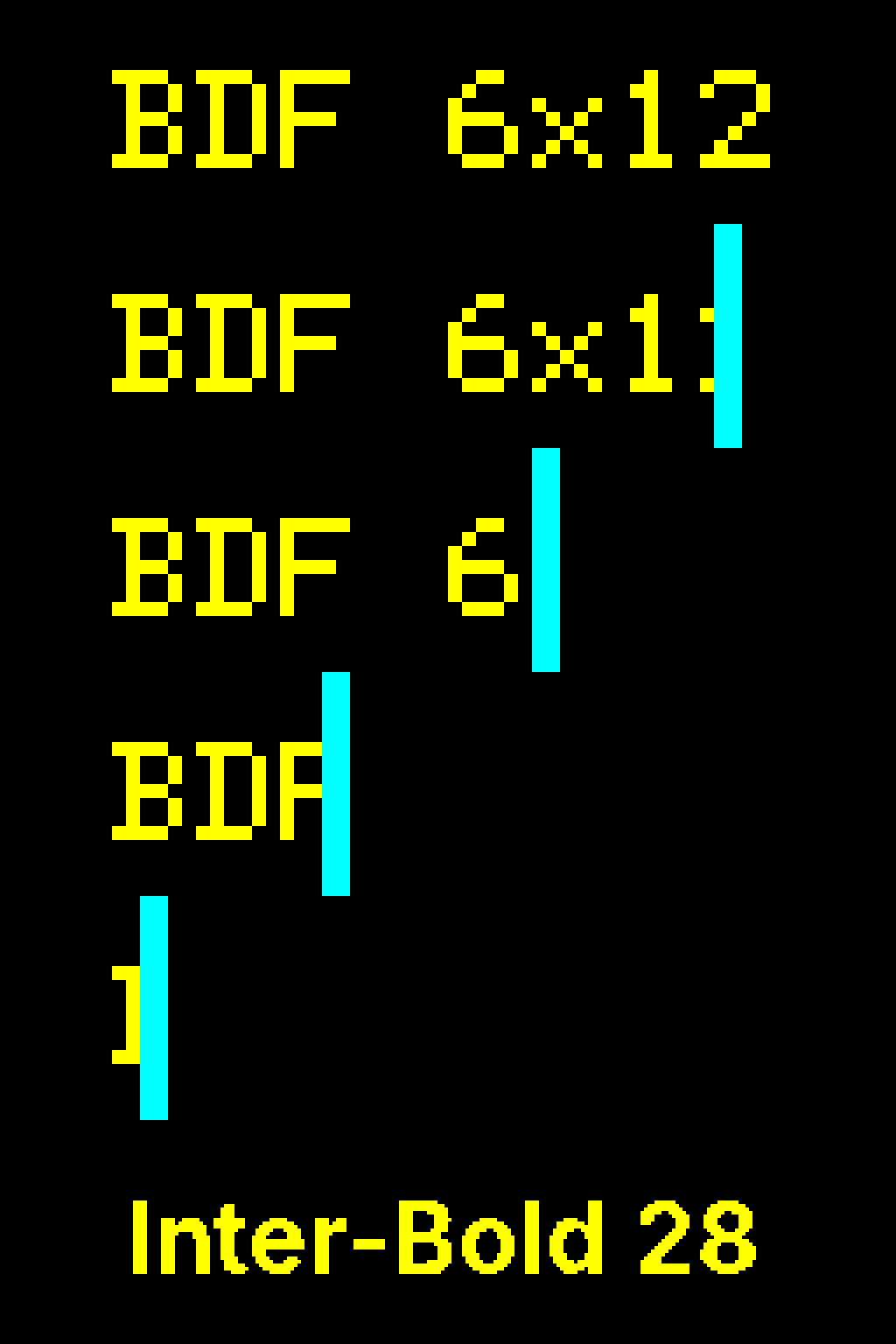
Bigsign canvas (256×64) — BDF 6×12 stretched to 48 real px (chunky) vs Inter-Bold @ 28 px (smooth, half-panel-height)
## BDF: the bundled bitmap fonts
[Section titled “BDF: the bundled bitmap fonts”](#bdf-the-bundled-bitmap-fonts)
BDF fonts are pre-rasterized pixel-by-pixel at a fixed cell size — there is no antialiasing, no threshold tuning, and no runtime rendering overhead. They load instantly and look crisp at the sizes they were designed for. Four aliases ship with led-ticker; the numbers are pixel cell width × height:
| Alias | Cell size | Python constant | Notes |
| ------ | --------- | --------------- | --------------------------------------------------------- |
| `5x8` | 5×8 px | `FONT_SMALL` | Smallest readable size; fits two rows on a 16-tall canvas |
| `6x10` | 6×10 px | `FONT_DELTA` | Compact alternative to the default |
| `6x12` | 6×12 px | `FONT_DEFAULT` | **Default font** — omit `font` to get this |
| `7x13` | 7×13 px | `FONT_LABEL` | Slightly wider strokes; good for short labels |
```toml
[[playlist.section.widget]]
type = "message"
text = "Hello"
font = "6x12" # default — can omit
```
## Hi-res (TTF / OTF) for the bigsign
[Section titled “Hi-res (TTF / OTF) for the bigsign”](#hi-res-ttf--otf-for-the-bigsign)
At `default_scale = 4`, BDF text is 12 real pixels tall — small on a 64-row panel. Hi-res fonts render at any real-pixel size you specify, using the bundled Inter typeface or a font you supply yourself.
Two fonts ship bundled: `Inter-Regular` and `Inter-Bold`. For a brand font (for example Adobe Beloved Sans), drop the `.otf` or `.ttf` file into `config/fonts/` next to your `config.toml` and reference it by filename stem. The directory is gitignored so licensed fonts stay off the repository.
`font_size` is required for all hi-res fonts — the rasterizer needs an explicit real-pixel target and there is no sensible default to fall back on.
```toml
[[playlist.section.widget]]
type = "message"
text = "Hello"
font = "Inter-Bold"
font_size = 28
```
## font\_threshold
[Section titled “font\_threshold”](#font_threshold)
Hi-res glyphs are anti-aliased during rasterization and then binarized to 1-bit before painting to the panel (LEDs are either on or off). `font_threshold` (0–255, default 128) is the cutoff: pixels at or above it are lit; below it are dark.
The default 128 works well for medium-stroke fonts like Inter at typical bigsign sizes. Thin-stroked fonts — for example Beloved Sans Regular at 24–32 px — have anti-aliased edge pixels that land in the 60–100 range; at the 128 default those edges get clipped to zero, leaving glyphs visibly broken. Dropping to \~80 includes those edge pixels and restores the correct weight.
**Match thresholds within a font family.** Bold at 128 has fewer lit pixels than Regular at 80 because the lower threshold fattens the regular strokes past Bold’s natural weight. Set both to the same value:
```toml
[[playlist.section.widget]]
type = "message"
text = "@firebird.demo"
font = "Beloved-Sans-Bold"
font_size = 28
font_threshold = 80 # same threshold as Regular below
[[playlist.section.widget]]
type = "message"
text = "Open 7 days"
font = "Beloved-Sans-Regular"
font_size = 24
font_threshold = 80 # match Bold above to preserve weight contrast
```
BDF fonts ignore `font_threshold` entirely — their bitmaps are already 1-bit.
## Character coverage
[Section titled “Character coverage”](#character-coverage)
Hi-res fonts pre-rasterize a fixed character set when the font loads, not lazily on demand. The set covers what most signage actually uses:
* **ASCII printable**: the standard `string.printable` range — letters, digits, punctuation, whitespace.
* **Extended Latin**: the most common Latin-1 accented characters (`àáâãäåæçèéêëìíîïñòóôõöøùúûüýÿ` + uppercase variants), so European-language RSS feeds render correctly.
* **Extended punctuation**: bullet (`•`), middle-dot (`·`), ellipsis (`…`), em-dash (`—`), en-dash (`–`), curly quotes (`’‘“”`), and guillemets (`«»`) — the typographic marks that show up in headlines, separator lists, and brand copy.
Any character outside this set falls back to the `?` glyph at render time. If you see a `?` on the panel where you expected your character, the codepoint isn’t in the rasterized set — the fix is to extend `EXTENDED_LATIN` or `EXTENDED_PUNCTUATION` in `src/led_ticker/fonts/hires_loader.py` and rebuild. A tripwire test (`tests/test_hires_font_loader.py:test_glyphs_for_extended_punctuation`) asserts the punctuation set stays rasterized AND that each glyph has lit pixels — catches both “char missing from the set” regressions and “char in set but threshold-clipped to zero pixels” issues.
BDF fonts have no fallback mechanism — characters not in the BDF’s bitmap are skipped entirely (zero advance, no glyph drawn). For BDF widgets, stick to ASCII unless you’ve verified the BDF you picked includes the codepoints you need.
## Decision tree
[Section titled “Decision tree”](#decision-tree)
| Panel | Viewing distance | Recommended |
| -------------------------------- | ---------------- | ------------------------------------------ |
| Smallsign (160×16, scale=1) | Any | BDF `6x12` (default) — pixel-perfect at 1× |
| Bigsign (256×64, scale=4), close | ≤ 6 ft | BDF or `Inter-Bold` @ 16–22 px |
| Bigsign, medium | 6–20 ft | `Inter-Bold` @ 22–28 px |
| Bigsign, far (across the street) | > 20 ft | `Inter-Bold` @ 28–32 px |
See also
* [concepts/display](/concepts/display/)
* [concepts/color-providers](/concepts/color-providers/)
* [widgets/message](/widgets/message/)
# Config hot-reload
> How led-ticker picks up config.toml changes while the sign is running — no restart needed for most edits.
With config hot-reload enabled (the default), editing `config.toml` while the sign is running causes the display process to pick up the change automatically — no restart, no brief blank panel, no dropped-frame glitch. The old config stays active until the new one passes validation, so a typo never takes the sign down.
## What reloads, what does not
[Section titled “What reloads, what does not”](#what-reloads-what-does-not)
| What changed | Effect |
| ----------------------------------------------------------------- | ----------------------------------------------------------------- |
| `[[playlist.section]]` — sections, widgets, transitions | Reloaded at the start of the next full playlist cycle |
| `[display] brightness` | Applied within \~30 seconds (the schedule tick interval) |
| `[display.schedule]` — windows, timezone | Reloaded along with the rest of `[display]` |
| `[display]` hardware fields (rows, cols, chain\_length, scale, …) | **Restart required** — these wire into the GPIO driver at startup |
| `[busy_light]` | **Restart required** |
| `[plugins]` | **Restart required** — plugins register at startup |
| `[web]` | **Restart required** |
If you change a restart-required field, the reload is still accepted (the reloadable changes take effect), and the sign logs a warning listing which fields need a restart. The [web status UI](/concepts/web-status-ui/) shows the same list in the **Last config reload** card under `restart_required`.
## How it works
[Section titled “How it works”](#how-it-works)
The display process checks `config.toml` for modifications at the top of every full playlist cycle — between the last widget of one pass and the first widget of the next. If the file’s modification time has changed, it:
1. Validates the new config in full (the same check `led-ticker validate` runs).
2. If validation fails, logs the error and keeps running on the old config — the panel never goes dark.
3. If validation passes, swaps in the new config, rebuilds the widget pool, and continues.
The swap happens only between cycles, so the running cycle always finishes consistently on one config — it never splits a section across a config boundary.
## Enabling and disabling
[Section titled “Enabling and disabling”](#enabling-and-disabling)
Hot-reload is on by default. To opt out:
Disable hot-reload
```toml
[display]
hot_reload = false
```
With `hot_reload = false`, the display process ignores `config.toml` modifications after startup. You need a restart for any config change to take effect.
## Feedback
[Section titled “Feedback”](#feedback)
**Logs** — each reload attempt logs at one of three levels:
* **INFO** — clean success: `config reloaded`.
* **WARNING** — partial success: `config reloaded (partial); restart required for: ` (display hardware fields changed; a restart is needed for those to take effect).
* **ERROR** — rejected: `config reload rejected: ` (the new config failed validation; the running config is unchanged).
```bash
docker compose logs -f led-ticker | grep reload
```
**Web status UI** — the Status tab’s **Last config reload** card shows the timestamp, whether it succeeded, the error message on failure, and which fields (if any) need a restart. The card is hidden until the first reload attempt after startup. See [Web status UI](/concepts/web-status-ui/#status-tab--snapshot-fields) for the full `last_reload` field shape.
## In Docker
[Section titled “In Docker”](#in-docker)
The `config` directory is mounted read-only (`./config:/code/config:ro`), which does not prevent the Pi’s own editor from updating the host file — the container sees the change through the bind mount. Hot-reload works the same way in Docker as when running from a source checkout.
Tip
Use `led-ticker validate config.toml` (or the web UI’s Validate tab) to confirm a candidate config before saving it — a validation pass on the command line guarantees the same check the hot-reload path runs.
## If the reload is not picking up your change
[Section titled “If the reload is not picking up your change”](#if-the-reload-is-not-picking-up-your-change)
* Confirm `hot_reload = false` is not set in your `[display]` block.
* Check that the file’s modification time actually changed — some editors write to a temp file and rename; that still changes `mtime` and triggers a reload. A few (rare) setups write in place without updating `mtime` — `touch config.toml` forces a check.
* The reload runs between cycles, not mid-render, so it may take up to one full playlist cycle to appear (a few seconds to a minute depending on hold times and widget count).
* Check `docker compose logs led-ticker` for a `reload rejected` line — that means the new config failed validation and the old one is still running.
See also
* [concepts/web-status-ui](/concepts/web-status-ui/)
* [reference/config-options](/reference/config-options/)
* [reference/cli](/reference/cli/)
# How rendering works
> The render pipeline — what happens between your TOML config and the panel lighting up. The engine loop, the canvas, overlays, and the swap.
This page is a mental model of **what happens between your `config.toml` and the panel lighting up** — useful whether you’re tuning a config or building a plugin. The other concept pages go deep on each piece; this one shows how they fit together.

A rainbow message on the panel — here's the pipeline that produces it.
## The pipeline
[Section titled “The pipeline”](#the-pipeline)
```plaintext
Config (TOML)
↓ parsed at startup
Playlist → sections → widgets
↓ engine tick (~20 fps)
widget.draw() → logical canvas
↓ ScaledCanvas expands it (when scale > 1)
overlay hooks paint (e.g. the busy light)
↓
LedFrame.swap() → double-buffered → panel
```
Each section below is one step of that flow.
## The engine loop
[Section titled “The engine loop”](#the-engine-loop)
At startup, led-ticker parses your config into a **playlist** of [sections](/concepts/sections-and-modes/), each holding one or more **widgets**. Then a background engine runs a steady loop at **20 frames per second** — one *tick* every 50 ms.
On each tick the engine:
1. **advances the frame counter(s)** — every animated effect (rainbow text, a color cycle, a typewriter) has [its own counter](/reference/frame-counters/) that moves one step;
2. **redraws** the current widget onto the canvas at its new frame;
3. **pushes** the finished frame to the panel (below), then sleeps until the next tick.
A section’s **mode** decides how its widgets are shown — held in place (`slideshow`) or scrolling — and for how long; **[transitions](/transitions/)** play the animation between one widget or section and the next. (An effect whose output doesn’t change with the frame skips the per-tick redraw — see [frame counters](/reference/frame-counters/).)
## The canvas
[Section titled “The canvas”](#the-canvas)
Widgets don’t draw to physical LEDs directly. They draw to a **logical canvas** — a fixed 16-pixel-tall grid — using simple `(x, y)` coordinates, so a widget never needs to know how big your sign is. When your `[display]` runs at `scale > 1` (a big sign), a **`ScaledCanvas`** wraps the real panel and expands every logical pixel into a `scale × scale` block, centering the content vertically.
That’s the short version — [Display](/concepts/display/) covers scaling, the `content_height × scale` ceiling, and per-section overrides in full.
## Reaching the panel
[Section titled “Reaching the panel”](#reaching-the-panel)
When a frame is ready, the engine calls **`LedFrame.swap()`** — the buffer swap, unrelated to the `slideshow` section mode above — which does two things in order:
1. runs every registered **overlay hook** — paint functions that draw *over* whatever’s on screen, every frame, like the [busy light](/concepts/busy-light/)’s status dot;
2. performs a **double-buffered swap**: the new frame is sent to the panel while the next one is drawn off-screen, so the display never tears or flickers mid-update.
Then the loop sleeps and the next tick begins.
## Why it’s built this way
[Section titled “Why it’s built this way”](#why-its-built-this-way)
A few deliberate choices explain the rest:
* **A fixed tick.** Driving everything from one steady \~20 fps clock keeps animations smooth and in sync, and makes timing predictable across very different signs.
* **A write-only panel.** The hardware framebuffer can be written but not read back, so widgets and effects **recompute each frame** from their frame counter rather than reading the current pixels — that’s why effects are functions of the frame number.
* **Logical, then physical.** Keeping drawing in logical 16-tall coordinates and expanding to the real panel at swap time means one widget runs unchanged on a tiny sign or a giant one.
The full engineering rules behind this — the hardware-rendering constraints that keep the panel from freezing — live in [`docs/plugin-system.md`](https://github.com/JamesAwesome/led-ticker/blob/main/docs/plugin-system.md) and the project’s `CLAUDE.md`, for contributors and plugin authors who need them.
See also
* [concepts/display](/concepts/display/)
* [concepts/sections-and-modes](/concepts/sections-and-modes/)
* [transitions](/transitions/)
# Sections and modes
> Sections group widgets, modes pick the run style — slideshow, ticker, or one_at_a_time.
The `[[playlist.section]]` block is the fundamental unit of a led-ticker program. Each section groups one or more widgets and tells the engine how to run them. Three modes are available: `slideshow`, `ticker`, and `one_at_a_time`.
A playlist is just an ordered list of sections. The engine runs them in sequence, firing a section-to-section transition at each boundary, and loops back to the start when the last section finishes.
## `ticker` — side-by-side continuous stream
[Section titled “ticker — side-by-side continuous stream”](#ticker--side-by-side-continuous-stream)
All widgets in the section are joined into a single continuous stream that scrolls left across the panel without stopping. Each widget follows immediately after the last, separated by a `•` bullet character. The stream loops: when the last widget exits the left edge, the first re-enters from the right. This is the classic news ticker or stock crawl — one unbroken ribbon of content.
`ticker` suits short-text widgets that the reader can absorb at a glance: a weather condition, a price update, a brief announcement. Combine several short widgets and the stream stays lively without any pauses. Transitions are not used between widgets in this mode — the bullet separator is the only break.
The separator is customizable per section. Set `separator` to any string — `" * "` or `" | "` are common alternatives — or `""` for a minimal two-space gap with no glyph. `separator_color` accepts the same shapes as widget `font_color` (constant `[r, g, b]`, `"rainbow"`, or a gradient table). `separator_font` and `separator_font_size` let you match the separator’s typeface to the rest of the section. All four fields are rejected on non-`ticker` modes. `separator_size` shrinks or grows the bigsign separator circle (default 8; radius = size ÷ 2); it does not affect the smallsign BDF `•`.

\`ticker\` — three messages and a countdown flow together separated by bullets; the panel never clears
```toml
[[playlist.section]]
mode = "ticker"
loop_count = 1
scroll_step_ms = 35
[[playlist.section.widget]]
type = "message"
text = "Open 9-5"
font_color = [225, 48, 108]
[[playlist.section.widget]]
type = "countdown"
text = "Summer Camps"
countdown_date = 2026-06-20
font_color = [120, 220, 255]
[[playlist.section.widget]]
type = "message"
text = "Free coffee Friday"
font_color = [255, 220, 0]
[[playlist.section.widget]]
type = "message"
text = "All ages welcome"
font_color = [180, 220, 180]
```
## `one_at_a_time` — sequential scroll
[Section titled “one\_at\_a\_time — sequential scroll”](#one_at_a_time--sequential-scroll)
Each widget scrolls all the way across the panel and fully off the left edge before the next widget enters from the right. Widgets never appear on screen at the same time. Each message gets its own clean moment without a held pause.
`one_at_a_time` suits medium-length messages that should read as distinct items — enrollment announcements, sale callouts, or any set of messages where you want each one to complete before the next begins. Unlike `ticker`, there is never any overlap between consecutive messages; unlike `slideshow`, there is no hold and no transition animation. The effect is a clean sequence of individual scrolls.

\`one\_at\_a\_time\` — three messages and a countdown each scroll fully off before the next enters; a clean gap between widgets
```toml
[[playlist.section]]
mode = "one_at_a_time"
loop_count = 1
scroll_step_ms = 35
[[playlist.section.widget]]
type = "message"
text = "Now Enrolling"
font_color = [225, 48, 108]
[[playlist.section.widget]]
type = "countdown"
text = "Summer Camps"
countdown_date = 2026-06-20
font_color = [120, 220, 255]
[[playlist.section.widget]]
type = "message"
text = "Spring Classes Open"
font_color = [255, 220, 0]
[[playlist.section.widget]]
type = "message"
text = "Drop-ins welcome"
font_color = [180, 220, 180]
```
## `slideshow` — held with transitions
[Section titled “slideshow — held with transitions”](#slideshow--held-with-transitions)
Each widget is displayed for `hold_time` seconds (default `3.0`). If the widget’s text overflows the panel width, it scrolls once before stopping; otherwise it holds stationary. When the hold expires a transition animation runs, and the next widget appears. `slideshow` is the natural fit for a storefront window display or information board where each item needs to be readable on its own.
The transition used between widgets in the section is configured via the `transition` field. If you omit `transition`, the global `[transitions] default` applies. When a section explicitly sets `transition = "..."`, that transition is also used when the section appears — overriding the global `between_sections` setting for that section’s entry.

\`slideshow\` — three messages and a phoenix image each hold for \`hold\_time\`, then a transition (\`push\_left\` here) reveals the next
```toml
[transitions]
default = "push_left"
duration = 0.5
[[playlist.section]]
mode = "slideshow"
loop_count = 1
hold_time = 2.5
[[playlist.section.widget]]
type = "message"
text = "Open daily"
font_color = [120, 220, 255]
[[playlist.section.widget]]
type = "message"
text = "10am - 8pm"
font_color = [225, 48, 108]
[[playlist.section.widget]]
type = "image"
path = "config/assets/phoenix_transparent.png"
fit = "pillarbox"
image_align = "center"
hold_time = 3.0
[[playlist.section.widget]]
type = "message"
text = "All ages"
font_color = [255, 220, 0]
```
For `gif` widgets in `slideshow` mode, `play_count = 0` plays the gif through the section’s `hold_time` — the engine computes how many complete loops fit and plays at least one. See [gif widget — `play_count = 0`](/widgets/gif/#playing-through-hold_time-play_count--0).
## `loop_count` and section progression
[Section titled “loop\_count and section progression”](#loop_count-and-section-progression)
`loop_count` controls how many times the engine runs through all of the section’s widgets before moving on to the next section. A `loop_count` of `1` (the default) means the engine plays each widget once and then moves on. A value of `2` plays the whole set twice, and so on. Section-to-section transitions fire once when the engine leaves the section — they are not repeated on each loop.
The global `[transitions] between_sections` setting controls what transition plays at section boundaries. A section can override this by setting `transition` explicitly — when it does, that transition is used both for inter-widget swaps within the section AND for the entry transition when the section first appears.
## Tuning scroll cadence with `scroll_step_ms`
[Section titled “Tuning scroll cadence with scroll\_step\_ms”](#tuning-scroll-cadence-with-scroll_step_ms)
Both `ticker` and `one_at_a_time` advance one logical pixel per engine tick by default — 50 ms per pixel, or about 20 logical pixels per second. Set `scroll_step_ms` on a section to override that cadence. Lower values (30-40 ms) speed the marquee up for dense content like RSS headlines or rapid stock tickers; higher values (70-100 ms) slow it down for messages that need a deliberate read. The same value also drives the post-hold scroll on `slideshow` mode for widgets whose content overflows the panel width.
```toml
[[playlist.section]]
mode = "one_at_a_time"
loop_count = 1
scroll_step_ms = 30 # snappier than the 50 ms default
[[playlist.section.widget]]
type = "rss.feed"
feed_url = "https://example.com/feed"
```
The section-level `scroll_step_ms` is distinct from the per-widget `scroll_speed_ms` on `gif` and `image` widgets — the section knob controls how fast the engine’s cursor advances across widgets in scroll modes; the widget knob controls how fast text scrolls inside a single widget’s text overlay. Different layers, different code paths; both can be set in the same config.
## Section backgrounds with `bg_color`
[Section titled “Section backgrounds with bg\_color”](#section-backgrounds-with-bg_color)
Setting `bg_color` on a section paints a solid RGB color across the panel before any widget draws. Widgets in the section inherit that background unless they set their own `bg_color` — one line at the section level instead of repeating it on every widget.
```toml
[[playlist.section]]
mode = "slideshow"
hold_time = 4.0
bg_color = [255, 244, 214] # brand cream — warm neutral behind all widgets in this section
[[playlist.section.widget]]
type = "message"
text = "Now Enrolling"
[[playlist.section.widget]]
type = "message"
text = "Spring Classes"
```
When a section has a `bg_color` and the next section has a different one, transitions paint the right color throughout — the engine forwards `outgoing_bg_color` and `incoming_bg_color` to the active transition so the panel never flashes through black at the cut-over. Widget-level `bg_color` works the same way for inter-widget transitions within a section.
A widget setting its own `bg_color` overrides the section default for that widget only. Use a section-level color as the base and only set widget-level `bg_color` when one widget needs a different tint.
## `default` vs `transition`
[Section titled “default vs transition”](#default-vs-transition)
The `[transitions]` block uses `default = "wipe_left"` for the playlist-wide default. Inside a `[[playlist.section]]` the equivalent is `transition = "wipe_left"` — writing `default = `inside a section block has no effect (the key is silently dropped).
## Which mode to use
[Section titled “Which mode to use”](#which-mode-to-use)
| Mode | What it looks like |
| --------------- | --------------------------------------------------------------------------------------------------------------- |
| `ticker` | All widgets joined in one continuous stream, looping endlessly — the classic news ticker |
| `one_at_a_time` | Each widget scrolls fully across and off before the next enters — clean sequential scrolls, no overlap |
| `slideshow` | Each widget holds on screen for `hold_time`, then a transition reveals the next — storefront / info-board style |
See also
* [concepts/display](/concepts/display/)
* [concepts/value-tokens](/concepts/value-tokens/)
* [transitions/index](/transitions/index/)
* [widgets/index](/widgets/index/)
# Value tokens
> Embed live clock, date, weather, and other values in any widget's text using the :id: token syntax. Built-in and plugin-contributed sources supported.
Any text-bearing widget can embed a **value token** — a `:name:` placeholder that resolves to a live string at display time. Declare the source once at the top of your config; reference it anywhere in a `text =` field (or `top_text`, `bottom_text`, overlay text on image/gif widgets).
```plaintext
text = "Open 9–5 :clock.now:"
text = "Happy :date.today:!"
text = "Breathe. Move. Rise." # no token — plain string
```
Tokens share the same `:slug:` syntax as [inline emoji](/assets/emoji/). An unknown `:slug:` renders as literal text (including the colons), so adding a `[[source]]` block is the only way to activate a token — a typo stays visible rather than silently disappearing.
## Declaring a source with `[[source]]`
[Section titled “Declaring a source with \[\[source\]\]”](#declaring-a-source-with-source)
Each value token needs a matching `[[source]]` block at the top level of your `config.toml` (alongside `[display]`, `[transitions]`, etc. — not nested inside `[[playlist.section]]`).
Clock token — 12-hour time with AM/PM
```toml
[[source]]
id = "clock.now" # the token name → use :clock.now: in text fields
type = "clock"
format = "%-I:%M %p" # strftime — "9:01 AM", "12:30 PM"
timezone = "America/New_York" # IANA name; omit to follow the Pi's system clock
```
Date token — day of week
```toml
[[source]]
id = "date.today"
type = "date"
format = "%A" # "Monday", "Tuesday", …
timezone = "America/New_York"
```
Static token — fixed text that never changes
```toml
[[source]]
id = "brand.tagline"
type = "static"
value = "Breathe. Move. Rise."
```
The `id` becomes the token name. It must match the pattern `[a-z_][a-z0-9_.]*` — lowercase letters, digits, underscores, and dots — to be usable as a `:token:`. An id that doesn’t match the pattern is accepted, but the `:...:` placeholder won’t be recognized at display time and renders as literal text instead. A dot in the name (like `clock.now`) is fine; it is just part of the name and has no special meaning.
## Using tokens in widgets
[Section titled “Using tokens in widgets”](#using-tokens-in-widgets)
Reference a declared source by its `id`, wrapped in colons, in any `text =` field on a `message`, `two_row`, `gif`, or `image` widget:
Clock + date in a message widget
```toml
[[source]]
id = "clock.now"
type = "clock"
format = "%-I:%M %p"
timezone = "America/New_York"
[[source]]
id = "date.today"
type = "date"
format = "%A"
timezone = "America/New_York"
[[playlist.section]]
mode = "slideshow"
hold_time = 10
[[playlist.section.widget]]
type = "message"
text = ":date.today: :clock.now:"
font_color = [255, 183, 3]
```
Tokens compose with everything else on the widget — `font_color = "rainbow"`, `animation = "typewriter"`, `border = "rainbow"`, inline emoji. The token is substituted before layout, so the rest of the pipeline sees a plain string.
## The three source types
[Section titled “The three source types”](#the-three-source-types)
### `clock` — live wall-clock time
[Section titled “clock — live wall-clock time”](#clock--live-wall-clock-time)
`format` is a [Python `strftime` format string](https://docs.python.org/3/library/datetime.html#strftime-and-strptime-format-codes). Common patterns:
| Format | Output |
| ------------- | ----------------------------- |
| `"%-I:%M %p"` | `9:01 AM` |
| `"%I:%M %p"` | `09:01 AM` (zero-padded hour) |
| `"%H:%M"` | `21:01` (24-hour) |
| `"%I:%M"` | `09:01` (12-hour, no AM/PM) |
`timezone` is an IANA timezone name (e.g. `"America/New_York"`, `"Europe/London"`, `"Asia/Tokyo"`). Omit it and the token follows the Pi’s system clock — a fresh Pi is often UTC, so set the timezone explicitly.
### `date` — calendar date
[Section titled “date — calendar date”](#date--calendar-date)
Same as `clock` but formatted for dates. Common patterns:
| Format | Output |
| ------------- | ------------ |
| `"%A"` | `Monday` |
| `"%B %-d"` | `June 30` |
| `"%m/%d"` | `06/30` |
| `"%a %-d %b"` | `Mon 30 Jun` |
`timezone` works the same as for `clock`.
### `static` — fixed text
[Section titled “static — fixed text”](#static--fixed-text)
`value` is a plain string that never changes. It is the simplest source and a good way to keep a reusable phrase in one place and reference it from multiple widgets.
```toml
[[source]]
id = "studio.name"
type = "static"
value = "Firebird Yoga"
# then in any widget:
# text = ":studio.name: · Breathe. Move. Rise."
```
## How live updates work
[Section titled “How live updates work”](#how-live-updates-work)
The display engine refreshes all synchronous sources (clock, date, static) once per second. A source’s value is compared to the previous tick — if it changed, the internal version counter increments and any widget that references that source rebuilds its display string and recalculates its layout. Widgets with no tokens are untouched.
**Constant-width formats** (`%H:%M`, `%I:%M %p`) produce a value the same pixel width every tick, so the panel never reflowing mid-hold. **Variable-width formats** (`%A` — “Monday” vs “Saturday”) reflow at most once per value change (per minute or per day), cleanly at the widget’s next hold tick.
During scrolling, transitions, and typewriter reveals, resolution is frozen — if a value changes mid-scroll, the new value takes effect at the next hold rather than interrupting the in-flight animation.
## Resolution order: emoji wins, then source, then literal
[Section titled “Resolution order: emoji wins, then source, then literal”](#resolution-order-emoji-wins-then-source-then-literal)
If a `:slug:` matches an emoji in the [emoji registry](/assets/emoji/), it renders as a pixel-art sprite — the emoji takes priority over any source with the same name. The validator (`make validate`) rejects a `[[source]]` `id` equal to an existing emoji slug, so this collision cannot occur in a valid config.
An `:unknown:` slug that matches neither an emoji nor a declared source renders as literal text (`:unknown:`). This is intentional — a missing or misspelled source name stays visible so you can spot it at a glance.
## Live (polled) sources
[Section titled “Live (polled) sources”](#live-polled-sources)
The `clock`, `date`, and `static` sources compute their value locally and instantly — they need no network and never fail. Some source types work differently: they fetch data in the background on a repeating `interval` (in seconds) and push the result into the token when the fetch completes.
These **polled sources** are contributed by plugins. A plugin registers a source type via `api.source` by subclassing `PolledDataSource` and implementing an `async def update()` method that calls `self._set_value(...)` with a new string. The engine spawns a supervised background task that calls `update()` every `interval` seconds for as long as the display is running.
A polled `[[source]]` block looks the same as a built-in one — the plugin type name and any type-specific fields sit alongside `id` and `interval`:
```toml
[[source]]
id = "my.token"
type = "some.plugin.type" # contributed by a plugin
interval = 300 # fetch every 5 minutes
# ...type-specific fields...
```
**Before the first fetch completes**, the token shows a short placeholder (e.g. `…`) so your layout is never blank. Once the first value arrives, it replaces the placeholder and the token updates live on the same reflow path as clock and date — any widget that references it rebuilds its display string and recalculates layout automatically.
If a fetch fails, the previous value is kept and the task retries on the next `interval`. A crashed fetch task is supervised and restarted, so a transient network error doesn’t freeze the token permanently. If a polled source like `:weather.nyc:` stops updating, the [web UI’s Monitors panel](/concepts/web-status-ui/#status-tab--monitors) shows whether it is erroring (with the error message and a retry countdown) or stale (fetch wedged, no response).
### Example: live weather
[Section titled “Example: live weather”](#example-live-weather)
The [weather plugin](/plugins/available/#weather) contributes a `weather.current` source. Declare it once:
```toml
[[source]]
id = "weather.nyc"
type = "weather.current" # from the weather plugin
location = "New York, US" # name / ZIP / "lat,lon"
interval = 1800 # refresh every 30 minutes
format = "{temp_f}°F {condition}" # optional; this is the default
```
Then reference it in any widget’s text:
```toml
[[playlist.section.widget]]
type = "message"
text = "NYC: :weather.nyc:" # → "NYC: 72°F Clear", updating live
```
The `format` string interpolates the current-conditions fields `temp_f`, `temp_c`, `condition`, `feelslike_f`, `feelslike_c`, `humidity`, `wind_mph`, and `emoji`. The `emoji` field expands to a condition icon that renders as a sprite, so `format = "{temp_f}° {emoji}"` gives `72° ☀`. The API key comes from `WEATHERAPI_KEY` in your `.env` (never in config); see the [weather plugin](/plugins/available/#weather) for setup.
## Tips
[Section titled “Tips”](#tips)
### Zero-pad the hour to avoid reflowing
[Section titled “Zero-pad the hour to avoid reflowing”](#zero-pad-the-hour-to-avoid-reflowing)
`%H:%M` (24-hour, `09:01`) and `%I:%M` (12-hour with leading zero, `09:01`) keep the time string a fixed pixel width. `%-I:%M` (no leading zero, `9:01`) gives a narrower string for single-digit hours — fine in `slideshow` hold, but the message will reflow at 10:00 when the hour gains a digit.
### Multiple `[[source]]` blocks are fine
[Section titled “Multiple \[\[source\]\] blocks are fine”](#multiple-source-blocks-are-fine)
Each block declares one source. Define as many as you need; they are all global across every section.
### Tokens work in `ticker` and `one_at_a_time` modes too
[Section titled “Tokens work in ticker and one\_at\_a\_time modes too”](#tokens-work-in-ticker-and-one_at_a_time-modes-too)
`ticker` and `one_at_a_time` sections scroll widgets continuously. Tokens resolve normally — the value used is whatever the source holds at the moment the widget is drawn. A per-minute date or AM/PM flip takes effect the next time the widget passes through the visible area.
See also
* [assets/emoji](/assets/emoji/)
* [concepts/sections-and-modes](/concepts/sections-and-modes/)
* [widgets/message](/widgets/message/)
# Web status UI
> A browser dashboard for your sign — status, live config viewer/validator, asset inventory, and a token-gated config editor and plugin Store.
The web status UI is a browser dashboard you open while the sign is running. By default it’s read-only, with token-gated editing (the config editor and the plugin Store). It shows you what the sign is displaying right now, lets you inspect the live config with secrets redacted, validate a config against the real sign before deploying it, and browse the fonts, images, and emoji available in your config directory.
**What you’ll need:** a running led-ticker sign set up from [Getting started](/getting-started/). No additional accounts, API keys, or hardware changes required.
## What’s on the dashboard
[Section titled “What’s on the dashboard”](#whats-on-the-dashboard)
Five tabs, one URL (`http://:8080`):
| Tab | What it shows |
| ------------- | ------------------------------------------------------------------------------------------------------------------------------------------------------------------ |
| **Status** | The widget currently playing, how long it has been on screen, section health, loaded plugins, and a stale/missing indicator when the display process is down. |
| **Config** | The full `config.toml` the display process loaded, with every value that looks like a secret replaced by `•••`. Safe to screenshot and share when troubleshooting. |
| **Validate** | Validate a file from the config directory against the real sign, or paste a candidate config into the text area and click **Validate**. |
| **Inventory** | Fonts, image/gif assets, and emoji slugs found in the config directory. |
| **Store** | Browse and install catalog plugins. Browsing is open; installing or removing requires a token. |
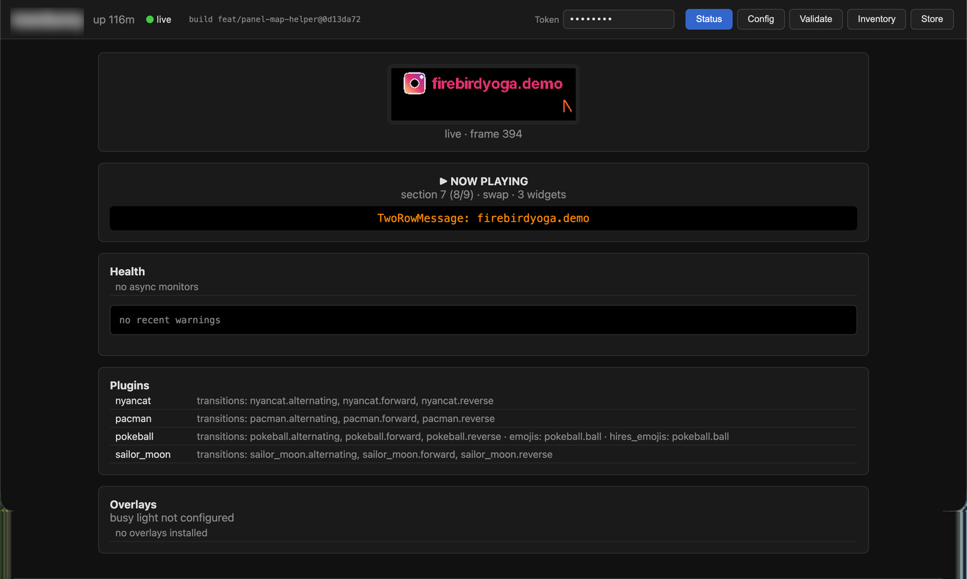
### Validate tab
[Section titled “Validate tab”](#validate-tab)
The Validate tab offers two paths:
* **Validate file** — a dropdown lists every `.toml` in the config directory. Select one and click **Validate file** to run `led-ticker validate` server-side on the real file. Validation happens on the Pi, so results are exact and secrets never leave the device.
* **Load redacted copy** — fills the text area with the selected file’s content with secrets replaced by `•••`, then shows a caveat that `•••` values may validate differently than the real file. Use this when you want to inspect or hand-edit the config before re-validating; use **Validate file** when you just need a pass/fail answer.
The text area is still there for pasting a config you haven’t saved to a file yet.
### Inventory tab
[Section titled “Inventory tab”](#inventory-tab)
The Inventory tab shows what the sidecar can see in the config directory (capped at 500 assets):
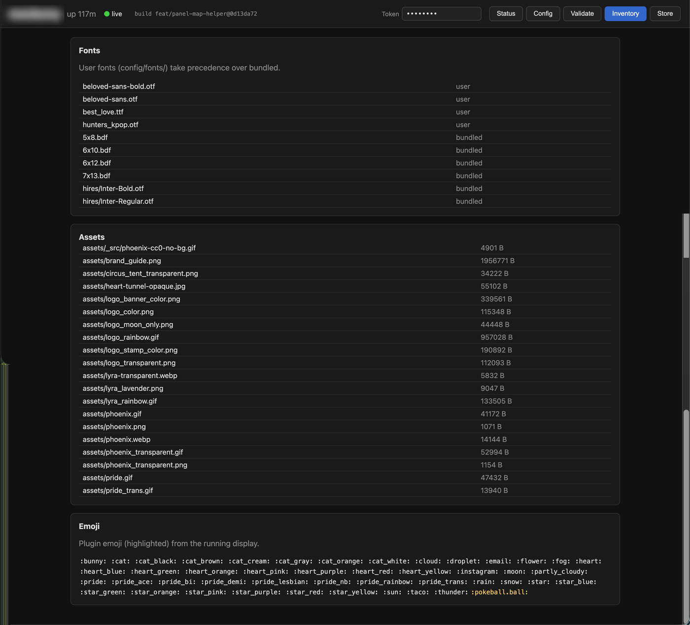
* **Fonts** — user fonts from `config/fonts/` (which take precedence over bundled ones) and the bundled BDF and hires fonts included with led-ticker.
* **Assets** — image and gif files (`config/`, recursively) with their file size.
* **Emoji** — core slugs and hires-only slugs baked into the installed package. Plugin emoji (such as `:baseball.ball:`) appear only while the display process is running — the sidecar itself never loads plugins, so the names come from `status.json` published by the display process.
### Store tab
[Section titled “Store tab”](#store-tab)
The Store tab lists every plugin in the [catalog](/plugins/available/) and shows each one’s current state — whether it is active, queued for the next restart, or available to install. Click **Install** to add a plugin or **Remove** to drop one.
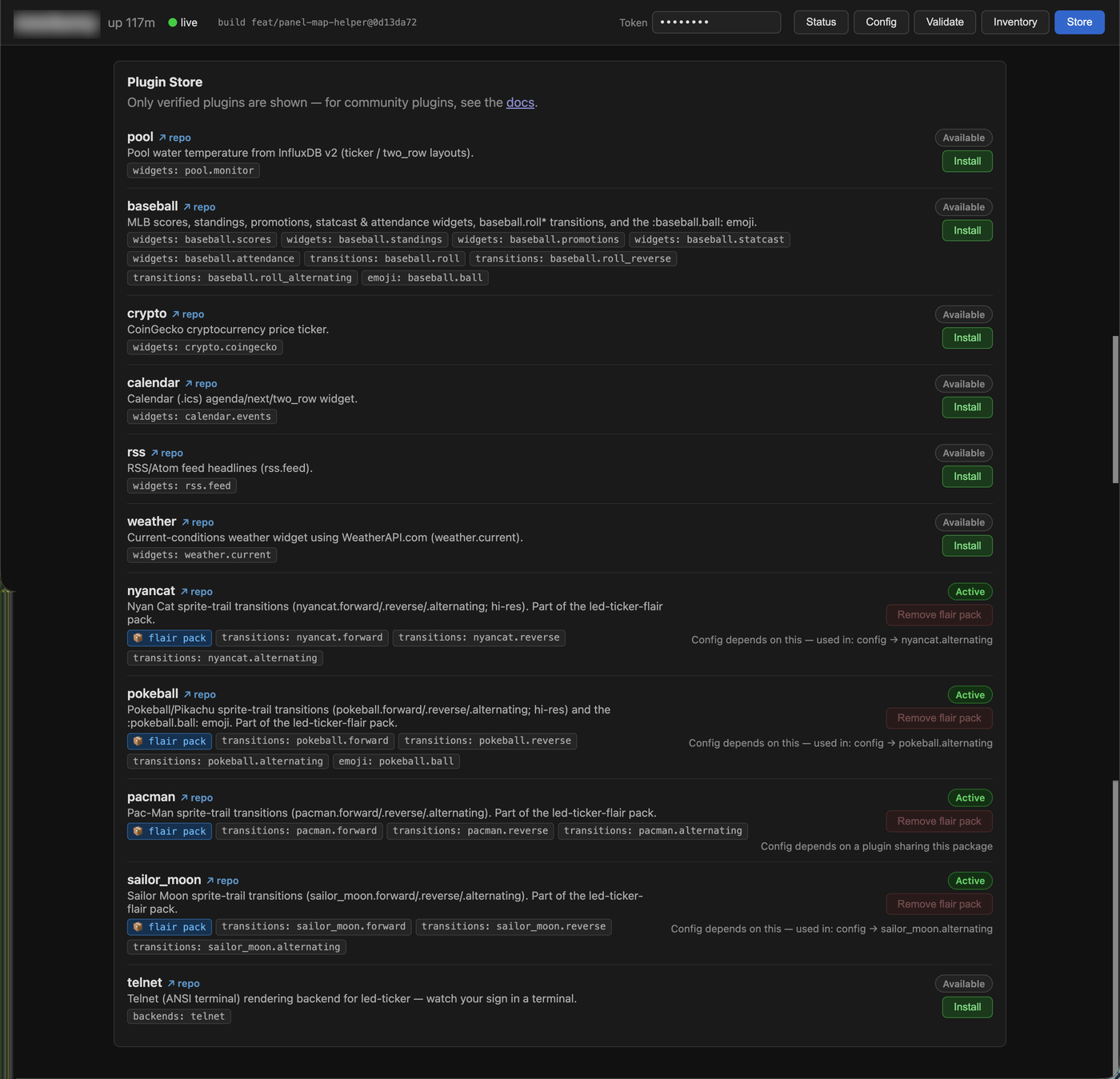
**A token is required to install or remove.** Browsing the Store is open, but any write action returns 401 without a valid token. Set `LED_TICKER_WEB_TOKEN` in your `.env` (see [Auth](#auth) below).
**Changes take effect on the next restart** — the same as editing `config/requirements-plugins.txt` by hand. The Store writes the manifest for you and shows a “pending restart” banner once there is a queued change. If `allow_restart = true` is set in your `[web]` block, the banner also shows a **Restart to apply** button — click it and the display process exits cleanly, then Docker’s `restart: unless-stopped` brings it back with the new plugins loaded. If `allow_restart` is not set, the banner shows a copyable command you can run yourself:
```bash
docker compose restart
```
**Removal is blocked while your config still uses the plugin.** If `config.toml` references any of the plugin’s widget or transition types, the Store shows which sections they appear in and links to the Config editor so you can remove them first. Once the config is clean, click **Remove** again and restart.
**Catalog plugins only.** The Store lists verified catalog plugins. Community plugins or plugins you are developing locally go in `config/requirements-plugins.txt` directly (see [Installing a plugin](/plugins/#installing-a-plugin)).
### Status tab — plugin detail
[Section titled “Status tab — plugin detail”](#status-tab--plugin-detail)
The Status tab’s **Plugins** card lists each loaded plugin’s registered widget, transition, and emoji names (e.g. `widgets: baseball.scores, baseball.standings · emojis: baseball.ball`). Display processes that predate v1.1 publish counts instead of names; the UI falls back to showing the raw count object in that case.
### Status tab — Overlays
[Section titled “Status tab — Overlays”](#status-tab--overlays)
The Status tab’s **Overlays** card shows what is compositing on top of the panel on every frame.
**Busy light state** — when `[busy_light]` is configured, the card shows:
* whether the dot is currently on (`● busy`) or off (`○ free`)
* the source (`file` or `http`)
* how many seconds remain on the active TTL deadline (`clears in Ns`), when one is armed
When no `[busy_light]` block is present in the config, the card shows “busy light not configured”.
**Overlay roster** — a table listing every overlay registered with the engine at startup, with its name and whether it comes from core (`busy_light`) or a plugin (the plugin’s namespace, e.g. `acme.clock`). The roster is static: it reflects what was loaded when the display process started and does not change while it is running.
The Overlays card is **read-only**. The busy light’s on/off state is controlled through the `[busy_light]` TOML config and, for `source = "http"`, through the `/busy` HTTP route the display process exposes — not through this dashboard. See [Busy light](/concepts/busy-light/) for the full control surface.
Note
The Overlays card requires `[web]` to be configured. Display processes started without a `[web]` block do not publish overlay state, and the card will not appear.
### Status tab — Monitors
[Section titled “Status tab — Monitors”](#status-tab--monitors)
The Status tab’s **Monitors** panel tracks the health of every live-data source and data widget running on the sign — automatically, with nothing to configure beyond adding the source or plugin in the first place.
**What it covers.** Two kinds of live-data workers show up here:
* **Polled `[[source]]` value-tokens** — sources like `:weather.nyc:` or `:crypto.btc:` that fetch their value from an API on a repeating interval (see [Value tokens](/concepts/value-tokens/)).
* **Data widgets** — plugin widgets that pull data in the background (weather, RSS, crypto, calendar, sports, pool, and others).
**The roll-up badge.** Next to the “Health” heading in the Monitors panel, a small colored badge summarizes the worst state across all monitors at a glance — red for error, amber for stale, green for all-ok.
**Per-monitor states.** Each row shows the source or widget name, its **type** (the source or widget class, like `weather.current` or `rss.feed`), and its current **value** (the last resolved data, like `72°F Sunny` or `5 items`). The type appears as muted text below the name so you can tell what a monitor is; the value confirms it’s returning real data. Each row also shows one of four states:
| State | Meaning |
| ----------- | ------------------------------------------------------------------------------------------------------------------------------------------------------------------------------------------------------- |
| **ok** | Updated within its expected interval — data is fresh. |
| **error** | The last fetch failed. The row shows the error message, a consecutive-failure count, and a “retrying in …” countdown to the next attempt. |
| **stale** | No successful update for well past the expected interval — the fetch task may be wedged. Stale differs from error: there is no error message because the fetch never returned, not even with a failure. |
| **waiting** | The source has not completed its first fetch yet. This appears briefly at startup. |
**“Sign not reporting.”** If the display process stops publishing its status snapshot, all monitor rows grey out and a warning appears at the top of the panel: “sign not reporting — monitor state may be stale.” This prevents a frozen snapshot from being mistaken for a healthy sign. Once the display process resumes, the warning clears automatically.
### Status tab — snapshot fields
[Section titled “Status tab — snapshot fields”](#status-tab--snapshot-fields)
The display process publishes a `status.json` file (schema version 9) containing the state of the running display. The web UI renders this snapshot; advanced users and integrations can also read it directly. Notable fields:
**`failed_plugins`** — plugins that failed to load at startup (load-time errors). Each entry lists the plugin namespace and the exception message. A failed plugin’s widgets, transitions, and emoji are unavailable. Restart the display process with the plugin fixed or removed to recover.
**`disabled_widgets`** — widgets the render circuit breaker has disabled during this run. If a widget’s `draw()`/`play()` raises an exception at render time, it is caught, dropped from rotation, and listed here as `{ "widget": "", "error": "" }`. The same circuit breaker also guards transition compositing, so a widget that raises during a transition is caught and dropped — the transition completes with the bad widget blank. The panel keeps running and moves on to the next widget. This is the render-time counterpart of `failed_plugins` (load-time). Restart to retry a disabled widget.
**`last_reload`** — the outcome of the most recent config hot-reload attempt: `{ ok, at, error, restart_required }`. `ok` is `true` when the reload succeeded and `false` when it was rejected. `at` is an ISO-8601 timestamp. On failure, `error` contains the validation error verbatim (the same message `led-ticker validate` would print) so you can act on it without tailing logs. `restart_required` is a list of section names — `display`, `busy_light`, `plugins`, `web` — whose changes were detected but cannot take effect until you restart the display process. The card is hidden until the first reload attempt after startup. See [Config hot-reload](/concepts/hot-reload/) for full details.
**`config_validation`** — the result of validating the config once at startup: `{ at, errors, warnings }`, where `at` is an ISO-8601 timestamp and `errors`/`warnings` are lists of `{ rule, location, message, fix }` (the same checks `led-ticker validate` runs). The sign always boots — an invalid widget is skipped and an invalid transition falls back to a cut — so this is the up-front diagnosis, not a boot failure. The **Config validation** card on the Status tab surfaces these issues and stays hidden when the config is clean. Reloads report through `last_reload`, not this field.
### Status tab — live preview
[Section titled “Status tab — live preview”](#status-tab--live-preview)
The Status tab includes a **live preview** panel that shows the actual content on the sign — the same pixels the panel is displaying, including the busy-light dot if one is configured. It updates at roughly 5 fps.
**Zero cost when nobody is watching.** The preview mirror is demand-driven: it wakes up when the page loads and polls for a new frame, and goes to sleep automatically around 10 seconds after the browser tab stops polling (navigating away, closing the tab, or the page going to the background). While asleep the display process does no extra work and writes nothing to disk for the preview. When you come back, there is a brief “waking the preview…” message while the mirror reconnects — typically a couple of seconds before the first frame appears.
**Scale-1 (smallsign) note.** On a 160×16 smallsign the preview pixel grid is very small. The browser scales it up to a readable size, but individual pixels are large blocks. Single-pixel-tall BDF text at the panel’s native resolution can be hard to read in the preview — this is expected and not a rendering error.
Note
The live preview requires a `[web]` block in the display process’s `config.toml`. Display processes started without it do not publish frames, and the preview panel will show “waking the preview…” indefinitely.
**If the preview is stuck on “waking the preview…”:**
* Confirm the display process is running with a `[web]` block in `config.toml` (see [Enabling it](#enabling-it) below). A process started before `[web]` was added needs a restart.
* Check that the `ticker-status` named volume is shared between the display process and the sidecar — the preview frame file lands in `/run/led-ticker/` inside both containers.
* If the sidecar and display process are on different versions, the display process may predate the live preview feature. Rebuild or reinstall both to the same version.
## Architecture
[Section titled “Architecture”](#architecture)
The dashboard is a separate **sidecar process** (`led-ticker webui`). It is unprivileged — no GPIO access, no API keys — and reads only `config.toml` and a `status.json` file the display process writes. Neither side needs the other to be up: if the display process crashes, the sidecar keeps serving (the Status tab shows a stale or missing indicator); if the sidecar is not running, the sign keeps displaying. Start order is irrelevant. The `status.json` path defaults to `/run/led-ticker/status.json` and is configurable via `status_path` in the `[web]` block.
## Enabling it
[Section titled “Enabling it”](#enabling-it)
Add a `[web]` block to your `config.toml`. An empty block is valid and uses the defaults:
Minimal — all defaults
```toml
[web]
# http_host = "0.0.0.0" # listen on all LAN interfaces (default)
# http_port = 8080 # (default)
# token = "" # open — see Auth below
```
Presence of the block enables status publishing in the display process. Absence (no `[web]` block at all) disables the feature entirely — existing configs without the block are unaffected.
### Docker
[Section titled “Docker”](#docker)
The `compose.yaml` defines the `webui` service behind the `webui` compose profile, so a plain `docker compose up -d` changes nothing. Enabling the dashboard takes two steps: add the `[web]` block to `config.toml`, then start with the profile on. Both are needed — the profile starts the sidecar, and the block tells the display process to publish (and the sidecar exits without it).
```yaml
# The webui service as it appears in compose.yaml (note the profile):
webui:
profiles: ["webui"]
image: led-ticker
build: .
container_name: led-ticker-webui
restart: unless-stopped
command: ["led-ticker", "webui", "--config", "/code/config/config.toml"]
network_mode: host
volumes:
- ./config:/code/config:ro
- ticker-status:/run/led-ticker
```
The `ticker-status` named volume is the shared channel: the display process writes `status.json` there; the sidecar reads it. Both services mount the same volume so they work correctly even when one is restarted independently.
Then bring it up:
```bash
COMPOSE_PROFILES=webui docker compose up -d
# or equivalently: docker compose --profile webui up -d
# Tip: put COMPOSE_PROFILES=webui in the .env next to compose.yaml to make it sticky.
```
Open `http://.local:8080` in a browser.
## Auth
[Section titled “Auth”](#auth)
By default the dashboard is open — appropriate for a trusted home LAN. To add a shared token, set `LED_TICKER_WEB_TOKEN` in your `.env`:
.env
```bash
LED_TICKER_WEB_TOKEN=change-me
```
The display process and sidecar both read this environment variable at startup. The `token` field in `[web]` is a fallback for setups that cannot use `.env` — it works, but logs a warning that secrets belong in the environment, not the config file.
With a token set, every request must include it, either as a header or a query parameter:
```bash
# Header form (preferred — token does not appear in server logs)
curl -H "X-Web-Token: change-me" http://pi:8080/api/status
# Query-param form (convenient for browser access)
http://pi:8080/?token=change-me
```
A missing or wrong token returns `401`. The query-param form works in a browser address bar, so bookmarking `http://pi:8080/?token=…` gives you one-click access.
**Secrets are always redacted** from the Config tab regardless of whether auth is enabled or what token was used. The redaction runs in the sidecar, not in the browser.
For anything beyond your home LAN — exposing the dashboard over the internet — put a reverse proxy (nginx, Caddy) in front and let the proxy handle TLS and stronger auth. The sidecar itself is a LAN-appliance; it has no TLS support.
## Editing the config
[Section titled “Editing the config”](#editing-the-config)
The **Config tab** doubles as an editor. Open it, make your changes, and click **Save**.
**A token is required to save.** Set `LED_TICKER_WEB_TOKEN` in your `.env` (see [Auth](#auth) above). With no token configured, reads stay open but the editor is read-only — Save returns 403. Once a token is set, it gates every request (reads and writes alike).
**What Save does, in order:**
1. Validates the submitted TOML — invalid TOML or a config that fails `led-ticker validate` is rejected and nothing is written.
2. Conflict-checks against the file on disk. If someone else saved the file since you loaded it, Save returns 409 and you can reload before retrying.
3. Backs up the current file to `config.toml.bak` in the same directory.
4. Writes the new content atomically (write to a temp file, then rename into place).
The Config tab reports **“applied live”** when the running display picked up the change via hot-reload, or **“restart required for …”** listing the sections (e.g. `display`, `plugins`) whose changes need a process restart to take effect.
Note
The Validate tab is always available regardless of whether a token is set. Use it to check a candidate config before saving.
**Deploy note.** In `compose.yaml` the webui service mounts the config directory `:rw` (the display service still mounts it `:ro`) — this is what lets the editor write `config.toml` from inside the container.
## Restarting the display process
[Section titled “Restarting the display process”](#restarting-the-display-process)
Some config changes — adding a plugin, changing `[display]` settings, toggling `[busy_light]` — cannot be applied by hot-reload alone. They require a full restart of the display process.
The web UI can trigger that restart for you. When `allow_restart = true` is set in your `[web]` block, a **Restart to apply** button appears in the **Config tab’s** “restart required” notice (after a save that needs a restart) and in the **Store tab’s** pending-restart banner (when a plugin install or remove is queued). Clicking it:
1. Confirms the action (a brief in-button countdown lets you cancel).
2. Posts to `/api/restart` — a token must be configured and supplied (the same token that gates config saves); with no token configured the endpoint returns 403.
3. The display process detects the signal on its next loop pass and exits cleanly (`sys.exit(0)`).
4. Docker’s `restart: unless-stopped` brings the display back automatically.
**The panel goes dark for roughly 5–10 seconds** while the process exits and restarts. This is expected — it is not a reboot of the Pi, and the sign resumes where it left off once the display process is back.
**`allow_restart` is off by default.** Enable it by adding the field to your `[web]` block:
Enabling the restart button
```toml
[web]
allow_restart = true # enables the Restart to apply button in the web UI
```
The `config/config.example.toml` shipped with the project sets `allow_restart = true` in its commented-out `[web]` block — uncomment the whole block to get the button alongside the other defaults.
Caution
`restart: unless-stopped` is already set in `compose.yaml`, so Docker deployments restart automatically. If you are running led-ticker from a source checkout without a process supervisor, clicking the button will leave the sign dark until you restart it manually — set up a supervisor or leave `allow_restart` at its default `false`.
## What it does not do
[Section titled “What it does not do”](#what-it-does-not-do)
* No Pi reboot.
* No brightness control.
## Which build is deployed?
[Section titled “Which build is deployed?”](#which-build-is-deployed)
The dashboard header shows the deployed build, as `branch@sha`. Use it to confirm both containers are running the code you expect. It resolves to the first of: the ref stamped into the Docker image at build time (`make update` / `make build` compute it and pass it in), or — for a non-Docker install running from a source checkout (local dev) — the ref read from Git at runtime.
* **`build unknown`** — neither applied: the image wasn’t built through `make update` (a bare `docker compose build` doesn’t stamp the commit), and it isn’t running from a Git checkout. Deploy with **`make update`** to stamp it. The sign still runs correctly; `unknown` is a label, not an error.
* **`⚠ webui build …`** — the webui sidecar is on a different build than the display process. This can happen when only one service is restarted without rebuilding. Run `make update` to rebuild and recreate the running services (the webui sidecar is included when its profile is enabled).
## Troubleshooting
[Section titled “Troubleshooting”](#troubleshooting)
**The page doesn’t load at all (connection refused)** — The sidecar isn’t running. On Docker, the `webui` service only starts when the `webui` compose profile is enabled — check `docker compose ps`; if the container is absent, start with `COMPOSE_PROFILES=webui docker compose up -d`. If the container exists but is restarting, check `docker compose logs webui` — a missing `[web]` block in `config.toml` makes the subcommand exit with a message naming the fix.
**“Status: missing” on the Status tab** — The display process has not written `status.json` yet. Confirm the display process is running (`docker compose ps`) and that both processes share the same `status_path` (default `/run/led-ticker/status.json`). The directory `/run/led-ticker/` is created by the display process on startup — if the display process has never started, the directory does not exist yet.
**“engine stalled?” on the live indicator** — The display process is running (status keeps publishing) but the render loop has stopped swapping frames. This is rare; check `docker compose logs led-ticker` for a stuck widget or transition, and restart the display service.
**“Status: stale” on the Status tab** — The display process wrote a status file but has not updated it recently. This usually means the process crashed or was stopped. Check `docker compose logs led-ticker`.
**Browser shows nothing / 401** — A token is set in `[web]`. Add `?token=` to the URL, or configure your browser extension / bookmark with the `X-Web-Token` header.
**Sidecar binds a port already in use** — The `[web]` sidecar defaults to `8080` and the `[busy_light]` HTTP source defaults to `8081`, so they don’t collide out of the box. If you override either to put both on the same port, one will fail to bind — give them distinct ports.
See also
* [concepts/hot-reload](/concepts/hot-reload/)
* [reference/config-options](/reference/config-options/)
* [concepts/busy-light](/concepts/busy-light/)
* [concepts/value-tokens](/concepts/value-tokens/)
* [reference/cli](/reference/cli/)
# Getting started
> Install led-ticker on Docker, preview configs on your laptop with no hardware, and deploy to a Raspberry Pi — start in under 5 minutes.
led-ticker drives RGB LED matrix panels from a Raspberry Pi via a TOML config — RSS, weather, custom messages, animated transitions, and more. One toolchain (Docker) covers everything: try it on your laptop with no hardware, then deploy the same image to a Pi when your panels arrive.
Not sure led-ticker is the right fit? → [Why led-ticker?](/why-led-ticker/)
| You want… | Go to |
| -------------------------------------------------------------------------------------- | ----------------------------------- |
| Try it on your laptop, no hardware (2 min) | Quickstart A below |
| Deploy to a Pi with panels (\~20 min) | Quickstart B below |
| Build a complete sign config from scratch, ready to deploy (no hardware needed, \~1 h) | the [Tutorial](/tutorial/01-setup/) |
**What you’ll need:**
* A laptop (macOS, Linux, or Windows) for the laptop quickstart
* A Raspberry Pi + [HUB75 panels + Adafruit HAT/Bonnet](/hardware/building-your-own/) for the Pi deploy (HUB75 is the standard connector on hobbyist RGB LED matrix panels — the Amazon/AliExpress “RGB LED matrix” panels are HUB75.)
* [Docker](https://docs.docker.com/get-docker/) — the single tool that covers both
## Step 1 — Install Docker
[Section titled “Step 1 — Install Docker”](#step-1--install-docker)
**Linux / Raspberry Pi:**
```bash
curl -fsSL https://get.docker.com | sh
sudo usermod -aG docker $USER
# Log out and back in (or: newgrp docker) for the group change to take effect.
```
**macOS / Windows:** install [Docker Desktop](https://docs.docker.com/get-docker/).
`docker compose` v2 ships with modern Docker — the old standalone `docker-compose` command is not required.
## Quickstart A — Try it on your laptop (no hardware)
[Section titled “Quickstart A — Try it on your laptop (no hardware)”](#quickstart-a--try-it-on-your-laptop-no-hardware)
**\~2 minutes, Docker only.** You’ll see a browser tab showing your sign rendering live in a simulated panel — no hardware needed.
Open a terminal (Terminal on macOS; WSL or a package manager like Chocolatey/Scoop provides `make` on Windows), then:
```bash
# Check Docker is installed first:
docker --version
# Clone (downloads the repo) + start:
git clone https://github.com/JamesAwesome/led-ticker.git
cd led-ticker
make try # make is a standard task runner, pre-installed on macOS/Linux
```
`make try` builds the image and starts a headless display engine plus the web UI — no panel, no Pi. Open **** and click the **live preview** tab to see the sign rendering in your browser. Already have a `config/config.toml`? `make try` previews it instead of the bundled example.
Both of those are **plugins** baked into the try image: the scrolling [Hacker News](https://news.ycombinator.com/) headlines come from the `rss.feed` widget, and the Nyan Cat sweep between sections is an animated transition — no API keys or `.env` needed (the headlines just need an internet connection). Browse the [plugin catalog](/plugins/available/) for weather, sports scores, crypto, calendars, and more. To try a different plugin, add its package to `config/requirements-plugins.try.txt`, reference its widget or transition in `config/config.try.example.toml`, then re-run `make try`. (On a real deploy it’s simpler still — edit `config/requirements-plugins.txt` and `docker compose restart`, no rebuild.)
To stop: press `Ctrl-C`, then run:
```bash
make try-down
```
## Quickstart B — Deploy to your Pi
[Section titled “Quickstart B — Deploy to your Pi”](#quickstart-b--deploy-to-your-pi)
**\~20 minutes, hardware required.**
Before you start
Your Pi should be running Raspberry Pi OS (Bookworm, 64-bit) with SSH enabled and you logged in — flash it with Raspberry Pi Imager if you haven’t. All commands below run on the Pi.
`make setup` seeds the smallsign starter config and won’t overwrite an existing `config/config.toml` — if you’re building a bigsign (or your own layout), copy your config example first (step 2) so the stack boots with the right one.
**1. Clone the repo:**
```bash
git clone https://github.com/JamesAwesome/led-ticker.git
cd led-ticker
```
**2. Copy the right example config:**
```bash
# Smallsign: Pi 4 + 5× 16×32 panels = 160×16 logical canvas
cp config/config.example.toml config/config.toml
# Bigsign: Pi 5 + 8× P3 32×64 panels = 256×64 logical canvas
cp config/config.bigsign.example.toml config/config.toml
```
Not sure which fits? See [Choosing a sign size](/hardware/building-your-own/#choosing-a-sign-size).
**3. Run setup:**
```bash
make setup
```
`make setup` checks Docker, seeds `.env`, builds the image, and brings the stack up. Run it once.
Most config changes (sections, widgets, schedule) take effect automatically within one playlist cycle — no restart needed. Hardware-level fields (`chain_length`, `gpio_slowdown`, `default_scale`) need `make restart`. `restart: unless-stopped` in `compose.yaml` brings the ticker back up on its own after power loss.
**Check it worked:** you should see the starter messages scrolling on the panels within about a minute (the first boot builds the Docker image — typically 10–20 minutes on a Pi 4; later boots are seconds). Watch progress with `make logs`; `docker compose ps` should show the service running. Panels still dark after the image is built? Check `gpio_slowdown` and start with the [Sharp edges](/hardware/building-your-own/#sharp-edges) section on the building-your-own page. Once the web UI is enabled (step 5), its [Status tab](/concepts/web-status-ui/) gives you a richer first-boot view — a live panel preview plus per-source health at a glance.
**4. Panel bring-up** — after wiring, run [`make panel-test`](/tools/panel-test/) to rule out any wiring, driver, or RGB-order problems. Before running `panel-test`, make sure `config.toml` has the correct `[display]` values for `chain_length`, `rows`, and `cols` — `panel-test` reads them. If your panels are a single horizontal chain (like the smallsign), `panel-test` is all you need. For a multi-row layout (like the bigsign or a custom grid), also run the [`panel-map`](/tools/panel-map/) workflow to derive the `pixel_mapper_config` Remap string for your panel layout.
**5. Optional: web UI** — add a `[web]` block to `config.toml`:
```toml
[web]
# defaults are fine; see the web-status-ui docs for options
```
Then start with the `webui` profile:
```bash
COMPOSE_PROFILES=webui docker compose up -d
```
Both parts are needed — the `[web]` block makes the display process publish, the profile starts the sidecar. See [Web status UI](/concepts/web-status-ui/#enabling-it) for the full options. Open `http://.local:8080` for a live dashboard, config editor, and plugin Store.
## Edit your config
[Section titled “Edit your config”](#edit-your-config)
A config is a list of **sections**, each containing **widgets** and a **mode** (`ticker`, `slideshow`, or `one_at_a_time`). Before editing, skim [Sections and modes](/concepts/sections-and-modes/) and the [message widget](/widgets/message/) page — the two most-used building blocks.
Validate any config before deploying. On a deployed sign, the easiest way is the web UI’s **Config tab** (step 5 above) — it validates before saving. On a dev machine:
```bash
make validate CONFIG=config/config.toml
```
(`make validate` needs the dev dependencies — install [uv](https://docs.astral.sh/uv/) and run `make dev` once first; `make dev` checks for uv and prints the install command if it’s missing.)
Private media (GIFs, images, fonts) goes in `config/local/` (gitignored) and is referenced as `path = "local/"` in your TOML.
## Run without a Pi
[Section titled “Run without a Pi”](#run-without-a-pi)
For a live browser preview, use Quickstart A above. The [`render-demo`](/tools/render-demo/) tool is for iterating on configs at the command line and generating GIFs — it runs the real ticker engine against a software stub and writes each config to a GIF:
```bash
make dev # install Python dev deps (requires uv)
make render-demo CONFIG=config/config.example.toml OUT=preview.gif
open preview.gif # macOS; xdg-open on Linux
```
## Next steps
[Section titled “Next steps”](#next-steps)
* **Build a config:** [Sections and modes](/concepts/sections-and-modes/) → [Widgets](/widgets/) → [Transitions](/transitions/)
* **Add plugins:** [Available plugins](/plugins/available/) — RSS, weather, sports scores, crypto, calendars, and more
* **Buy / build hardware:** [Building your own](/hardware/building-your-own/) → [Smallsign](/hardware/smallsign/) or [Bigsign](/hardware/bigsign/)
* **Reference:** [`[display]` and section knobs](/reference/config-options/) · [CLI](/reference/cli/)
See also
* [tutorial/01-setup](/tutorial/01-setup/)
* [concepts/sections-and-modes](/concepts/sections-and-modes/)
* [hardware/building-your-own](/hardware/building-your-own/)
# Hardware: Bigsign reference build
> led-ticker's reference build for tall multi-row displays — Pi 5 + eight P3 32x64 panels in a 2x4 vertical-serpentine layout for a 256x64 ticker.
The **bigsign** is led-ticker’s reference build for tall multi-row displays: a Raspberry Pi 5 driving eight P3 32x64 RGB matrix panels arranged in a 2x4 vertical-serpentine layout for a 256x64 canvas. The hi-res font, hi-res emoji, and `ScaledCanvas` features were all developed against this build, and the dimensions match the bigsign-flavored examples in `config/`. Different panel counts or layouts will work — the canvas math comes from `pixel_mapper_config`, not from a hardcoded shape — but the BOM, wiring diagram, and Pi-5 tuning knobs below are what we built and tested against. Drawing logic stays at a 16-tall logical canvas; `ScaledCanvas` blows it up by a factor of four to fill the panel.
## At a glance
[Section titled “At a glance”](#at-a-glance)
* Raspberry Pi 5
* 8x P3 32x64 RGB matrix panels in a 2x4 vertical-serpentine layout = 256x64 logical canvas
* `default_scale = 4` — every logical pixel becomes a 4x4 block on the real panel, content vertically centered
* Drawing logic stays at “1x scale” with 16-tall content; the wrapper handles the expansion
* Same Docker image as the smallsign; the rgbmatrix library detects the SoC at runtime
## Bill of materials
[Section titled “Bill of materials”](#bill-of-materials)
| Component | Quantity | Notes |
| ------------------------- | -------- | ----------------------------------------------------------------------------------------------------------------------------------------- |
| Raspberry Pi 5 | 1 | 4 GB is plenty. A microSD card and a USB-C power supply for the Pi itself. |
| P3 32x64 RGB matrix panel | 8 | HUB75 panels with the standard 16-pin IDC connector. Matched panels render most consistently across the 2x4 grid. |
| Adafruit RGB matrix HAT | 1 | Sets `hardware_mapping = "adafruit-hat"` in the config. The bonnet works equivalently. |
| 5V power supply | 1 | Sized for eight P3 panels at full white — that’s serious current. A 5V / 30A+ supply with thick busbars is the comfortable headroom pick. |
| 16-pin IDC ribbon cables | 7+ | One between each pair of panels in chain order. The serpentine route bends across rows so cables need to reach across the layout. |
| Power pigtails / busbar | 1+ | Whatever your panels expect. Each panel has its own 2-pin power input — a busbar across the back of the frame keeps the wiring tidy. |
| Shroud / frame | 1 | A 2x4 grid of P3 panels is heavy and benefits from a rigid frame. Acrylic diffuser optional. |
**Total cost (rough):** \~$400–600 USD. The 8 P3 panels at $40–60 each are the dominant line item; the Pi 5 + HAT + a 30–60 A 5 V supply with thick busbars round out the build. Frame and shroud costs vary widely depending on whether you fabricate or buy. Prices change — verify before ordering. These were checked in early 2026.
The rgbmatrix library detects the SoC at runtime, so the same Docker image runs on both the smallsign (Pi 4 / BCM2711) and the bigsign (Pi 5 / RP1). No separate build, no per-Pi flag — the Pi-5-specific knobs in the next section are simply ignored on a Pi 4 and vice versa.
## The 2x4 serpentine layout
[Section titled “The 2x4 serpentine layout”](#the-2x4-serpentine-layout)
Eight panels are tiled into a 2x4 grid (two rows of four). The data chain enters at the **bottom-right** panel and runs vertically: each column is wired bottom-to-top, with a diagonal jumper from the top of each column to the bottom of the next column to its left. There is no horizontal hop along the bottom row — the chain always climbs a column, then crosses diagonally to the bottom of the next one. All panels are installed upright (no 180° rotations). The `pixel_mapper_config` Remap string in the config tells the rgbmatrix library how each panel’s chain index maps to its physical (x, y) on the finished canvas.
```text
col 1 col 2 col 3 col 4
top [8] [6] [4] [2]
↑ ↘ ↑ ↘ ↑ ↘ ↑
bot [7] [5] [3] [1] ← data chain enters here
```
Each `[N]` is the panel’s position in the chain (1 = first, 8 = last). The `↑` arrows show each column climbing bottom-to-top; the `↘` arrows show the diagonal jumper from the top of one column to the bottom of the next column to its left. If your top-row panels are physically mounted upside down (some manufacturers ship them that way), swap each top-row `n` for `s` in the Remap string — see the comment in the config snippet below.
## Config snippet
[Section titled “Config snippet”](#config-snippet)
The minimal `[display]` block for the bigsign — straight from `config/config.bigsign.example.toml`:
```toml
[display]
rows = 32
cols = 64
chain_length = 8
parallel = 1
# Remap each panel to its physical position. Serpentine chain order, all panels upright.
pixel_mapper_config = "Remap:256,64|192,32n|192,0n|128,32n|128,0n|64,32n|64,0n|0,32n|0,0n"
brightness = 60
gpio_slowdown = 3 # bumped from 2 to pair with RIO mode (default); raise to 4-5 if flicker
hardware_mapping = "adafruit-hat"
default_scale = 4 # 4× scaling fills the 64-tall canvas
# --- Pi 5 performance tuning ---
pwm_bits = 8 # 11 (default) → 8 ≈ 8× faster refresh, slightly worse color
show_refresh_rate = true # log measured refresh Hz to stderr
```
The 256x64 logical canvas comes from the `pixel_mapper_config` Remap header (`256,64`), not from `cols * chain_length` directly — `chain_length = 8` is just the panel count for the rgbmatrix library; the mapper rearranges those panels into the 2x4 grid.
## Pi-5 tuning
[Section titled “Pi-5 tuning”](#pi-5-tuning)
### `pwm_bits = 8`
[Section titled “pwm\_bits = 8”](#pwm_bits--8)
PWM bit depth, default 11. Cutting to 8 buys roughly **8× faster refresh** at the cost of a small drop in color depth. On a panel this big the refresh boost is the difference between visible scan-line flicker and a clean image, and the color hit is barely noticeable for text and pixel art. Leave it at 8 unless you’re displaying photos and care about smooth gradients.
### RP1 backend (RIO vs PIO)
[Section titled “RP1 backend (RIO vs PIO)”](#rp1-backend-rio-vs-pio)
Pi-5 only. The RP1 SoC offers two GPIO drive modes:
* **RIO mode (the library default — `rp1_pio` not set)** — faster refresh, higher CPU.
* **PIO mode (`rp1_pio = 1`)** — lower CPU, slower refresh.
The bigsign uses RIO — the default, so nothing to set. The Pi 5 has cores to spare and the bigger panel wants every Hz it can get. Note that RIO mode requires bumping `gpio_slowdown` (next section). Before June 2026 the knob was called `rp1_rio` and PIO was the default; an old `rp1_rio = 1` line in a config is now ignored (with a startup warning) and RIO applies anyway.
### `gpio_slowdown = 3`
[Section titled “gpio\_slowdown = 3”](#gpio_slowdown--3)
GPIO timing slowdown, must pair with RIO mode (the default). The Pi 4 default of `2` is too aggressive when paired with RIO mode — start at `3`, and raise to `4` or `5` if you still see flicker. Higher values trade refresh rate for stability, same tradeoff as on the smallsign just at a higher floor.
## Sharp edges
[Section titled “Sharp edges”](#sharp-edges)
### `content_height` cannot exceed 16 at scale = 4
[Section titled “content\_height cannot exceed 16 at scale = 4”](#content_height-cannot-exceed-16-at-scale--4)
The hard ceiling is `content_height × scale ≤ panel_h_real`. For the bigsign at `scale = 4` and a 64-tall panel that’s `content_height ≤ 16`. Pushing above the ceiling makes the wrapper’s vertical offset go negative — the logical canvas is taller than the real panel — and the top + bottom rows of your content silently clip. BDF text is forgiving because cells sit near the vertical center, but hi-res emoji and large hi-res fonts surface the clip immediately (e.g. a hi-res `:instagram:` icon loses about 4 real px off the bottom). For per-row breathing room use `text_y_offset` on the widget, not a higher `content_height`.
### The `pixel_mapper_config` Remap string is sensitive to chain order
[Section titled “The pixel\_mapper\_config Remap string is sensitive to chain order”](#the-pixel_mapper_config-remap-string-is-sensitive-to-chain-order)
Every entry in the string must correspond to a specific panel position in your data chain — get the order wrong (or rotate one panel 180° to match the rest of the row) and you’ll see content split across panels or rendered upside down. The string in `config/config.bigsign.example.toml` matches a 2x4 serpentine starting at the bottom-right with all panels upright; if your panels are mounted differently, you’ll need to edit each entry’s orientation flag (`n`, `s`, `e`, `w`). Use [`panel-map`](/tools/panel-map/) to derive and verify the Remap string from your physical layout instead of hand-editing it.
### Hi-res emoji only render at scale ≥ 2
[Section titled “Hi-res emoji only render at scale ≥ 2”](#hi-res-emoji-only-render-at-scale--2)
Slugs like `:moon:` and `:instagram:` have a 32x32 hi-res sprite in `HIRES_REGISTRY` that paints directly to the unwrapped real canvas, bypassing the wrapper’s 4x4 block expansion for sharper detail. On a smallsign at `default_scale = 1` the renderer falls back to the 8x8 lo-res sprite automatically — same icon footprint, less detail. Don’t expect hi-res emoji output on the smallsign.
### `pixel_mapper_config` for non-bigsign layouts
[Section titled “pixel\_mapper\_config for non-bigsign layouts”](#pixel_mapper_config-for-non-bigsign-layouts)
The Remap string follows the format `Remap:WIDTH,HEIGHT|x,yORIENT|...` with one entry per panel in chain order. Orientations: `n` = normal, `s` = 180°, `e` = 270°, `w` = 90°, `x` = discard. The bigsign’s 2×4 vertical-serpentine chain is documented above. For simpler layouts:
* **2×2 grid (chain runs along the bottom row first, then top row right-to-left)**, all panels upright: `Remap:128,64|0,32n|64,32n|64,0n|0,0n`
* **Single row of 4 panels**, all upright, chain enters left: `Remap:256,32|0,0n|64,0n|128,0n|192,0n`
If your physical layout doesn’t match the chain order from the data cable, every panel in the wrong position needs an entry in the Remap string. See the upstream [`hzeller/rpi-rgb-led-matrix`](https://github.com/hzeller/rpi-rgb-led-matrix) README — the base for the [`jamesawesome/rpi-rgb-led-matrix`](https://github.com/JamesAwesome/rpi-rgb-led-matrix) fork led-ticker ships — for the full Remap reference.
### Wiring or driver problem? Run `panel-test` first
[Section titled “Wiring or driver problem? Run panel-test first”](#wiring-or-driver-problem-run-panel-test-first)
If your widgets render with the wrong colors, a garbled bottom half, only one panel lit, or visible flicker, the issue is most likely in the hardware layer (`led_rgb_sequence`, `panel_type`, `chain_length`, `gpio_slowdown`) — not in your config. The [`panel-test`](/tools/panel-test/) diagnostic isolates the hardware layer by painting flat R/G/B/W/B colors, so you can verify wiring and driver init before debugging widgets.
## Reference config
[Section titled “Reference config”](#reference-config)
A complete working config for this build, including the `pixel_mapper_config` string and the Pi 5 RP1 tuning this hardware needs. Drop this into `config/config.toml` and adjust the per-widget content.
Complete `config.bigsign.example.toml` (256×64 bigsign)
```toml
# led-ticker bigsign configuration — 256×64 canvas
#
# 8× P3 32×64 panels in a 2×4 vertical-serpentine layout = 256×64 logical.
# Driven by a Raspberry Pi 5 through an Adafruit RGB Matrix HAT.
#
# Copy this to config.toml on the bigsign Pi and adjust the playlist for your
# content. Full config-options reference:
# https://docs.ledticker.dev/reference/config-options/
[display]
rows = 32
cols = 64
chain_length = 8
parallel = 1
# pixel_mapper_config tells the rgbmatrix library how each panel's position in the
# data chain maps to its physical (x, y) on the finished canvas. The bigsign
# chain enters at the bottom-right panel, climbs each column bottom-to-top,
# then jumps diagonally to the bottom of the next column to its left. All
# panels are installed upright (no 180° rotations). See the chain diagram and
# instructions for deriving your own mapper string at:
# https://docs.ledticker.dev/hardware/bigsign/
#
# Format: Remap:WIDTH,HEIGHT|x,yORIENT|... (one entry per panel in chain order)
# Orientations: n=normal, s=180°, e=270°, w=90°, x=discard.
# If your top-row panels are physically flipped 180°, swap each top-row 'n'
# for 's' (e.g. "192,0n" → "192,0s").
pixel_mapper_config = "Remap:256,64|192,32n|192,0n|128,32n|128,0n|64,32n|64,0n|0,32n|0,0n"
brightness = 60
# default_scale = 4 means every widget draws at the standard 16-tall logical
# canvas, and the ScaledCanvas wrapper expands every pixel to a 4×4 real block
# to fill the 64-tall panel. Widget code never sees the 256×64 panel directly
# — all drawing is in logical-pixel coordinates.
default_scale = 4
hardware_mapping = "adafruit-hat"
# Pi 5 RP1 GPIO tuning.
#
# The library's default Pi 5 backend is RIO (Registered IO) — faster
# refresh, more CPU than PIO. Set rp1_pio = 1 only to trade refresh
# speed for lower CPU.
#
# gpio_slowdown = 3 pairs with RIO mode. The Pi 4 default of 2 is too
# aggressive with RIO; raise to 4–5 if you still see flicker.
#
# pwm_bits = 8 drops from the 11-bit default, buying roughly 8× faster
# refresh at a small color-depth cost. Barely noticeable for text and pixel
# art; only relevant if you're displaying photos with smooth gradients.
gpio_slowdown = 3
pwm_bits = 8
show_refresh_rate = true # log measured refresh Hz to stderr; remove once stable
[title]
delay = 5
# Global transition defaults. Full transition catalogue and per-family tuning
# lives at https://docs.ledticker.dev/transitions/.
[transitions]
default = "push_left"
duration = 0.5
easing = "ease_out"
between_sections = "dissolve"
# --- Playlist ---
# Each [[playlist.section]] displays in order, then the whole playlist loops.
# Sections, modes, and timing knobs: https://docs.ledticker.dev/concepts/sections-and-modes/
[[playlist.section]]
mode = "ticker"
loop_count = 1
# scale inherits from display.default_scale (4)
[playlist.section.title]
type = "message"
text = "#DevOps News"
font_color = "random"
[[playlist.section.widget]]
type = "message"
text = "May the uptime be with you!"
[[playlist.section.widget]]
type = "message"
text = "Always be shipping!"
# --- Countdowns at scale=2 ---
# Dropping to scale=2 gives 32px-tall content centered with 16px black bands
# top and bottom — a visual change of pace between sections.
[[playlist.section]]
mode = "ticker"
loop_count = 2
scale = 2
[playlist.section.title]
type = "message"
text = "Count Downs"
font_color = "random"
[[playlist.section.widget]]
type = "countdown"
text = "Days Until Summer"
countdown_date = 2026-06-20
[[playlist.section.widget]]
type = "countdown"
text = "Days Until Fall"
countdown_date = 2026-09-22
# --- GIF / image playback ---
# The gif widget plays an animated GIF or static image at native physical
# resolution (256×64), using the same fit/text-overlay knobs as the image
# widget. Full reference: https://docs.ledticker.dev/widgets/gif/
#
# `path` resolves relative to this config file's directory. Drop assets
# under `/assets/` and reference by relative path.
#
# [[playlist.section]]
# mode = "slideshow"
# loop_count = 2
#
# [[playlist.section.widget]]
# type = "gif"
# path = "assets/phoenix.gif"
# fit = "pillarbox"
```
See also
* [hardware/smallsign](/hardware/smallsign/)
* [concepts/display](/concepts/display/)
* [concepts/fonts](/concepts/fonts/)
* [tools/panel-map](/tools/panel-map/)
# Hardware: Building your own
> Build your own scrolling RGB LED matrix sign — Raspberry Pi + HUB75 panels bill of materials, wiring, and the Docker deploy, end to end.
led-ticker ships two **reference builds**: the [smallsign](/hardware/smallsign/) (Pi 4 + 5× 32×16 panels) and the [bigsign](/hardware/bigsign/) (Pi 5 + 8× P3 32×64 panels). They’re starting points, not requirements — anything in between (or beyond) is a viable build, and the engine is the same.
## Choosing a sign size
[Section titled “Choosing a sign size”](#choosing-a-sign-size)
The two reference builds sit at very different points on the cost / complexity / use-case curve. Use them as starting points and adjust panel count, panel pitch, or layout to fit your space.
| Reference build | Cost & complexity | Use case |
| --------------------------------- | ------------------------------------------------------------------------------------------------------------------ | ----------------------------------------------------------------------------------------------------------------------------------------- |
| **Smallsign** — 5x 32x16, 160x16 | Lowest. One Pi 4, five panels, a bonnet, a 10A 5V supply. One evening of soldering and a weekend of config work. | A scrolling marquee for a desk, a shop window, or a single-line live feed (RSS, weather, countdowns). 16 rows is one BDF text line tall. |
| **Bigsign** — 8x P3 32x64, 256x64 | High. Pi 5, eight P3 panels, a HAT, a 30A+ supply, a rigid frame, a 2x4 serpentine wiring run, hi-res font tuning. | Storefront-scale display. Fits hi-res emoji, two-row handles + promos, animated GIFs, and Inter / Beloved Sans rendered at native pixels. |
Anything between those two — three panels in a row, six panels in a 2x3 grid, a custom non-rectangular layout — is fine; the rgbmatrix library and the led-ticker engine don’t assume the reference shapes. You’ll edit the `[display]` block (`rows`, `cols`, `chain_length`, `pixel_mapper_config`) to match your wiring. For `pixel_mapper_config` specifically, don’t hand-write the Remap string — use [`panel-map`](/tools/panel-map/) to derive it from your physical layout.
You don’t need any of this hardware to start. The [`render-demo`](/tools/render-demo/) tool runs the real ticker engine against a test stub canvas and writes the output to a gif, so you can develop your config end-to-end with nothing but a laptop.
## Power budgets
[Section titled “Power budgets”](#power-budgets)
RGB matrix panels draw current proportional to the number of LEDs lit at any moment. The rule-of-thumb upper bound is:
```text
amps_max = rows × cols × number_of_panels × 0.06A (per LED, full white)
```
That’s the **theoretical maximum** at 5V with every pixel cranked to white at the same instant. In practice that never happens — text, emoji, and animations only light a fraction of the panel — so the practical draw is roughly 30-40% of the theoretical max.
| Reference build | Theoretical max | Practical pick |
| --------------- | --------------- | -------------- |
| Smallsign | 5V × \~150A | 5V × **10A** |
| Bigsign | 5V × \~980A | 5V × **60A** |
A 5V / 10A brick covers the smallsign with comfortable headroom; the bigsign wants a 5V / 30-60A supply with thick busbars (split across multiple injection points if your panels have multiple power inputs). Adafruit’s product pages publish per-panel current draw curves — cross-reference those for whichever panels you actually buy, since brightness, panel revision, and pixel pitch all shift the number.
The Pi itself runs off its own USB-C supply; do **not** try to power panels off the Pi’s 5V rail. The math doesn’t work for one panel either, let alone five or eight.
## Software-first development
[Section titled “Software-first development”](#software-first-development)
You can develop a complete led-ticker config without owning a single panel. Two paths — pick whichever fits your workflow:
**Browser preview (Docker, no Python needed)** — the fastest way to see the sign rendering:
```bash
make try # build + start; open http://localhost:8080 → live preview tab
```
`make try` starts a headless engine and the web UI in Docker. Stop with `Ctrl-C` then `make try-down`.
**GIF renderer (Python dev path)** — render any config to a GIF at panel resolution, useful for CI, scripted demos, and configs with live-data widgets:
```bash
git clone https://github.com/JamesAwesome/led-ticker.git
cd led-ticker
make dev # install Python dev deps (requires uv)
```
Run the test suite — no hardware, no Docker:
```bash
make test
```
`make test` runs the full suite — pyproject’s `[tool.pytest.ini_options] pythonpath = ["tests/stubs"]` puts the stub canvas on the path automatically, so no env var is needed. \~1450 tests, finishes in \~2 minutes.
Render any config to a gif at panel resolution:
```bash
make render-demo CONFIG=mysign.toml OUT=mysign.gif
```
A minimal config you can render right now:
```toml
[display]
rows = 16
cols = 32
chain_length = 5
default_scale = 1
brightness = 60
[[playlist.section]]
mode = "slideshow"
loop_count = 1
hold_time = 4.0
[[playlist.section.widget]]
type = "message"
text = "Hello, panel"
font_color = "rainbow"
```
The output gif is upscaled 4x by default so individual LED pixels read clearly. See [`render-demo`](/tools/render-demo/) for the full set of flags and the long-running pipeline used for data-fetch widgets.
## Deploying to the Pi
[Section titled “Deploying to the Pi”](#deploying-to-the-pi)
Once your config renders the way you want, push it to a Pi. Deployment is **Docker Compose** — one command and the sign is running:
```bash
make setup # Docker preflight + config/.env seed + bring-up (first time)
make update # rebuild the image (real version) + recreate services (subsequent deploys)
```
`make setup` (or `make setup MODE=deploy`) checks that Docker is installed, seeds `config/config.toml` and `.env` if they don’t exist yet, and runs `docker compose up -d`. After that, `make update` rebuilds the image (with a real version baked in) and recreates the running services for every subsequent deploy.
Key behaviors built into `compose.yaml`:
* `restart: unless-stopped` — the ticker comes back up on power loss or crash.
* Config mounted read-only (`./config:/code/config:ro`) — a typo in a hot-edit can’t crash the ticker into a half-applied state.
* Hot-reload is on by default: edit `config/config.toml` on the host and most changes (sections, widgets, schedule) take effect within one playlist cycle — no restart needed.
**Panel bring-up** — after wiring up the hardware and the first boot:
1. Run [`make panel-test`](/tools/panel-test/) to cycle the panel through solid R/G/B/White/Black. If colors are missing or wrong, check your wiring and the `led_rgb_sequence` config knob before going further.
2. Use the [`panel-map`](/tools/panel-map/) reveal → derive → verify workflow to build the `pixel_mapper_config` Remap string for your exact panel layout.
To take the sign down for a diagnostic, `docker compose stop`; bring it back with `docker compose start`.
**Repo hygiene** — your running `config/config.toml` is gitignored (it’s yours to customize per sign). Private media — images, GIFs, custom fonts — goes in `config/local/` (also gitignored) and is referenced in TOML as `path = "local/"`.
## Sharp edges
[Section titled “Sharp edges”](#sharp-edges)
### The rgbmatrix library is hardcoded to a fork in the Dockerfile
[Section titled “The rgbmatrix library is hardcoded to a fork in the Dockerfile”](#the-rgbmatrix-library-is-hardcoded-to-a-fork-in-the-dockerfile)
If you deploy via Docker (the recommended path), you don’t need to do anything — the image already builds the correct fork.
For source builds: the Dockerfile pins [`jamesawesome/rpi-rgb-led-matrix`](https://github.com/JamesAwesome/rpi-rgb-led-matrix) — our fork of `hzeller/rpi-rgb-led-matrix`. It tracks upstream’s Pi 5 RP1 support ([hzeller#1886](https://github.com/hzeller/rpi-rgb-led-matrix/pull/1886)) and adds three patches the engine depends on: a GCC-10 build fix, a Pillow shim, and a **SubFill Python binding that upstream doesn’t ship**. Because of that last one, stock upstream is not a drop-in replacement. If you `apt install` or `pip install` a different rgbmatrix on the Pi outside the Docker image — or check out upstream `hzeller/master` and `make install` it — your Pi will diverge from what the engine was tested against, and you’ll spend an afternoon chasing flicker that isn’t a config bug. Rebuild from source against the pinned fork.
### USB-C “5V 3A” power supplies aren’t dedicated panel supplies
[Section titled “USB-C “5V 3A” power supplies aren’t dedicated panel supplies”](#usb-c-5v-3a-power-supplies-arent-dedicated-panel-supplies)
A phone charger or a generic USB-C brick marketed as 5V 3A does not sustain rated current under inductive matrix load — the voltage sags, panels glitch, and you blame the config. Use a dedicated 5V supply sized per the power-budget table above (10A for the smallsign, 30-60A for the bigsign), with thick power leads to each panel’s 2-pin input.
### Panels run hot at full brightness
[Section titled “Panels run hot at full brightness”](#panels-run-hot-at-full-brightness)
P3 panels at brightness 60+ get warm to the touch within minutes; the smallsign is more forgiving but still climbs over time. For sustained or always-on installs add a fan behind the panels, or design a shroud with airflow gaps. Heat shortens LED lifespan and can warp panel substrates if it accumulates with no ventilation.
### Running from a source checkout (dev / evaluation)
[Section titled “Running from a source checkout (dev / evaluation)”](#running-from-a-source-checkout-dev--evaluation)
If you want to run led-ticker directly from a Python virtualenv rather than Docker — for development, custom patches, or experimentation — install the package and its deps with `make dev` (which runs `uv sync --extra dev`), then invoke `led-ticker --config config/config.toml` directly.
Wheels on the Pi
A source-checkout install on the Pi may compile some dependencies from source — piwheels does not provide aarch64 wheels and its cp314 armv7l coverage is incomplete as of mid-2026. The Docker image ships every wheel pre-built, so the first build (via `make setup`) is typically faster than a bare `pip install` on the Pi.
## Inspecting the running async loop (Python 3.14+)
[Section titled “Inspecting the running async loop (Python 3.14+)”](#inspecting-the-running-async-loop-python-314)
led-ticker is one long-lived asyncio loop plus a background task per data widget (`run_monitor_loop`) and the optional busy-light HTTP server. On Python 3.14 you can print the live task tree of a running process with no code changes or restart:
```bash
# pid of the led-ticker process (inside the container or in a dev checkout)
python -m asyncio pstree
# flat list with awaited-by edges
python -m asyncio ps
```
If a data widget’s `update()` task has died (the tell-tale: its periodic ”… updated: N stories” INFO log stopped), it will be absent from the tree — turning “is the poller still alive?” into a direct answer.
See also
* [hardware/smallsign](/hardware/smallsign/)
* [hardware/bigsign](/hardware/bigsign/)
* [tools/render-demo](/tools/render-demo/)
* [tools/panel-map](/tools/panel-map/)
* [getting-started](/getting-started/)
# Hardware: Longboi reference build
> led-ticker's reference build for widescreen single-row displays — Pi 5 + four Muen P2 128×64 panels chained horizontally for a 512×64 canvas (~1m wide).
The **longboi** is led-ticker’s reference build for widescreen single-row displays: a Raspberry Pi 5 driving four [Muen P2 128×64 indoor LED panels](https://www.aliexpress.us/item/3256808899822704.html) chained horizontally for a 512×64 canvas — roughly 100 cm × 13 cm overall. The MLB scoreboard layout and the hires font pipeline were developed against this build. It sits on top of a bookcase and appears on camera during meetings, which is why the reference config is tuned to minimise flicker in video.
## At a glance
[Section titled “At a glance”](#at-a-glance)
* Raspberry Pi 5
* 4× Muen P2 128×64 LED panels chained left-to-right = 512×64 physical canvas
* \~100 cm × 13 cm overall (four 256 mm × 128 mm panels end-to-end)
* `default_scale = 4` — every logical pixel becomes a 4×4 block on the real panel; drawing logic stays at the standard 16-tall logical canvas
* No `pixel_mapper_config` needed — a single horizontal chain with `chain_length = 4` is enough
* Same Docker image as the bigsign; the rgbmatrix library detects the SoC at runtime
## Bill of materials
[Section titled “Bill of materials”](#bill-of-materials)
| Component | Quantity | Notes |
| --------------------------------------------------------------------------------------- | -------- | ------------------------------------------------------------------------------------------------------------------------ |
| Raspberry Pi 5 | 1 | 4 GB is plenty. A microSD card and a USB-C supply for the Pi itself. |
| [Muen P2 128×64 indoor LED panel](https://www.aliexpress.us/item/3256808899822704.html) | 4 | HUB75 panels, 256 mm × 128 mm each, P2 (2 mm) pitch. FM6126A driver IC — `panel_type = "FM6126A"` is required in config. |
| Adafruit RGB Matrix Bonnet | 1 | Sets `hardware_mapping = "adafruit-hat"` in the config. The HAT works equivalently. |
| [Mean Well LRS-200-5 5 V 40 A supply](https://www.amazon.com/dp/B0B6HSLSQQ) | 1 | 200 W headroom for four P2 panels. Wire directly to panel power inputs — do NOT power panels off the Pi. |
| 16-pin IDC ribbon cables | 3+ | One between each panel in the chain. Most panels ship with a short cable; buy extras for the longer runs. |
| Power distribution wire / pigtails | 1+ | Each panel has its own 2-pin power input. Daisy-chain from the PSU or use a busbar. |
**Total cost (rough):** \~$300–400 USD. The PSU and four panels are the dominant line items. Cross-check current pricing before ordering.
## Assembly notes
[Section titled “Assembly notes”](#assembly-notes)
### E-pin soldering (required for 64-row panels)
[Section titled “E-pin soldering (required for 64-row panels)”](#e-pin-soldering-required-for-64-row-panels)
Required step — do not skip
64-row panels need the **E address line** for row addressing beyond row 32. The Adafruit bonnet was designed for 32-row panels and does not wire E by default. Without it the bottom half of every panel renders mirrored or garbled.
Solder a jumper wire from **GPIO 8** to the **E pad** on the Adafruit bonnet. Follow the [Adafruit RGB Matrix Bonnet setup guide](https://learn.adafruit.com/adafruit-rgb-matrix-bonnet-for-raspberry-pi/matrix-setup) for pad location and soldering instructions.
This is the one step not covered by the panel datasheet or the rgbmatrix README — everything else (IDC cables, power wiring) is standard HUB75.
### Panel init sequence (`panel_type = "FM6126A"`)
[Section titled “Panel init sequence (panel\_type = "FM6126A")”](#panel-init-sequence-panel_type--fm6126a)
The Muen P2 panels use the FM6126A (or compatible) driver IC, which requires a proprietary initialization sequence at startup. Set `panel_type = "FM6126A"` in the config. Without it the driver powers up in a bad state and the first scan lines render with the wrong brightness or color.
### Color channel order (`led_rgb_sequence = "BRG"`)
[Section titled “Color channel order (led\_rgb\_sequence = "BRG")”](#color-channel-order-led_rgb_sequence--brg)
These panels wire the HUB75 R/G/B lines in a non-standard order (G → Red LED, R → Blue LED, B → Green LED). Set `led_rgb_sequence = "BRG"`. Without it all colors are wrong.
## Config snippet
[Section titled “Config snippet”](#config-snippet)
The minimal `[display]` block for the longboi, tuned for camera use (`pwm_bits = 7` and `limit_refresh_rate_hz = 100` reduce flicker visible in video):
```toml
[display]
rows = 64
cols = 128
chain_length = 4
brightness = 60
default_scale = 4
hardware_mapping = "adafruit-hat"
panel_type = "FM6126A" # FM6126A init sequence — required for Muen P2
led_rgb_sequence = "BRG" # Muen P2 color channel order
gpio_slowdown = 5 # Pi 5 RIO backend (default); raise if flicker persists
pwm_bits = 7 # 7-bit PWM: tuned for camera; default is 11
limit_refresh_rate_hz = 100 # caps refresh to stabilise image on camera
```
### Tuning knobs
[Section titled “Tuning knobs”](#tuning-knobs)
| Setting | Value | Why |
| ----------------------- | ----------- | --------------------------------------------------------------------------------------------------- |
| `gpio_slowdown` | `5` | Pi 5 with the default RIO backend needs higher slowdown than Pi 4. Raise to 6+ if flicker persists. |
| `row_address_type` | `0` | Must remain `0` (the default) with the RIO backend. Setting `1` breaks display output. |
| `pwm_bits` | `7` | 7-bit PWM keeps the refresh rate high while limiting flicker visible in video. Default is 11. |
| `limit_refresh_rate_hz` | `100` | Caps the refresh to a stable rate for camera capture. Remove if not on camera. |
| `panel_type` | `"FM6126A"` | Required FM6126A init sequence; without it the bottom half of panels is garbled. |
| `led_rgb_sequence` | `"BRG"` | Muen P2 non-standard color wiring. Without it all colors are wrong. |
| `default_scale` | `4` | Maps the 16-tall logical canvas to the 64-tall physical panel. |
## Photos
[Section titled “Photos”](#photos)
*Photos coming soon.*
* Full display on bookcase (form factor)
* E-pin solder joint on the bonnet (the critical assembly step)
* Back of panels showing IDC cable routing
See also
* [hardware/bigsign](/hardware/bigsign/)
* [hardware/building-your-own](/hardware/building-your-own/)
* [widgets/mlb](/widgets/mlb/)
# Hardware: Smallsign reference build
> led-ticker's reference build for short single-line displays — Pi 4 + five chained 32x16 panels for a 160x16 ticker.
The **smallsign** is led-ticker’s reference build for short single-line displays: a Raspberry Pi 4 driving five chained 32x16 RGB matrix panels through Adafruit’s RGB matrix bonnet for a 160x16 canvas. It’s the target the project was originally written against, and the dimensions the smallsign-flavored examples in `config/` assume. You don’t have to match it exactly — any HUB75 panel chain that fits a similar shape (Pi 4 with the adafruit-hat mapping, 16-tall canvas) will run the same configs — but the parts list and tuning notes below are what we built and tested against.
## At a glance
[Section titled “At a glance”](#at-a-glance)
* Raspberry Pi 4 Model B
* 5x chained 32x16 RGB matrix panels = 160x16 logical canvas
* \~20 fps (50ms per frame)
* `default_scale = 1` — drawing logic and panel pixels are 1:1
* Same Docker image as the bigsign reference build; the rgbmatrix library detects the SoC at runtime
## Bill of materials
[Section titled “Bill of materials”](#bill-of-materials)
What is HUB75?
HUB75 is the standard data-cable interface for RGB LED matrix panels — a 16-pin IDC connector carrying RGB + clock + addressing signals. Any panel advertised as “HUB75-compatible” works with the Adafruit bonnet / HAT and the rgbmatrix library this project uses.
| Component | Quantity | Notes |
| ---------------------------- | -------- | ------------------------------------------------------------------------------------------------------------------------------------------------------------------------------------------------------------------------------ |
| Raspberry Pi 4 Model B | 1 | 2 GB is plenty. A microSD card and a USB-C power supply for the Pi itself. |
| 32x16 RGB matrix panel | 5 | HUB75 panels with the standard 16-pin IDC connector. Matched panels render most consistently. |
| Adafruit RGB matrix bonnet | 1 | Sets `hardware_mapping = "adafruit-hat"` in the config. Bonnet and HAT are Adafruit’s two names for boards that do the same job — plug onto the Pi’s GPIO header and drive HUB75 panels; the bonnet is the low-profile option. |
| 5V power supply | 1 | Size for the chain — five 32x16 panels at full white draw several amps. A 5V / 10A brick is a comfortable headroom pick. Do NOT power the panels off the Pi’s USB rail. |
| 16-pin IDC ribbon cables | 4 | Flat ribbon cable with HUB75 plugs — carries data panel-to-panel. One between each pair of panels. Most panels ship with one short cable; you may need extras to reach all four gaps. |
| Power pigtails / barrel jack | 1+ | Whatever your panels expect. Each panel has its own 2-pin power input. |
| Shroud / case (optional) | 1 | Acrylic diffuser + a 3D-printed frame is the typical finish. Not required to run. |
**Total cost (rough):** \~$150–200 USD depending on panel sourcing and shipping. The Pi 4 is the largest single line item; the Adafruit bonnet or HAT runs $20–25; matched 32×16 panels run $15–25 each at retail (cheaper in lots from AliExpress). Cross-check current pricing before ordering — these numbers were verified in early 2026 and panel prices fluctuate.
The config tells the rgbmatrix library you’re using the bonnet/HAT via `hardware_mapping = "adafruit-hat"`. If you swap to a bare wiring harness, that flag changes too — see the upstream [`hzeller/rpi-rgb-led-matrix` README](https://github.com/hzeller/rpi-rgb-led-matrix) (the base for the [`jamesawesome/rpi-rgb-led-matrix`](https://github.com/JamesAwesome/rpi-rgb-led-matrix) fork led-ticker ships) for alternatives.
## Wiring
[Section titled “Wiring”](#wiring)
Before wiring, finish Adafruit’s own assembly steps for the bonnet — solder the GPIO header if yours shipped unsoldered (see [Adafruit’s bonnet guide](https://learn.adafruit.com/adafruit-rgb-matrix-bonnet-for-raspberry-pi/assembly)). That product prep is Adafruit’s territory; everything after it is covered here.
Chain the five panels left-to-right with the IDC ribbon cables. **Chain order matters**: the first panel in the chain (where the bonnet’s data output plugs in) is the LEFTMOST panel on screen, and the last panel in the chain is the RIGHTMOST. If your text shows up mirrored or split across the wrong panels, you’ve got the chain reversed.
Each panel has two HUB75 connectors, labeled IN and OUT on the silkscreen — data flows bonnet → panel 1 IN, then panel 1 OUT → panel 2 IN, and so on down the chain.
Each panel also needs its own 5V power lead — the data ribbon does not carry panel power. Most builds share one splitter or busbar from the 5V supply, with a short 2-pin lead to each panel’s power connector.
Seat the bonnet so its 40-pin socket covers all 40 pins of the Pi’s GPIO header — it only fits flush one way, with the bonnet’s board overhanging the Pi’s USB-port end when seated correctly. The bonnet’s HUB75 output plugs into the first panel’s data input. The `chain_length` field in the config (next section) tells led-ticker how many panels are linked.
## Config snippet
[Section titled “Config snippet”](#config-snippet)
The minimal `[display]` block for the smallsign — straight from `config/config.example.toml`:
```toml
[display]
rows = 16 # panel height
cols = 32 # panel width
chain_length = 5 # number of panels chained left-to-right
brightness = 60 # 0-100, not 0-255
gpio_slowdown = 2 # mandatory on Pi 4 — bump to 3+ if flicker
hardware_mapping = "adafruit-hat" # Adafruit bonnet or HAT
```
The 160x16 logical canvas is `cols * chain_length` wide by `rows` tall. Every widget on the smallsign draws to that canvas at native pixel resolution — no `ScaledCanvas` wrapper, no logical-to-physical block expansion.
## Sharp edges
[Section titled “Sharp edges”](#sharp-edges)
### `gpio_slowdown` is mandatory on the Pi 4
[Section titled “gpio\_slowdown is mandatory on the Pi 4”](#gpio_slowdown-is-mandatory-on-the-pi-4)
Without it (or with it set to 0) the rgbmatrix library updates the GPIO faster than the Pi 4 can keep up, and you’ll see panels glitch, flicker, or display garbage. Start at `2` — that’s the example config’s default — and bump it to 3 or higher if you still see flicker. Higher values trade refresh rate for stability.
### Do not set `default_scale` to anything other than 1 here
[Section titled “Do not set default\_scale to anything other than 1 here”](#do-not-set-default_scale-to-anything-other-than-1-here)
The smallsign is 16 logical rows tall and 16 physical rows tall — there is no logical-to-physical wrapping to do. The `ScaledCanvas` wrapper only kicks in when `default_scale > 1` and assumes the panel is taller than 16 logical rows, so cranking it on the smallsign just clips your content.
### Brightness is 0-100, not 0-255
[Section titled “Brightness is 0-100, not 0-255”](#brightness-is-0-100-not-0-255)
Setting `brightness = 255` doesn’t make the panels brighter — the rgbmatrix library reads it as “the maximum, plus a lot more” and behavior is undefined. Stay in 0-100; 60 is a typical indoor value.
### Wiring or driver problem? Run `panel-test` first
[Section titled “Wiring or driver problem? Run panel-test first”](#wiring-or-driver-problem-run-panel-test-first)
If your widgets render with the wrong colors, only one panel lit, or visible flicker during scrolling, the issue is most likely in the hardware layer (`led_rgb_sequence`, `chain_length`, `gpio_slowdown`) — not in your config. The [`panel-test`](/tools/panel-test/) diagnostic isolates the hardware layer by painting flat R/G/B/W/B colors, so you can verify wiring before debugging widgets.
## Reference config
[Section titled “Reference config”](#reference-config)
A complete working config for this build. Drop this into `config/config.toml` and adjust the per-widget content for your sign.
Complete `config.example.toml` (160×16 smallsign)
```toml
# led-ticker configuration — smallsign starter (160×16 canvas)
#
# 5× chained 32×16 panels = 160×16 logical canvas. Driven by a Raspberry Pi 4
# through an Adafruit RGB Matrix bonnet. No pixel_mapper_config needed — panels
# are a single horizontal chain_length, left-to-right.
#
# This starter runs entirely on BUILT-IN widgets — no plugins required, so it
# boots straight from `make setup`. Want live data (weather, RSS, crypto, MLB
# scores, pool temps)? Those are first-party plugins — see "Add live data with
# plugins" near the bottom and https://docs.ledticker.dev/plugins/ .
#
# Copy this to config.toml and adjust the playlist sections for your content.
# Full config-options reference: https://docs.ledticker.dev/reference/config-options/
[display]
rows = 16
cols = 32
chain_length = 5
brightness = 60
gpio_slowdown = 2 # mandatory on Pi 4 — bump to 3+ if you see flicker
hardware_mapping = "adafruit-hat"
# hot_reload = true # live-reload config.toml edits without a restart (default on; set false to disable)
# --- Optional: brightness schedule (uncomment + edit to use) ---
# Example: full brightness by day, a softer evening, and a dim overnight
# (10pm–7am, every day). Times are local wall-clock — set `timezone` or they
# follow the Pi's system clock (often UTC). Any hour not covered by a window
# uses the [display] `brightness` above.
# [display.schedule]
# enabled = true
# timezone = "America/New_York" # set this! defaults to the Pi's system time (often UTC)
#
# [[display.schedule.windows]]
# start = "07:00"
# end = "18:00"
# brightness = 100
#
# [[display.schedule.windows]]
# start = "18:00"
# end = "22:00"
# brightness = 40
#
# [[display.schedule.windows]] # dim overnight, 10pm → 7am, every day
# start = "22:00" # 10pm — wraps past midnight to 7am
# end = "07:00"
# brightness = 15 # dim, not off (set brightness = 0 to switch the panel off)
# # days omitted = every day; e.g. days = ["mon", "tue", "wed", "thu", "fri"] for weekdays only
[title]
delay = 5
# --- Transitions ---
# Global transition defaults. Full transition catalogue and per-family tuning
# lives at https://docs.ledticker.dev/transitions/. The values below give a
# 0.5-sec wipe between widgets within a section and a dissolve between sections
# — readable on a 160×16 smallsign without being distracting.
[transitions]
default = "wipe_alternating"
duration = 0.5
easing = "ease_out"
between_sections = "dissolve"
# --- Playlist ---
# Each [[playlist.section]] displays in order, then the whole playlist loops.
# Sections, modes, and timing knobs: https://docs.ledticker.dev/concepts/sections-and-modes/
# Welcome / brand messages.
[[playlist.section]]
mode = "ticker"
loop_count = 1
[playlist.section.title]
type = "message"
text = "#DevOps News"
font_color = "random"
[[playlist.section.widget]]
type = "message"
text = "May the uptime be with you!"
[[playlist.section.widget]]
type = "message"
text = "Always be shipping!"
# Counts down to any date. Message + remaining days scroll across the panel.
[[playlist.section]]
mode = "ticker"
loop_count = 2
[playlist.section.title]
type = "message"
text = "Count Downs"
font_color = "random"
[[playlist.section.widget]]
type = "countdown"
text = "Days Until Spring"
countdown_date = 2027-03-20 # ← change to your own date
[[playlist.section.widget]]
type = "countdown"
text = "Days Until Summer"
countdown_date = 2027-06-20
# Counts up from any past date. Widget disappears before countup_date arrives.
[[playlist.section.widget]]
type = "countup"
text = "Open for"
countup_date = 2024-01-01
# Local time — the built-in clock widget. `format` is "12h"/"24h" or a strftime
# template (e.g. "%I:%M %p %Z"); set `timezone` to an IANA name or it follows
# the Pi's system clock. Knobs: https://docs.ledticker.dev/widgets/clock/
[[playlist.section]]
mode = "slideshow"
hold_time = 5
loop_count = 1
[playlist.section.title]
type = "message"
text = "Local Time"
font_color = "random"
[[playlist.section.widget]]
type = "clock"
format = "12h"
timezone = "America/New_York"
font_color = "rainbow"
# A bundled sample animation — no plugin, no API key, and no media of your own
# required. config/assets/ ships a few CC0 clips; swap `path` for your own art
# in config/local/ (gitignored). Image/gif knobs: https://docs.ledticker.dev/widgets/gif/
[[playlist.section]]
mode = "slideshow"
hold_time = 5
loop_count = 1
[[playlist.section.widget]]
type = "gif"
path = "assets/phoenix.gif"
fit = "pillarbox"
image_align = "center"
# ── Add live data with plugins ────────────────────────────────────────
# Everything above is built in. For live feeds, install a first-party plugin
# (https://docs.ledticker.dev/plugins/) — copy the requirements file, add the
# plugin you want, and restart (no image rebuild):
#
# cp config/requirements-plugins.example.txt config/requirements-plugins.txt
# # uncomment the plugin line(s) you want, then:
# docker compose restart
#
# (or use the web UI Store tab, which writes that file for you). Then add a
# section using the plugin's widget type:
#
# led-ticker-weather weather.current current conditions (WeatherAPI.com)
# led-ticker-rss rss.feed RSS / Atom headlines
# led-ticker-crypto crypto.coingecko crypto prices (CoinGecko)
# led-ticker-baseball baseball.scores / .standings / … + baseball.roll* transition
# led-ticker-calendar calendar.events calendar (.ics) agenda / next event
# led-ticker-pool pool.monitor pool water temperature (InfluxDB)
#
# Example — current weather (needs led-ticker-weather + WEATHERAPI_KEY in .env;
# location can be a city name, zip code, or "lat,lon"):
#
# [[playlist.section]]
# mode = "slideshow"
# loop_count = 1
#
# [playlist.section.title]
# type = "message"
# text = "Weather"
# font_color = "random"
#
# [[playlist.section.widget]]
# type = "weather.current"
# text = "NYC"
# location = "New York"
# units = "imperial"
# ──────────────────────────────────────────────────────────────────────
# --- Images and media ---
# Bundled sample art lives in config/assets/ and is referenced as
# path = "assets/" (e.g. path = "assets/phoenix.gif").
# Your own media goes in config/local/ (gitignored), referenced as
# path = "local/" (e.g. path = "local/logo.gif").
# The entire config/ directory is mounted into the container, so both
# locations resolve correctly at runtime.
# Busy light — a persistent corner dot that lights up while a local file
# exists. The dot composites over every section and transition. (Real
# calendar/Slack sources are a future addition behind the same overlay.)
#
# DOCKER (the usual deploy): `~/.busy` is the CONTAINER's home, which your
# host can't reach. Point file_path at the bind-mounted config dir instead
# and toggle the file on the host:
# file_path = "/code/config/.busy" # in-container path (./config:/code/config:ro)
# touch config/.busy # ON rm config/.busy # OFF
#
# [busy_light]
# enabled = true
# file_path = "/code/config/.busy"
# poll_interval = 5.0
# corner = "top_right" # top_left | top_right | bottom_left | bottom_right
# color = [255, 0, 0] # 3 ints, each 0-255
# size = 4 # dot side in physical px: ~4 on the 16-tall
# # smallsign, ~8-10 on the 64-tall bigsign/longboi
# token = "" # fallback only — prefer LED_TICKER_BUSY_TOKEN in .env
# Web status UI — serves a live dashboard of what's on the panel at
# http://:8080. Presence of this block enables status publishing by the
# display process; the sidecar reads status.json and handles HTTP.
#
# DOCKER (the usual deploy): the compose.yaml webui service sits behind the
# `webui` compose profile — start with `COMPOSE_PROFILES=webui docker compose up -d`
# (or add COMPOSE_PROFILES=webui to your .env to make it sticky).
# Docs: https://docs.ledticker.dev/concepts/web-status-ui/
#
# [web]
# http_host = "0.0.0.0"
# http_port = 8080
# token = "" # fallback only — prefer LED_TICKER_WEB_TOKEN in .env (secrets don't belong in config.toml)
# status_path = "/run/led-ticker/status.json" # default works in Docker too (shared volume mounts here)
# allow_restart = true # enables the "Restart to apply" button in the web UI; requires a process supervisor
# # to bring the display back — Docker's `restart: unless-stopped` (shipped in compose.yaml)
# # handles this automatically. Defaults to false.
```
See also
* [hardware/bigsign](/hardware/bigsign/)
* [hardware/building-your-own](/hardware/building-your-own/)
* [getting-started](/getting-started/)
# Validation rules
> Configuration mistakes the validator catches before they bite on the panel.
`led-ticker validate` reads your `config.toml` and reports every rule below. Run it before you deploy:
```bash
led-ticker validate config/config.toml
```
It exits non-zero on errors so you can wire it into CI.
The numeric IDs in headings below match the `rule` field on `--json` output (used by the [`creating-a-config`](/tools/creating-a-config/) skill and any other programmatic consumer); they’re stable across releases. The human-readable CLI output drops them — every error / warning is self-contained on a single line.
## Errors
[Section titled “Errors”](#errors)
Errors block the engine from starting. Fix all of these before deploying.
### Rule 3 — `text_align = "scroll"` with `fit = "stretch"` hides the text
[Section titled “Rule 3 — text\_align = "scroll" with fit = "stretch" hides the text”](#rule-3--text_align--scroll-with-fit--stretch-hides-the-text)
Stretch fills every panel pixel with image, leaving no transparent regions for the scrolling text to show through. Use `text_align = "scroll_over"` (text paints on top of the image — the intended pairing with a fullscreen opaque stretch), switch `fit` to `"pillarbox"`, `"letterbox"`, or `"crop"`, or change `text_align` to `"left"`, `"right"`, or `"auto"`.
### Rule 7 — `text_x_offset` is rejected in scroll modes
[Section titled “Rule 7 — text\_x\_offset is rejected in scroll modes”](#rule-7--text_x_offset-is-rejected-in-scroll-modes)
Static `text_x_offset` doesn’t compose with the per-tick scroll cursor. Either set `text_x_offset = 0` or change `text_align` to `"left"` or `"right"`.
### Rule 8 — `hold_time < 0.05` is almost certainly a unit error
[Section titled “Rule 8 — hold\_time < 0.05 is almost certainly a unit error”](#rule-8--hold_time--005-is-almost-certainly-a-unit-error)
`hold_time` is in seconds, not milliseconds. Anything under 50 ms is rejected. If you wrote `3000` thinking ms, you want `3.0`.
### Rule 12 — `animation` is only valid on `message`, `gif`, and `image`
[Section titled “Rule 12 — animation is only valid on message, gif, and image”](#rule-12--animation-is-only-valid-on-message-gif-and-image)
Other widget types have their own draw paths and ignore `animation` silently — the validator rejects it explicitly to make the no-op visible. For dynamic color on `weather.current`, `rss.feed`, the crypto widgets, or `two_row`, use `font_color = "rainbow"` or a gradient instead.
### Rule 14 — `animation = "typewriter"` on `gif` / `image` is single-row only
[Section titled “Rule 14 — animation = "typewriter" on gif / image is single-row only”](#rule-14--animation--typewriter-on-gif--image-is-single-row-only)
Typewriter draws fixed-position glyphs and rejects three combinations: `bottom_text` set (two-row mode), `text_align = "scroll"` / `"scroll_over"` (cursor moves each tick), or empty `text`. Drop the conflicting setting. Typewriter still composes with `font_color = "rainbow"` and `border = "rainbow"`.
### Rule 22 — Font line-height exceeds the per-row band
[Section titled “Rule 22 — Font line-height exceeds the per-row band”](#rule-22--font-line-height-exceeds-the-per-row-band)
On `two_row`, or on `gif` / `image` with `bottom_text` set, each row gets a slice of `content_height`. A font taller than its band would clip into the other row. Pick a smaller `font_size`, raise `content_height`, set `top_row_height` to give the offending row more space, or use a BDF alias (`5x8`, `6x12`).
### Rule 25 — `start_hold` is only valid on scroll modes
[Section titled “Rule 25 — start\_hold is only valid on scroll modes”](#rule-25--start_hold-is-only-valid-on-scroll-modes)
`start_hold` controls the pre-roll delay before a `ticker` / `one_at_a_time` section’s first widget begins moving. It calls into `_scroll_and_delay`, which `slideshow` mode doesn’t use. Setting `start_hold` on a `slideshow` section would silently do nothing — the validator rejects it so the misconfiguration surfaces immediately. For `slideshow` mode, the per-widget hold is `hold_time`. Also rejected: `start_hold < 0`.
### Rule 26 — `separator_*` is only valid on `ticker`
[Section titled “Rule 26 — separator\_\* is only valid on ticker”](#rule-26--separator_-is-only-valid-on-ticker)
The `separator`, `separator_font`, `separator_font_size`, and `separator_color` fields customize the small bullet that `ticker` mode inserts between widgets in the side-by-side stream. `slideshow` mode doesn’t intersperse anything; `one_at_a_time` fully exits each widget before the next, so no separator is needed. Setting any of these fields on a non-`ticker` section would silently do nothing — the validator rejects it. Either remove the fields, or change `mode` to `"ticker"`.
### Rule 28 — `bottom_text_loops` requires `bottom_text_wrap`
[Section titled “Rule 28 — bottom\_text\_loops requires bottom\_text\_wrap”](#rule-28--bottom_text_loops-requires-bottom_text_wrap)
`bottom_text_loops` on a `two_row` widget controls how many full wrap cycles the bottom row must play before the section ends. A cycle is `bottom_text` + the separator — both only exist when `bottom_text_wrap = true`. In non-wrap mode the bottom row scrolls once over its overflow and there’s no cycle to count, so the validator rejects `bottom_text_loops > 0` without wrap. Negative values and `true` / `false` (bool — `bool` is a Python int subclass, so without an explicit guard `bottom_text_loops = true` would silently behave as `1`) are also rejected. Either turn on wrap mode, drop `bottom_text_loops`, or replace the bool with an integer count.
### Rule 31 — `scroll_step_ms` must be positive
[Section titled “Rule 31 — scroll\_step\_ms must be positive”](#rule-31--scroll_step_ms-must-be-positive)
`scroll_step_ms` is the engine’s per-tick advance, in milliseconds per logical pixel. The wraps\_forever branch in `_swap_and_scroll` computes `n_ticks = int(hold_time / scroll_speed)` where `scroll_speed = scroll_step_ms / 1000`. A value of `0` raises `ZeroDivisionError` at startup; negative values produce nonsensical tick counts. Set `scroll_step_ms` to a positive integer (typical range: 25–60 ms per pixel) or omit the field to inherit the engine default.
### Rule 29 — `text_loops` on `two_row` (did you mean `bottom_text_loops`?)
[Section titled “Rule 29 — text\_loops on two\_row (did you mean bottom\_text\_loops?)”](#rule-29--text_loops-on-two_row-did-you-mean-bottom_text_loops)
`text_loops` is the marquee-loop field on the `gif` / `image` widgets — those widgets are single-row by default and use the unprefixed name. The `two_row` widget is always two-row and uses `bottom_text_loops` to match its `bottom_text_wrap` / `bottom_text_separator` family. A config that writes `text_loops = N` on a `two_row` widget is almost always a copy-paste from a gif/image marquee config — the validator catches it and points at the right name. Rename `text_loops` to `bottom_text_loops` and set `bottom_text_wrap = true` (loops require wrap mode — see rule 28).
### Rule 1 — `content_height × scale` exceeds the panel height
[Section titled “Rule 1 — content\_height × scale exceeds the panel height”](#rule-1--content_height--scale-exceeds-the-panel-height)
`content_height × scale` must be ≤ the real panel height in pixels. When it exceeds the ceiling, the `ScaledCanvas` wrapper’s vertical offset goes negative and content silently clips at both the top and bottom edges. This is not recoverable at runtime — any section that trips this check will render broken on the panel. Lower `content_height` to `panel_h ÷ scale` (e.g. `content_height = 16` for a bigsign at `scale = 4` and a 64 px tall panel), or lower `scale`.
### Rule 34 — `scroll_speed_ms` set at section level, or `scroll_step_ms` set on a `gif`/`image` widget
[Section titled “Rule 34 — scroll\_speed\_ms set at section level, or scroll\_step\_ms set on a gif/image widget”](#rule-34--scroll_speed_ms-set-at-section-level-or-scroll_step_ms-set-on-a-gifimage-widget)
These two fields look similar but live at different scopes:
* `scroll_step_ms` belongs on the **section** — it controls the engine’s per-tick cursor advance across all widgets in the section.
* `scroll_speed_ms` belongs on the **widget** (`gif` / `image`) — it controls the text-marquee cadence inside a single widget’s `play()` loop.
Writing `scroll_speed_ms` in a `[[playlist.section]]` block (section scope) silently does nothing — the section loader doesn’t know the field. Writing `scroll_step_ms` on a `gif` or `image` widget passes it as an unknown kwarg that crashes at startup. The validator catches both and points at the correct scope.
### Rule 38 — Unknown field name on a widget
[Section titled “Rule 38 — Unknown field name on a widget”](#rule-38--unknown-field-name-on-a-widget)
A key in a `[[playlist.section.widget]]` block doesn’t match any field the widget accepts. This previously passed validation and crashed at startup with a raw `TypeError` from attrs internals. The validator now catches it at config-load time and includes a did-you-mean suggestion:
```plaintext
✗ ERROR section[0].widget[0]: widget type='message' got unknown field: 'text_color' (did you mean 'font_color'?)
Fix: Remove or rename the field. Run `led-ticker validate --list-fields message` to see valid fields.
```
Common sources: copy-pasting a field name from the wrong widget type (`text_color` instead of `font_color`; `alignement` misspelling of `center`; `scroll_speed_ms` on a non-image widget). Run `led-ticker validate --list-fields TYPE` to see all accepted fields for a given widget type.
### Rule 39 — Unknown transition name
[Section titled “Rule 39 — Unknown transition name”](#rule-39--unknown-transition-name)
A transition name in `[transitions] default`, `[transitions] between_sections`, or a per-section `transition` / `entry_transition` / `widget_transition` field doesn’t exist in the transition registry. A typo here always crashes at startup, so this check runs even without `--strict`. The error includes a did-you-mean hint when the typo is close to a known name:
```plaintext
✗ ERROR transitions.default: unknown transition 'wipe_alternaiting' (did you mean 'wipe_alternating'?)
Fix: Check the transition name spelling. Run `led-ticker validate --list-fields` or see docs.ledticker.dev/transitions/ for the full catalogue.
```
The sentinel value `"cut"` is always accepted. For the full list of available names, see [Transitions](/transitions/).
## Warnings
[Section titled “Warnings”](#warnings)
Warnings don’t block the engine, but they flag a likely rendering quirk worth resolving.
### Rule 30 — `hold_time` set alongside `bottom_text_loops`
[Section titled “Rule 30 — hold\_time set alongside bottom\_text\_loops”](#rule-30--hold_time-set-alongside-bottom_text_loops)
When a section has an explicit `hold_time` AND a `two_row` widget with `bottom_text_loops > 0`, the engine uses `max(hold_time_ticks, bottom_text_loops × cycle_width)` to compute section duration — the larger value dominates. Common confusion: a user sets `bottom_text_loops = 3` expecting “exactly 3 loops” but their `hold_time` (say `8.0` at `scroll_step_ms = 35` ≈ 228 ticks) happens to exceed `3 × cycle_width`, and the section runs for 5+ loops instead. The fix depends on intent: for an EXACT loop count, drop `hold_time` from the section so `bottom_text_loops` is the only floor; for a FIXED duration, drop `bottom_text_loops`; if you want both as floors and you understand `max()`, ignore the warning. Rule 30 is scoped to `two_row` only — gif/image widgets handle their own timing inside `play()` and `hold_time` doesn’t reach them, so the same field combination on those widgets is harmless and silent.
### Rule 6 — `two_row` at `scale = 4` collapses the canvas to 64 logical pixels wide
[Section titled “Rule 6 — two\_row at scale = 4 collapses the canvas to 64 logical pixels wide”](#rule-6--two_row-at-scale--4-collapses-the-canvas-to-64-logical-pixels-wide)
Most handles fit at 64 logical px, but anything longer overflows and the bottom row scrolls unintentionally. Use `scale = 2` (128 logical px) with `content_height ≤ 16`.
### Rule 21 — `transition_duration` is in seconds, not milliseconds
[Section titled “Rule 21 — transition\_duration is in seconds, not milliseconds”](#rule-21--transition_duration-is-in-seconds-not-milliseconds)
`transition_duration` takes seconds. A value above `5.0` is almost always a unit error (you wrote `800` thinking ms; you wanted `0.8`). The validator flags any duration above 5 s or below 50 ms across `[transitions] default`, `[transitions] between_sections`, and per-section overrides — the fix is to divide by 1000.
### Rule 23 — Held `top_text` is wider than the canvas
[Section titled “Rule 23 — Held top\_text is wider than the canvas”](#rule-23--held-top_text-is-wider-than-the-canvas)
The top row on a `two_row` widget (and the top row on `gif` / `image` widgets when `bottom_text` is set) is held — it doesn’t scroll. If the rendered text is wider than the logical canvas, the right edge clips silently at runtime. The validator measures the text against the resolved font (including inline `:slug:` emoji) and warns when it would overflow. Shorten the text, drop inline emoji, lower `top_font_size`, or set the section’s `scale` lower to widen the logical canvas (each step from `scale = 4` to `scale = 2` to `scale = 1` doubles the available width).
### Rule 24 — `font` name is unknown
[Section titled “Rule 24 — font name is unknown”](#rule-24--font-name-is-unknown)
The named font isn’t bundled and didn’t turn up in `config/fonts/`. This is a warning, not an error: a config drafted on a laptop without the brand font is still useful, and the file may live on the Pi by deploy time. The ticker will raise at startup if the section actually runs without the font present, so resolve the warning before deploy. Drop the font file into `config/fonts/` on the deploy target, or pick one of the bundled fonts (BDF: `5x8`, `6x10`, `6x12`, `7x13`; hires: `Inter-Bold`, `Inter-Regular`).
### Rule 35 — `default = "..."` inside a `[[playlist.section]]` is silently ignored
[Section titled “Rule 35 — default = "..." inside a \[\[playlist.section\]\] is silently ignored”](#rule-35--default---inside-a-playlistsection-is-silently-ignored)
`default` is a key in the `[transitions]` block — it sets the global default transition for all sections. Inside a `[[playlist.section]]` block the equivalent field is `transition`, not `default`. Writing `default = "wipe_left"` inside a section block looks valid to TOML but is silently dropped by the section loader. Rename it to `transition = "wipe_left"` to get the intended per-section override.
## Strict-only checks
[Section titled “Strict-only checks”](#strict-only-checks)
These checks only run when you pass `--strict` to `led-ticker validate`. Use `--strict` in CI so a warning-clean config is enforced before deploy — all existing warnings are also promoted to errors in strict mode.
### Rule 40 — Asset `path` does not exist on disk
[Section titled “Rule 40 — Asset path does not exist on disk”](#rule-40--asset-path-does-not-exist-on-disk)
In `--strict` mode, any `path` field on a `gif` or `image` widget must point to a file that exists relative to the config file’s directory. This check is strict-only because the asset may only live on the deploy target (Pi), not on your laptop:
```plaintext
✗ ERROR section[0].widget[0]: asset path 'assets/missing.gif' does not exist (resolved to /home/pi/config/assets/missing.gif)
Fix: Check the path is correct relative to the config file. In --strict mode all referenced asset files must be present.
```
Run `validate` without `--strict` during local drafting; switch to `--strict` on the Pi or in CI once all assets are in place.
### Rule 42 — `bulb_size` must be a positive integer
[Section titled “Rule 42 — bulb\_size must be a positive integer”](#rule-42--bulb_size-must-be-a-positive-integer)
The `bulb_size` field on a `lightbulbs` border must be a positive integer (or omitted to use the panel-size auto-default).
**Fix:** Set `bulb_size = 3` (typical bigsign value) or omit the field.
### Rule 43 — `bulb_size` exceeds panel-height ceiling
[Section titled “Rule 43 — bulb\_size exceeds panel-height ceiling”](#rule-43--bulb_size-exceeds-panel-height-ceiling)
A `lightbulbs` border with `bulb_size > panel_height // 2` would have its top-edge and bottom-edge bulbs overlap. Catches: `bulb_size = 9` on a smallsign-class 16-row panel (max=8).
**Fix:** Reduce `bulb_size` to ≤ `panel_height // 2`, or omit it to use the auto-default (3 on big panels, 1 on small).
### Rule 44 — `mode` must be `chase`, `alternate`, or `unison`
[Section titled “Rule 44 — mode must be chase, alternate, or unison”](#rule-44--mode-must-be-chase-alternate-or-unison)
Typo in the `mode` field, or a mode that doesn’t exist yet.
**Fix:** Set `mode` to one of `chase`, `alternate`, or `unison`.
### Rule 45 — `direction` must be `cw` or `ccw`
[Section titled “Rule 45 — direction must be cw or ccw”](#rule-45--direction-must-be-cw-or-ccw)
The `direction` field on a chase-mode lightbulbs border must be one of those two values.
**Fix:** Set `direction = "cw"` (clockwise) or `direction = "ccw"` (counter-clockwise).
### Rule 46 — `chase_density` must be an integer ≥ 1
[Section titled “Rule 46 — chase\_density must be an integer ≥ 1”](#rule-46--chase_density-must-be-an-integer--1)
`chase_density = N` means “1 in N bulbs is lit”. Values less than 1 are nonsensical.
**Fix:** Set `chase_density` to 1 (every bulb lit), 2 (every other), 3 (every third — classic marquee), etc.
### Rule 47 — `gap` must be ≥ 0
[Section titled “Rule 47 — gap must be ≥ 0”](#rule-47--gap-must-be--0)
Negative gaps would cause bulbs to overlap, producing an undefined visual.
**Fix:** Set `gap = 0` (bulbs touching) or a positive integer.
### Rule 48 — `chase_density` ignored outside chase mode (warning)
[Section titled “Rule 48 — chase\_density ignored outside chase mode (warning)”](#rule-48--chase_density-ignored-outside-chase-mode-warning)
`chase_density` only affects the chase animation. Setting it on `mode = "alternate"` or `mode = "unison"` is silently ignored.
**Fix:** Either remove `chase_density`, or change `mode` to `chase`.
### Rule 49 — `direction` ignored outside chase mode (warning)
[Section titled “Rule 49 — direction ignored outside chase mode (warning)”](#rule-49--direction-ignored-outside-chase-mode-warning)
`direction` only affects the chase animation.
**Fix:** Either remove `direction`, or change `mode` to `chase`.
### Rule 51 — `hue_wraps` must be a positive number
[Section titled “Rule 51 — hue\_wraps must be a positive number”](#rule-51--hue_wraps-must-be-a-positive-number)
`hue_wraps` controls how many full hue cycles the rainbow sweeps around the perimeter. Zero or negative values (or non-numeric values) would produce an empty or reversed rainbow with undefined behavior.
**Fix:** Set `hue_wraps` to a positive number such as `1.0` (one full cycle) or `2` (two cycles). Omit it to use the default of `1.0`.
### Rule 52 — `hue_wraps` ignored unless `lit_color = "rainbow"` (warning)
[Section titled “Rule 52 — hue\_wraps ignored unless lit\_color = "rainbow" (warning)”](#rule-52--hue_wraps-ignored-unless-lit_color--rainbow-warning)
`hue_wraps` only affects the rainbow color sweep. When `lit_color` is a fixed color (or absent), `hue_wraps` has no effect and is silently ignored.
**Fix:** Either set `lit_color = "rainbow"` to enable the rainbow effect, or remove `hue_wraps`.
See also
* [tools/validate](/tools/validate/)
* [getting-started](/getting-started/)
* [transitions](/transitions/)
# Plugins
> Extend led-ticker with external plugins — widgets, transitions, emojis, fonts, and lifecycle hooks — installed via a requirements file and auto-registered at startup.
Plugins extend led-ticker without forking core. A plugin is a small Python package that registers extra **widgets, transitions, color providers, animations, borders, easings, emojis, fonts, or lifecycle hooks** through led-ticker’s public plugin API. The flagship example is the [pool water-temperature widget](https://github.com/JamesAwesome/led-ticker-plugins/tree/main/plugins/pool), which lives in the led-ticker-plugins monorepo and contributes `type = "pool.monitor"`.
You don’t need any plugins to run led-ticker — the [built-in widgets](/widgets/) cover most signs. Reach for a plugin when you want something they don’t offer (pool temperatures, a smart-home sensor, a custom feed), and anyone can publish one without changes to core.
Plugins can connect anything with an API — sensor values, custom data feeds, brand fonts, lifecycle hooks. The [pool widget](/plugins/available/) shows the pattern: an InfluxDB water-temperature query becomes a rotating display widget wired up in a single `register(api)` call.
## Installing a plugin
[Section titled “Installing a plugin”](#installing-a-plugin)
No rebuild needed
Edit `config/requirements-plugins.txt`, then `docker compose restart` — the change applies on the next start in seconds. No image rebuild needed.
**Docker (the primary path)** — edit `config/requirements-plugins.txt` and restart:
```bash
# First time: create your plugin manifest from the example
cp config/requirements-plugins.example.txt config/requirements-plugins.txt
# Add the plugin name, then:
docker compose restart
```
`requirements-plugins.txt` is a standard pip requirements file — one package per line. The startup reconcile installs everything listed and removes anything that was removed. Add a plugin by appending its name; remove it by deleting the line. No image rebuild needed.
**Zero-terminal alternative:** if you have the [web status UI](/concepts/web-status-ui/) running, the **Store tab** offers a point-and-click install — see [Install from the web UI](#install-from-the-web-ui) below.
**Dev / source checkout convenience** — if you also have a local dev checkout (`make dev`), the `led-ticker plugin` CLI subcommands edit the manifest for you:
```bash
led-ticker plugin add pool # + line in config/requirements-plugins.txt (no install)
led-ticker plugin remove pool # − line
docker compose restart # installs/uninstalls on the next start
led-ticker plugin install pool # add + pip install now (dev virtualenv only)
led-ticker plugin uninstall pool # remove + pip uninstall
```
Note
`add` / `remove` only edit a host file, so run them **on the host** from your project root (where `config/` lives) — not inside the container. Don’t reach for `docker compose exec led-ticker led-ticker plugin add …`: the container mounts `./config` read-only, so the write fails.
All subcommands resolve a catalog name to a pip source (git or PyPI), or take a raw pip spec (`git+https://…` / a PyPI requirement) like `pip` itself. Run from your project root so the manifest lands in `config/requirements-plugins.txt` (the file the Docker build and startup reconcile read); pass `--config ` for a non-standard layout. See the [CLI reference](/reference/cli/#led-ticker-plugin) for all flags. `led-ticker plugin list` marks each plugin `[declared]` (in the manifest) and `[installed]` (in this environment), so you can confirm what the next restart will include.
* On Docker, plugins install at container startup into a persistent `ticker-plugins` volume (separate from the image layer) — the image itself never changes. Installs are **constrained to core’s dependency versions** (a plugin can bring its own new libraries but can’t move a version core pins — a conflict is caught on start and logged, never breaks silently at runtime).
* The live `config/requirements-plugins.txt` is gitignored — it’s yours to customize per sign. A fresh clone installs **no** plugins until you create it.
Once installed, a plugin registers automatically via its `led_ticker.plugins` entry point — its widget types are available immediately at startup.
### Install from the web UI
[Section titled “Install from the web UI”](#install-from-the-web-ui)
If you have the [web status UI](/concepts/web-status-ui/) running, the **Store tab** offers a point-and-click alternative for catalog plugins. Open the dashboard, click **Store**, find the plugin you want, and click **Install**. The Store writes `config/requirements-plugins.txt` for you.
**A token is required to install or remove.** Browsing the list is open, but clicking Install or Remove requires a valid token — set `LED_TICKER_WEB_TOKEN` in your `.env` (see the [web UI auth docs](/concepts/web-status-ui/#auth)). Without a token the buttons are disabled.
**Changes take effect on the next `docker compose restart`** — same as editing the manifest by hand. Once you click Install, the Store shows a “pending restart” banner with a copyable restart command. Run it from your project root when you are ready:
```bash
docker compose restart
```
**Removal is blocked while your config still uses the plugin.** If `config.toml` still references any of the plugin’s widget or transition types when you click Remove, the Store tells you which sections they appear in and links to the Config editor to remove them first. Once the config is clean, click Remove again and restart.
**Catalog plugins only.** The Store lists only verified catalog plugins from the led-ticker-plugins monorepo. To install a community plugin or a plugin you are developing locally, add it to `config/requirements-plugins.txt` directly (see the CLI section above).
### Changing a plugin’s version or source
[Section titled “Changing a plugin’s version or source”](#changing-a-plugins-version-or-source)
Editing an **exact PyPI pin** (`led-ticker-pool==0.1.0` → `==0.2.0`) and restarting is enough: the reconcile compares the manifest pin against the installed version and reinstalls in place when they differ.
Changing an **unpinned** line, a **range** spec (`>=`, `~=`), or a **git/URL source** (e.g. retargeting `@main` or a moved branch) is *not* reliably detected on a restart — the namespace is unchanged and the reconcile can’t tell whether the upstream source moved, so it leaves the installed copy alone (and logs an INFO saying so). To force a refresh of a non-pinned source, reset the plugin volume (see [reset all plugins](#removing-a-plugin) below). Pinning to a tag or commit SHA avoids this entirely and is recommended for production signs.
### Production deployments
[Section titled “Production deployments”](#production-deployments)
For a production sign, pin **every** plugin to an immutable tag or commit SHA — not `@main`, a moving branch, or a floating range. A moving source is not re-detected on restart (see [Changing a plugin’s version or source](#changing-a-plugins-version-or-source) above), and an immutable pin makes each deploy reproducible. For example:
```plaintext
# config/requirements-plugins.txt (production example)
led-ticker-weather==0.3.0
led-ticker-rss==0.2.1
```
Your `config/requirements-plugins.txt` and `config.toml` are **gitignored and per-sign** — upstream changes never rewrite them for you. When a plugin’s catalog name, package, or a widget/transition `type` changes (a pack consolidation, a rename), reconcile both files on each sign at deploy: the manifest line, and any affected `type = "…"` in the config. Run `led-ticker validate config.toml` to catch a stale type before it reaches the panel.
## Removing a plugin
[Section titled “Removing a plugin”](#removing-a-plugin)
Delete the line from `config/requirements-plugins.txt` and restart:
```bash
led-ticker plugin remove pool
docker compose restart
```
The container uninstalls the plugin from the `ticker-plugins` volume on the next start. The manifest is authoritative — anything not listed is removed.
Note
Before removing a plugin, also remove its widget types from `config.toml`. If `config.toml` still references a plugin’s widgets when the container starts, the reconciler blocks the uninstall (you’ll see a “removal blocked” entry on the status page) and the plugin stays installed. Once you’ve removed the widgets from your config, the next `docker compose restart` will uninstall it cleanly.
**To reset all plugins** (reinstall everything from scratch on the next start):
```bash
docker compose down -v
docker compose up -d
```
`docker compose down -v` stops the stack and removes the project’s named volumes by their real names (e.g. `led-ticker_ticker-plugins`). Running `docker volume rm ticker-plugins` with the bare name will silently fail — Compose prefixes named volumes with the project name. This is also the fix if a plugin volume becomes corrupt or out of sync.
Migrating to a plugin pack
If plugins you previously installed separately have since merged into a single **pack** — e.g. the homage sprite-trail plugins `led-ticker-nyancat` / `-pokeball` / `-pacman` / `-sailor_moon` are now one `led-ticker-flair` pack — replace the old per-family lines in `requirements-plugins.txt` with the single pack line, then run **`docker compose down -v`** (a plain restart is not enough). A restart leaves the old packages installed: their namespaces are now also provided by the pack, so the reconciler sees them as still-declared and won’t remove them, and the duplicate registration shows up as `namespace already claimed by another plugin` on the status page. `down -v` clears the volume so only the pack is reinstalled.
## Offline / air-gapped installs
[Section titled “Offline / air-gapped installs”](#offline--air-gapped-installs)
The first `docker compose restart` after adding a plugin needs network access to download it. If your sign runs without internet access, either:
* **Pre-seed the volume** by running `docker compose restart` once on a networked machine (or host), then moving the volume data to the air-gapped sign.
* **Build a derivative image** that bakes the plugin in: write a small Dockerfile that starts `FROM led-ticker` and adds a `RUN pip install -c /code/constraints-core.txt ` layer with your plugins, build it on a machine with network access, then deploy that image to the air-gapped sign. The `-c /code/constraints-core.txt` flag pins the install to core’s frozen dependency versions, so a baked plugin can’t bump a core-pinned dependency (the same constraint the runtime reconcile applies). One caveat: a PEP 517 build from an sdist runs in an *isolated* build environment that does **not** inherit `-c`, so the constraint only governs the final install resolution — prefer prebuilt wheels and pin to vetted, immutable sources (a tag or commit SHA, not `@main`).
## Relationship to the `[plugins]` config block
[Section titled “Relationship to the \[plugins\] config block”](#relationship-to-the-plugins-config-block)
These are complementary layers:
* **`config/requirements-plugins.txt`** controls what is **installed** (applied at container startup).
* The optional **`[plugins]` block** in `config.toml` controls what is **loaded**: `enabled` toggles plugin loading, `disable = ["namespace"]` skips a plugin, and `dir` points at a local-plugin directory. It does not install anything.
A plugin must be installed **and** not disabled to be active.
## Writing a plugin
[Section titled “Writing a plugin”](#writing-a-plugin)
A plugin imports only from `led_ticker.plugin` (the curated public surface) and exposes a `register(api)` function under the `led_ticker.plugins` entry-point group; `api.widget("name")(cls)` registers a namespaced widget (`.`). The full surface — the `register(api)` contract, every registration method, the exported names, and the conventions — is the [Plugin API reference](/plugins/api-reference/). For loader internals, deployment, and known edges, see [`docs/plugin-system.md`](https://github.com/JamesAwesome/led-ticker/blob/main/docs/plugin-system.md).
New to it? The four-page [**authoring guide**](/plugins/authoring/01-scaffold/) walks you from an empty `register(api)` to an installed widget plugin, step by step. For a complete real-world example, the [`pool`](https://github.com/JamesAwesome/led-ticker-plugins/tree/main/plugins/pool) package in the led-ticker-plugins monorepo shows the entry point, tests, and packaging end-to-end.
## If something goes wrong
[Section titled “If something goes wrong”](#if-something-goes-wrong)
* **`'pool.monitor' looks like a plugin widget, but no 'pool' plugin is loaded. Install it with `led-ticker plugin install pool“** at validate/startup → the plugin isn’t installed. The same hint appears for any namespaced name that doesn’t resolve — a transition, border, color provider, or animation. On Docker, run `led-ticker plugin add pool` then `docker compose restart`; from a source checkout, run `led-ticker plugin install pool`. Either way, `led-ticker plugin status` confirms what’s registered.
* **A plugin’s widget shows `--`, dim values, or raises at startup** → that’s the plugin’s own runtime/config issue (e.g. pool needs `INFLUXDB_TOKEN`); check the plugin’s README. A plugin that fails to *load* is skipped with a logged error and never crashes the display.
## Available plugins
[Section titled “Available plugins”](#available-plugins)
See [Available plugins](/plugins/available/) for the current list and a link to each plugin’s repository.
# Plugin API reference
> The complete public led_ticker.plugin surface — the register(api) contract, every registration method, the exported names, and the authoring conventions.
This page is for **developers writing a plugin**. It catalogs the entire public `led_ticker.plugin` surface: the `register(api)` entry point, every registration method, the names you can import, and the conventions a plugin follows. For a guided, build-it-up introduction, start with the [plugin authoring guide](/plugins/authoring/01-scaffold/); come here when you need the exact shape of something.
Note
A plugin imports **only** from `led_ticker.plugin`. Everything else under `led_ticker` is internal and can change without notice. If a name isn’t on this page, treat it as private.
## The `register(api)` contract
[Section titled “The register(api) contract”](#the-registerapi-contract)
A plugin is a Python package that exposes a top-level `register(api)` function under the `led_ticker.plugins` [entry-point group](https://packaging.python.org/en/latest/specifications/entry-points/) — an *entry point* is how an installed package advertises a hook other code can discover. The loader finds it, builds a `PluginAPI` bound to your plugin’s **namespace** (the prefix every registered name gets), and calls it:
my\_plugin/\_\_init\_\_.py
```python
from led_ticker.plugin import PluginAPI
def register(api: PluginAPI) -> None:
@api.widget("clock")
class Clock:
def draw(self, canvas, frame): ...
```
pyproject.toml
```toml
[project.entry-points."led_ticker.plugins"]
my_plugin = "my_plugin:register"
```
Two rules govern every registration:
* **Auto-namespacing.** Every name you register is prefixed with your plugin’s namespace — `api.widget("clock")` in the `acme` plugin registers `acme.clock` (written in config as `type = "acme.clock"`). You cannot register a bare name or shadow a built-in.
* **Atomic load.** Calls buffer until `register()` returns cleanly. If `register()` raises, the whole plugin is discarded — there is no half-registered state.
`API_VERSION` (currently `(1, 1)`) is exported so a plugin can check the surface version it was built against.
## Registration methods
[Section titled “Registration methods”](#registration-methods)
`PluginAPI` exposes fourteen registration methods. The **decorator** forms register a class; the **call** forms register a value directly. Several examples below draw onto a **canvas** — the pixel grid for the current frame (the [`Canvas`](#exported-names) type, listed under Exported names).
### Visual building blocks
[Section titled “Visual building blocks”](#visual-building-blocks)
| Method | Form | Registers |
| --------------------------- | --------- | ------------------------------------------------------------------------------------------------------ |
| `api.widget(name)` | decorator | A [widget](/widgets/) class under `namespace.name` |
| `api.transition(name)` | decorator | A [transition](/transitions/) class |
| `api.backend(name)` | decorator | A rendering [backend](#backend-authoring) class (selectable as `[display] backend = "namespace.name"`) |
| `api.color_provider(style)` | decorator | A [color provider](/concepts/color-providers/) class |
| `api.animation(style)` | decorator | An [animation](/concepts/animations/) class |
| `api.border(name)` | decorator | A [border effect](/concepts/borders/) class |
| `api.source(name)` | decorator | A `DataSource` subclass under `namespace.name` — powers inline `:namespace.name:` value tokens |
| `api.easing(name, fn)` | call | An easing function `(float) -> float` |
```python
@api.widget("clock")
class Clock:
def draw(self, canvas, frame): ...
@api.transition("swirl")
class Swirl:
def frame_at(self, t, canvas, outgoing, incoming, **kw): ...
@api.backend("telnet")
class TelnetBackend:
def setup(self): ...
def create_canvas(self): ...
def swap(self, canvas): ...
api.easing("snap", lambda t: 0.0 if t < 0.5 else 1.0)
```
In a transition’s `frame_at`, `t` runs 0 → 1; `outgoing` and `incoming` each have a `.draw(canvas)`; you render the in-between frame onto `canvas`, and the **return value is ignored**. A full walkthrough (building a wipe) is coming in the Extending section.
### Assets
[Section titled “Assets”](#assets)
| Method | Form | Registers |
| ----------------------------- | ---- | -------------------------------------------------------- |
| `api.emoji(slug, data)` | call | A low-res 8×8 emoji (`PixelData`) under `namespace.slug` |
| `api.hires_emoji(slug, data)` | call | A hi-res emoji (`HiResEmoji`) for scaled-canvas draws |
| `api.font(name, path)` | call | A font file; `path` is relative to the plugin root |
→ Worked example: [Custom emoji](/plugins/extending/custom-emoji/) covers the `PixelData` format, hi-res sprites, and a PNG→pixels recipe.
Caution
Pair every hi-res emoji with a low-res one. led-ticker keeps two emoji registries: inline `:namespace.slug:` tokens and unscaled (small) canvases resolve only through the **low-res** registry. So register a matching `api.emoji(slug, …)` for each `api.hires_emoji` — a hi-res registration with no low-res counterpart logs a warning at load.
### Lifecycle hooks
[Section titled “Lifecycle hooks”](#lifecycle-hooks)
| Method | Form | Registers |
| --------------------- | ---- | ---------------------------------------------------------------------------- |
| `api.overlay(paint)` | call | A `paint(canvas)` run every frame before the hardware swap |
| `api.on_startup(fn)` | call | A hook run once after the frame + session exist; receives a `StartupContext` |
| `api.on_shutdown(fn)` | call | A hook run best-effort when the run loop exits |
Caution
Register overlays through `api.overlay` — these are exception-guarded: if your paint function raises, led-ticker disables just that overlay and logs it, rather than letting the error freeze the panel.
## Exported names
[Section titled “Exported names”](#exported-names)
These are the names you can import from `led_ticker.plugin` — the types you’ll subclass or annotate against. They’re the stable surface, so anything you build on them keeps working as led-ticker evolves.
### Core
[Section titled “Core”](#core)
| Name | What it is |
| ------------------- | ---------------------------------------------------------------------------------------------------------------------- |
| `PluginAPI` | The namespace-bound registrar passed to `register(api)` |
| `StartupContext` | Frozen dataclass passed to an `on_startup` hook (`frame`, `session`, `config`) |
| `ValidationContext` | Geometry passed to `validate_config_warnings` (`scale`, `content_height`, `panel_width`, `panel_height`, `config_dir`) |
| `API_VERSION` | `(major, minor)` tuple of the plugin surface version |
### Base classes & protocols
[Section titled “Base classes & protocols”](#base-classes--protocols)
| Name | What it is |
| ------------------- | ------------------------------------------------------------------------------------------------------------------------------------------------- |
| `Widget` | The widget protocol (a `draw()` or play-style widget) |
| `Container` | Monitor/container widget base (cycles a live `feed_stories` list) |
| `Updatable` | Protocol for widgets with `async def update(self)` |
| `Transition` | The [transition](/transitions/) protocol (`frame_at`) |
| `ColorProvider` | The [color-provider](/concepts/color-providers/) protocol (`color_for`) |
| `ColorProviderBase` | Base that enforces the `frame_invariant` class attr |
| `Animation` | The [animation](/concepts/animations/) protocol (`frame_for`) |
| `BorderEffect` | The [border](/concepts/borders/) protocol (`paint`) |
| `BorderEffectBase` | Base that enforces the `frame_invariant` class attr |
| `DataSource` | Base class for an inline value source — subclass, implement `compute() -> str`, register with `api.source(name)` |
| `PolledDataSource` | Base class for async (network-backed) sources — subclass, implement `async def update()`, call `self._set_value(...)` inside it |
| `SegmentMessage` | Re-exported single-line message widget (compose stories from it) |
| `TwoRowMessage` | Re-exported two-row widget |
| `TickerMessage` | Re-exported single-region scrolling message widget (compose/subclass for rich stories) |
| `FrameAwareBase` | Base for an animated widget — inherit (with `@attrs.define`) and read effect counters via `self.frame_for(name)`; the engine drives the counters. |
### Data & types
[Section titled “Data & types”](#data--types)
| Name | What it is |
| ----------------- | ----------------------------------------------------------------------------------------------------------------------------------------------------------------------------------------------------------------- |
| `Canvas` | The draw target (`SetPixel`, `width`, `height`) |
| `Color` | An rgbmatrix color value |
| `ColorTuple` | Type alias `tuple[int, int, int]` for raw RGB |
| `DrawResult` | The return shape of a widget `draw()` |
| `AnimationFrame` | The return shape of `Animation.frame_for` |
| `LensSpec` | Frozen fisheye-lens descriptor an animation returns on `AnimationFrame.lens` (`magnify`, `edge_squeeze`, `profile`); the engine owns the warp math, a plugin ships only the spec |
| `PixelData` | `list[(x, y, r, g, b)]` — one tuple per lit pixel of a low-res emoji |
| `HiResEmoji` | A hi-res emoji sprite — `pixels` ((x,y,r,g,b) in physical coords), `physical_size`, optional `physical_width` |
| `Font` | A resolved font handle |
| `HiresFont` | A resolved hi-res font |
| `HiresSpec` | Frozen sprite spec for a hi-res transition: `sprite_path` (Path to a gif/webp), `flip_horizontal`, `trail` (`"none"`/`"black"`/`"rainbow"`) |
| `RotationSurface` | Offscreen rotation surface for transition authors — construct once per transition instance, snapshot the outgoing on the first frame, blit per frame; re-fire detection via the `t < _last_t` pattern (see below) |
| `ScaledCanvas` | The wrapper widgets receive when `default_scale > 1`; use `is_scaled(canvas)` to gate hi-res paths |
| `FONT_DEFAULT` | The bundled default BDF font as a ready-to-use `Font` constant |
| `FONT_SMALL` | The bundled small BDF font as a ready-to-use `Font` constant |
### Helpers
[Section titled “Helpers”](#helpers)
| Name | What it is |
| -------------------------------------------------------------------------- | ----------------------------------------------------------------------------------------------------------------------------------------------------------------------------------------------------------------------------- |
| `make_color(r, g, b)` | Build a `Color` from RGB components (0–255) |
| `make_rotation_surface(canvas)` | Factory for a construct-once `RotationSurface` bound to the canvas’s scale policy — the seam for transition authors; pass the live canvas on each `blit()` call, not just at construction |
| `as_color_provider(color)` | Wrap a constant `Color` as a uniform (non-animated) `ColorProvider` — e.g. a widget’s default font color |
| `coerce_color_provider(value, context="font_color")` | Parse a TOML color spec (constant `[r,g,b]`; `"rainbow"`/`"color_cycle"`/`"shimmer"`/`"random"`; or `{style=…}` table) into a `ColorProvider`. Use for a plugin’s own color fields. |
| `draw_text(canvas, font, text, x, y, color)` | Draw text (inline `:emoji:` included); returns the next x |
| `draw_with_emoji(canvas, font, cursor_pos, y, color, text, ...)` | Rich-text renderer accepting a per-char `ColorProvider` (`draw_text` is the simpler form when the color is a single `Color`; both render inline `:emoji:`) |
| `count_text_chars(text)` | Count rendered characters in `text`, counting each `:emoji:` token as one (pair with a per-char provider’s `total_chars`) |
| `draw_text_per_char(...)` | Lower-level per-character text draw used by data widgets |
| `get_text_width(font, text)` | Pixel width of `text` in `font` |
| `compute_baseline(font, ...)` | The baseline y for a font |
| `compute_cursor(canvas_width, content_width, cursor_pos, padding, center)` | Resolve a start cursor + end padding for content of a given width (centering / overflow math); the second return value is inter-widget spacing for side-by-side mode — if you only need centering, use the first return value |
| `resolve_font(name, ...)` | Resolve a font by name (bundled, plugin, or [BDF](/concepts/fonts/)) |
| `draw_emoji_at(canvas, slug, x, y)` | Draw a registered emoji at a position |
| `measure_emoji_at(canvas, slug)` | Measure a registered emoji |
| `colors` | The built-in named-color module |
| `format_clock(...)` | Format a time per led-ticker’s clock conventions (12h / 24h presets, or a `strftime` template) |
| `run_monitor_loop(widget, interval, ..., register_monitor=True)` | The periodic-refresh loop for a monitor widget; `register_monitor=False` opts out of status-board registration (busy\_light only) |
| `spawn_tracked(coro)` | Spawn a tracked background task from a `start()` / hook |
| `safe_scale(canvas)` | The canvas’s logical→physical scale (`1` when unscaled) |
| `compute_baseline_for_band(font, h, scale)` | Baseline for text within an arbitrary band height (multi-row layouts) |
| `measure_width(font, text)` | Logical width of `text` incl. inline `:emoji:` (layout math) |
| `resolve_band_heights(...)` | Split a canvas height into row bands (shared with two-row/image) |
| `EMOJI_ROW_CAP` | The 8×8 low-res emoji/sprite height — per-row sprite cap for band layouts |
| `ENGINE_TICK_MS` | Engine render cadence in milliseconds (50 ms = 20 fps); use for time-based animation math |
| `font_line_height_logical(font, scale)` | A font’s logical line height (never hardcode a cell height) |
| `unwrap_to_real(canvas)` | The raw underlying real canvas for direct `SetPixel` at native res |
| `paint_hires(canvas, callback)` | Unwrap + forward `scale`/`y_offset_real` to a hi-res paint callback |
| `is_scaled(canvas)` | `True` if `canvas` is a scaled wrapper — the documented gate for hi-res paths |
| `snap_reset(canvas, incoming_bg_color)` | Clear + repaint a transition’s incoming background (hi-res snap helper) |
| `render_hires_frame(t, canvas, outgoing, incoming, spec, **kwargs)` | Paint one frame of a hi-res sprite traversing the panel for the given `HiresSpec` (use on a `ScaledCanvas`) |
| `SNAP_THRESHOLD` | The transition `t` at which to snap to the incoming frame (call `snap_reset` at/after this) |
### Backend authoring
[Section titled “Backend authoring”](#backend-authoring)
Register via api.backend(), not register\_backend
Plugin authors register a backend with **`api.backend(name)`** from inside their `register(api)` function — it auto-namespaces the registration to `.` (selectable via `[display] backend = "."`) and is cleaned up on reload. `register_backend(name)` is the **built-in** path (used by `headless` / `rgbmatrix`); it registers a bare, un-namespaced name that `reset_plugins()` will not clean up and that could shadow a future built-in. It is listed below for completeness only — do not use it in a plugin.
| Name | What it is |
| ---------------------------------- | --------------------------------------------------------------------------------------------------------------------------------------------------------------------------------------------------- |
| `Backend` | The rendering-backend protocol (`setup()`, `create_canvas()`, `swap()`, `brightness()`); `brightness` is buffered before `setup()` and live after |
| `BackendNotReadyError` | Raised when a canvas/swap/brightness op is attempted before `setup()` |
| `register_backend(name)` | **Internal / built-in use only** (plugin authors use `api.backend()` — it auto-namespaces). Class decorator registering a backend under a bare `name` (selectable via `[display] backend = "name"`) |
| `run_backend_conformance(factory)` | Run the importable conformance suite (the hardware-rendering constraints) against backends from `factory` |
| `HeadlessBackend` | The shipped software backend (no hardware) — reuse it for tests or as a base for a custom backend |
| `HeadlessCanvas` | The canvas produced by `HeadlessBackend`; exposes `get_pixel(x, y)` so a backend can serialize its own pixel state (use to stream/send frames in a custom output backend) |
### Using `FrameAwareBase` for animated effects
[Section titled “Using FrameAwareBase for animated effects”](#using-frameawarebase-for-animated-effects)
`FrameAwareBase` is the base class for any widget whose color or animation state changes frame-to-frame. Inherit from it (with `@attrs.define`) and call `self.frame_for(name)` to read per-effect counters that the engine drives; the counters advance automatically so your `draw()` doesn’t need to track time itself.
`FrameAwareBase` also provides `frames_to_transition_ready()`. The engine calls it at the hold→transition handoff and may extend the hold by up to roughly one second so animated effects can finish at a natural rest point — for example, letting a shimmer sweep reach its pause window before the scene changes, or waiting for a typewriter reveal to finish its last few characters. The method aggregates `frames_to_rest(frame, total_chars)` across the widget’s effects (color providers, animations) and never raises. Widgets with per-region text (such as a two-row layout with different text in each band) override `_effect_total_chars(attr_name)` to supply each effect with the character count it actually renders with; the default uses the widget’s `text` attribute.
### `AnimationFrame.rotation` and `emits_rotation`
[Section titled “AnimationFrame.rotation and emits\_rotation”](#animationframerotation-and-emits_rotation)
`AnimationFrame` — the return value of `Animation.frame_for` — carries two fields:
* **`visible_text: str`** — the slice of the message text to render this tick (used by typewriter).
* **`rotation: float`** — a clockwise rotation in degrees to apply to the rendered text this tick. The default is `0.0`, which takes the normal draw path with no rotation. When non-zero, the message widget renders the text into an offscreen surface, rotates that surface around the text block’s center, and composites it back to the canvas.
An animation that emits non-zero rotations must also set `emits_rotation = True` as a class attribute. This opt-in marker tells the validator to run rule 63.
An animation can instead return a **`LensSpec`** on `AnimationFrame.lens` (default `None`) to pass the scrolling text through a stationary fisheye lens — the engine owns all of the warp math, so a plugin ships only the declarative spec (`magnify`, `edge_squeeze`, `profile`) and sets `emits_lens = True` as a class attribute (the marker for validate rule 64, the lens twin of rule 63’s hi-res-font-at-scale-1 warning).
**Scale-1 displays (smallsign):** pairing a rotation-emitting animation with a hi-res font raises a configuration warning. Hi-res text renders at native-pixel resolution and the offscreen rotate path operates at logical resolution — they interact badly. Rule 63 applies only when `scale == 1`; on scaled displays the snapshot architecture described below handles the mismatch. For BDF fonts the rotate path is fully supported at any scale.
**Scaled displays (bigsign, `default_scale > 1`):** the rotate path uses a snapshot-artifact architecture. Before the spin begins, the widget renders the full text — including hi-res fonts and hi-res emoji at their correct physical size — into a full-resolution offscreen buffer, then downsamples it to half-physical resolution. That half-resolution artifact is what rotates each tick, so the rotation itself runs at half detail. When the spin settles (`rotation == 0.0`), the widget reverts to the normal full-detail draw path automatically, so the resting state is always sharp.
Two behavior notes for plugin animation authors:
* **Mid-spin detail:** the artifact renders at half physical resolution during the spin, then sharpens on settle. This is expected and intentional — not a rendering error.
* **Animated `font_color` providers freeze during the spin.** The artifact is rendered once and reused for every tick of the spin — so a rainbow or color\_cycle sweep that was moving before the spin appears frozen mid-rotation. The provider’s live phase is tracked separately throughout; on settle the widget returns to the live path and colors resume exactly where the phase clock left them. For most spin durations (under two seconds) this is imperceptible; for longer spins, consider a constant color (`font_color = [r, g, b]`) — every animated provider (rainbow, color\_cycle, shimmer) freezes the same way.
```python
from led_ticker.plugin import Animation, AnimationFrame
@api.animation("spin")
class SpinAnimation:
emits_rotation = True
def frame_for(self, frame: int, full_text: str, canvas_width: int, text_width: int) -> AnimationFrame:
degrees = (frame * 6) % 360 # one full revolution every 60 ticks (3 s at 20 fps)
return AnimationFrame(visible_text=full_text, rotation=float(degrees))
```
For time-based math in animation classes, `ENGINE_TICK_MS` (importable from `led_ticker.plugin`, listed in the [Helpers table](#helpers)) gives the engine’s render cadence — 50 ms per tick — so you can convert a desired rotation speed in degrees/second to a per-tick increment without hardcoding the cadence.
**Transition authors** can reuse the same rotation machinery via `make_rotation_surface` and `RotationSurface` (both in the [Data & types table](#data--types) and [Helpers table](#helpers)): construct a surface once per transition instance, snapshot the outgoing into it on the first frame (`t < _last_t` detects a new firing and triggers `surface.invalidate()` so the snapshot is rebuilt fresh), then call `surface.blit(canvas, angle, canvas.width / 2)` on every subsequent frame — the snapshot is drawn exactly once per firing, and the per-frame blit operates on the cheaper half-resolution artifact on scaled displays (at scale 1 it blits the full buffer directly).
Configuring a plugin backend
Plugin backends can’t read custom `[display]` fields yet — `DisplayConfig` has a fixed field set, so any unrecognized key is ignored. Pass backend config (host, port, …) via **environment variables** for now. See [`docs/plugin-system.md` §12](https://github.com/JamesAwesome/led-ticker/blob/main/docs/plugin-system.md) and the planned `[display.]` follow-up.
## Conventions
[Section titled “Conventions”](#conventions)
A few behaviors are **conventions** the type carries, not `api.*` calls:
* **`validate_config`** — a widget may define `@classmethod validate_config(cls, cfg) -> list[str]`. It’s called during config validation with the raw (pre-coercion) TOML for that widget; any returned strings become pre-flight errors. The rule travels with the widget type.
* **`validate_config_warnings`** — a widget may define `@classmethod validate_config_warnings(cls, cfg: dict[str, Any], ctx: ValidationContext) -> list[str]`. Like `validate_config`, it runs at config-validation time with raw pre-coercion config; but the returned strings surface as **warnings** via `led-ticker validate` — they are never errors and never block the display from loading. The hook receives display geometry via `ValidationContext` (`scale`, `content_height`, `panel_width`, `panel_height`, `config_dir`), making it suitable for checks like “this font size may clip on a 16-tall canvas at scale=4”. A hook that raises is isolated (logged at WARNING level, then ignored). Available from core API `(1, 1)`. If your plugin must also run on older cores, guard registration with `if API_VERSION >= (1, 1):`.
* **`font_color` injection** — to accept the standard `font_color` color-provider knob, declare a `font_color: object = None` field on the widget; the loader coerces the TOML value to a `ColorProvider` and injects it. Without the field, `font_color` is rejected as unknown.
* **`frame_invariant`** — `ColorProviderBase` / `BorderEffectBase` require subclasses to set a `frame_invariant: bool` class attr. `True` means output never varies by frame (enables a static fast path); `False` forces a per-tick redraw.
* **`restart_on_visit`** — a color provider or border may set `restart_on_visit = False` to keep a continuous animation phase across a section’s `loop_count`, instead of resetting on each visit.
* **`should_display`** — a widget may define `def should_display(self) -> bool`. The engine calls it once per section pass; returning `False` removes the widget from that pass (it is re-evaluated on the next pass). Absent → always shown. A `should_display` that raises keeps the widget — a visibility check must never crash the render loop. Use it to gate a widget on a runtime condition: the built-in `countdown` / `countup` widgets hide while their day count is negative; a custom widget could show only during certain hours.
## Where to next
[Section titled “Where to next”](#where-to-next)
* **Build one step by step:** the [plugin authoring guide](/plugins/authoring/01-scaffold/) walks from scaffold to a packaged widget.
* **Loader internals & edge cases:** [`docs/plugin-system.md`](https://github.com/JamesAwesome/led-ticker/blob/main/docs/plugin-system.md) covers discovery, the `[plugins]` config block, deployment, and known surface gaps.
* **The surfaces you’ll extend:** [widgets](/widgets/), [transitions](/transitions/), [color providers](/concepts/color-providers/), [animations](/concepts/animations/), [borders](/concepts/borders/).
See also
* [plugins/authoring/01-scaffold](/plugins/authoring/01-scaffold/)
* [plugins](/plugins/)
* [concepts/color-providers](/concepts/color-providers/)
# Authoring 1: Scaffold & register
> Create a led-ticker plugin that loads — the register(api) entry point, the two discovery channels, and how to verify it.
What you'll build: example.counter — a widget that counts the days since a date, here DAY 2346 in icy cyan.
A **plugin** is a small Python package that adds widgets (and more) to led-ticker without changing core. Over these four pages you’ll build one — `example.counter`, a deliberately tiny widget that shows the number of days since a date (no data, no async; real plugins like the [pool widget](/plugins/available/) fetch live data and render richer screens) — then survey everything else you can contribute.
A plugin is just a module that exposes a `register(api)` function. led-ticker calls it once at startup and hands you an `api` object; you call methods on it to register your contributions.
## Prerequisites
[Section titled “Prerequisites”](#prerequisites)
You’ll work inside a led-ticker checkout:
* Clone it and run `make dev` — this creates a local `.venv/` (nothing installed globally) and puts the `led-ticker` command on its `PATH`.
* Your plugins live in `config/plugins/`, next to `config/config.toml`.
* To run `led-ticker plugins` (below): with that venv active, run `led-ticker plugins` directly; under Docker, run `docker compose exec led-ticker led-ticker plugins`.
## The smallest plugin that loads
[Section titled “The smallest plugin that loads”](#the-smallest-plugin-that-loads)
1. Create a file for your plugin. A plugin can be a single `.py` file or a package directory:
```plaintext
example/
__init__.py
```
2. Add a `register(api)` that does nothing yet:
example/\_\_init\_\_.py
```python
def register(api):
pass
```
## Make led-ticker discover it
[Section titled “Make led-ticker discover it”](#make-led-ticker-discover-it)
* Local (drop-in)
Put the file under your config’s plugins directory (default `config/plugins/`):
```plaintext
config/plugins/example/__init__.py
```
The plugin’s **namespace** is its file/dir name — here, `example`.
* Packaged (entry point)
Ship it as an installable package declaring a `led_ticker.plugins` entry point (covered in [Package & install](/plugins/authoring/03-package/)):
```toml
[project.entry-points."led_ticker.plugins"]
example = "example:register"
```
The entry-point **name** (`example`) is the namespace.
## Verify it loads
[Section titled “Verify it loads”](#verify-it-loads)
Run:
```bash
led-ticker plugins
```
Your `example` namespace should appear in the list (with no contributions yet).
## Namespaces
[Section titled “Namespaces”](#namespaces)
Everything a plugin registers is namespaced by `.`, so plugins never collide with core or each other. The widget you build next, registered as `counter`, becomes `example.counter` in config — `type = "example.counter"`.
API version
The plugin API is versioned (`API_VERSION`, currently `1.0`). A plugin can declare the major version it needs with a module-level `requires_api = 1`; led-ticker skips (and logs) a plugin that needs a newer API than it provides.
Import only the public surface
Import only from `led_ticker.plugin` (plus `attrs` and the standard library). Anything else under `led_ticker.*` is private and may change without notice. Also: no `from __future__ import annotations` in plugin source — led-ticker runs on Python 3.14 (PEP 649) and the linter rejects it.
[Continue the tutorial: Authoring 2: Build the widget →](/plugins/authoring/02-widget/)
# Authoring 2: Build the widget
> Register a widget, declare its config fields, implement draw(), and validate config — the full Counter widget.
Now make `example.counter` real. A widget is a class registered with `api.widget`, carrying its config as fields and rendering with a `draw()` method.
Follow along with the finished file
The complete widget is [`examples/plugins/example/__init__.py`](https://github.com/JamesAwesome/led-ticker/blob/main/examples/plugins/example/__init__.py) (\~40 lines). Open it alongside this page — each section below is one piece of that file, and the whole thing is reproduced at the bottom.
## Register a widget class
[Section titled “Register a widget class”](#register-a-widget-class)
`api.widget(name)` is a decorator. Pair it with `@attrs.define` so led-ticker can inspect your config fields:
```python
import attrs
from led_ticker.plugin import Color, draw_text, make_color, resolve_font
def register(api):
@api.widget("counter")
@attrs.define
class Counter:
since: str
label: str = "DAY"
color: Color | None = None
bg_color: Color | None = None
```
`attrs` is a small library for declarative classes; it ships with led-ticker (no separate install), and `@attrs.define` is what lets the loader read your field names and defaults to build the widget from TOML.
The class lives inside `register()` so the `api` object is in scope when the `@api.widget` decorator runs — treat the `def register(api):` wrapper as boilerplate every plugin has.
Each field is a config key. In TOML:
```toml
[[playlist.section.widget]]
type = "example.counter"
since = "2024-01-01"
label = "DAY"
color = [130, 220, 255]
bg_color = [10, 10, 40]
```
That `[[playlist.section.widget]]` block goes inside a playlist section in your `config.toml` — see [Your first config](/tutorial/02-first-config/) for the surrounding structure.
Color fields are coerced for you
`color` is a known color key, so led-ticker converts an `[r, g, b]` list into a `Color` object before constructing your widget — `self.color` is already a `Color` (or `None`). `bg_color` works the same way. `font_color` — the standard text-color key — is different: it coerces to a *color provider*, an object with a `color_for(...)` method that can yield a constant color, a rainbow, a gradient, and more. So a widget that declares a `font_color` field reads `self.font_color.color_for(...)` rather than treating it as a plain `Color`. See [Color providers](/concepts/color-providers/) for the full list and how config maps to each.
## Implement `draw()`
[Section titled “Implement draw()”](#implement-draw)
`draw()` paints one frame and returns `(canvas, end_x)` — the canvas and the x-coordinate where your content ends (so the engine can chain widgets). A `canvas` is the display surface the engine hands your widget for this frame — you paint onto it (here via `draw_text`) and return it unchanged.
```python
def draw(self, canvas, cursor_pos=0, *, y_offset=0, font_color=None):
if self.bg_color is not None:
canvas.Fill(self.bg_color.red, self.bg_color.green, self.bg_color.blue)
font = resolve_font("6x12")
color = self.color if self.color is not None else make_color(255, 255, 255)
text = f"{self.label} {self._days()}"
end_x = draw_text(canvas, font, text, cursor_pos, 10 + y_offset, color)
return canvas, end_x
```
The helpers all come from `led_ticker.plugin`:
* `resolve_font("6x12")` — a bundled BDF font (or a hi-res name + size).
* `make_color(r, g, b)` — a `Color` without importing the matrix library.
* `draw_text(canvas, font, text, x, y, color)` — draws text (with inline emoji support) and returns the end-x.
To paint a **background**, call the canvas’s own `canvas.Fill(r, g, b)` before your text. `bg_color` is a raw `Color`, so `self.bg_color.red` / `.green` / `.blue` give the channels (that’s the `bg_color = [10, 10, 40]` in the TOML above). Leave `bg_color` unset and the widget just draws over whatever’s already on the canvas.
cursor\_pos and font\_color
`cursor_pos` is the x position the engine gives this widget’s slot — pass it straight to `draw_text` as the x argument (drawing at a hardcoded `0` breaks scrolling). The `y` argument to `draw_text` is the text *baseline* — `10` seats a 6×12 line on a 16-row panel; use a larger value on taller panels. `font_color` is an optional per-frame color the engine may inject (e.g. a color provider); honor it when your widget should follow a theme. This widget uses its own `color` field instead.
### Rich text: per-character animated colors
[Section titled “Rich text: per-character animated colors”](#rich-text-per-character-animated-colors)
`draw_text` already renders inline `:emoji:`, but it takes only a flat `Color`. When your widget should give text **per-character animated colors** (rainbow, gradient, shimmer) — as data widgets like the pool monitor do — reach for `draw_with_emoji`, which accepts a `ColorProvider`:
```python
from led_ticker.plugin import (
as_color_provider,
count_text_chars,
draw_with_emoji,
make_color,
)
# Your widget receives font_color as a ColorProvider (or None).
# as_color_provider wraps a fallback Color so you always have a provider:
provider = font_color if font_color is not None else as_color_provider(make_color(255, 255, 255))
text = f"TEMP {value}°"
total = count_text_chars(text) # counts `:slug:` tokens as one char each
end_x = draw_with_emoji(canvas, font, cursor_pos, y, provider, text, frame=self.frame_for("font_color"), total_chars=total)
```
Reach for `draw_with_emoji` over `draw_text` purely when the color is a `ColorProvider` rather than a flat `Color` — both render inline emoji identically. `count_text_chars` measures the total — pair it with the provider’s `total_chars` argument so a rainbow sweeps correctly across any inline emoji in the string.
For named color constants (`RED`, `DEFAULT_COLOR`, `RGB_WHITE`, …) use `led_ticker.plugin.colors`:
```python
from led_ticker.plugin import colors
color = colors.RED
```
Full table: [API reference → Helpers](/plugins/api-reference/#helpers).
The `_days()` helper is plain Python:
```python
import datetime as _dt
# ...
def _days(self):
return (_dt.date.today() - _dt.date.fromisoformat(self.since)).days
```
## Validate config
[Section titled “Validate config”](#validate-config)
Add a `validate_config` classmethod to reject bad config *before* the sign runs (it shows up in `led-ticker validate`). It receives the raw, pre-coercion config and returns a list of error strings:
```python
@classmethod
def validate_config(cls, cfg):
errors = []
since = cfg.get("since")
if since is None:
errors.append("since is required (a YYYY-MM-DD date)")
else:
try:
start = _dt.date.fromisoformat(str(since))
except ValueError:
errors.append(f"since must be a YYYY-MM-DD date; got {since!r}")
else:
if start > _dt.date.today():
errors.append(f"since must not be in the future; got {since!r}")
return errors
```
## The complete widget
[Section titled “The complete widget”](#the-complete-widget)
Assembled, that’s the whole plugin — drop it in `config/plugins/example/__init__.py` (or package it, next page):
```python
"""Minimal example led-ticker plugin — the worked example for the authoring guide.
Drop `example/` into your `config/plugins/` (local use), or package it with an
`[project.entry-points."led_ticker.plugins"] example = "example:register"`
entry (packaged use), then reference it in TOML as `type = "example.counter"`.
Imports only `led_ticker.plugin` (the public surface) plus `attrs` and stdlib —
never a private `led_ticker.*` module.
"""
import datetime as _dt
import attrs
from led_ticker.plugin import Color, draw_text, make_color, resolve_font
def register(api):
@api.widget("counter")
@attrs.define
class Counter:
"""Shows whole days since a configured date, e.g. ``DAY 42``."""
# Config fields. The loader builds the widget from your TOML, passing
# declared keys as constructor kwargs; `@attrs.define` lets it inspect them.
since: str # required — a YYYY-MM-DD date (validate_config enforces it)
label: str = "DAY"
# `color` is a known color key: the loader coerces an [r, g, b] list in
# TOML into a Color before your widget sees it (None = default white).
color: Color | None = None
# `bg_color` is also a raw color key. Paint it behind the text with the
# canvas's own Fill() (None = leave the background untouched).
bg_color: Color | None = None
@classmethod
def validate_config(cls, cfg):
"""Pre-coercion config check; return a list of human-readable errors."""
errors = []
since = cfg.get("since")
if since is None:
errors.append("since is required (a YYYY-MM-DD date)")
else:
try:
start = _dt.date.fromisoformat(str(since))
except ValueError:
errors.append(f"since must be a YYYY-MM-DD date; got {since!r}")
else:
if start > _dt.date.today():
errors.append(f"since must not be in the future; got {since!r}")
return errors
def _days(self):
return (_dt.date.today() - _dt.date.fromisoformat(self.since)).days
def draw(self, canvas, cursor_pos=0, *, y_offset=0, font_color=None):
"""Render `