Tutorial 3: Multi-widget sign
Chapter 2 ended with a single ticker section and one message widget. This
chapter adds sections, introduces the three display modes, shows how to mix widget
types, and finishes with the two_row widget rendered at hi-res.
~15 min · no hardware needed
Picks up from Chapter 2 — continue with the one-section config/config.toml you built there (or use the reset block below). No new prerequisites.
Reset block — start of Chapter 3
If you need to reset to the starting point for this chapter, create
config/config.toml with the state from the end of Chapter 2:
[display]rows = 64cols = 256chain_length = 1default_scale = 4brightness = 60
[[playlist.section]]mode = "ticker"loop_count = 1
[[playlist.section.widget]]type = "message"text = "Welcome to Firebird Yoga"font_color = [225, 48, 108]
Sections and modes
Section titled “Sections and modes”A config can have multiple [[playlist.section]] blocks. The playlist cycles
through them in order, looping forever. Each section picks its own mode:
ticker— all widgets in the section scroll end-to-end as one continuous stream. The text exits left and re-enters right on the next loop — the classic news ticker feel.slideshow— each widget is displayed individually, held forhold_timeseconds. If the content is wider than the canvas it scrolls before holding; otherwise it’s shown statically. Transitions between widgets are animated.one_at_a_time— each widget scrolls fully off the left edge before the next one enters from the right. No overlap between consecutive messages, and no held pause or transition between them.
Add a second section to your config — a slideshow section with two short messages:
[transitions]default = "push_left"duration = 0.5
[[playlist.section]]mode = "ticker"loop_count = 1scroll_step_ms = 40
[[playlist.section.widget]]type = "message"text = "Welcome to Firebird Yoga"font_color = [225, 48, 108]
[[playlist.section.widget]]type = "message"text = "Open Tuesday – Sunday  *  10am – 8pm"font_color = [255, 240, 200]
[[playlist.section]]mode = "slideshow"loop_count = 1hold_time = 2.5transition = "push_left"
[[playlist.section.widget]]type = "message"text = "Open daily"font_color = [120, 220, 255]
[[playlist.section.widget]]type = "message"text = "10am – 8pm"font_color = [225, 48, 108]
A few new fields:
[transitions]— sets the default transition for the whole config.push_leftslides the outgoing content off left while the incoming content slides in from the right.duration = 0.5sets the transition length in seconds.scroll_step_ms— milliseconds of wall-clock time between each one-pixel scroll step. 40 ms gives a comfortable reading pace.transition = "push_left"on a section — overrides the default for that section’s inter-widget transitions.hold_time = 2.5— how long to hold each widget inslideshowmode before moving to the next.
Validate, then save. The browser preview updates within one playlist cycle — you’ll see the two messages scroll side-by-side in section 1, then the sign switches to the two held cards in section 2:

Adding more widget types
Section titled “Adding more widget types”The countdown widget shows a day-count label. It takes message (the label
text) and countdown_date (a TOML date literal). Add a third section that mixes
a countdown with an announcements message:
[[playlist.section]]mode = "ticker"loop_count = 1scroll_step_ms = 40
[[playlist.section.widget]]type = "countdown"text = "Summer Camps"countdown_date = 2026-06-15font_color = [180, 220, 180]
[[playlist.section.widget]]type = "message"text = "All ages welcome  *  Drop-ins welcome"font_color = [255, 220, 0]
The countdown renders as Summer Camps: 35 (or however many days remain). It
scrolls through the same ticker stream as the message widget on either
side — no special treatment needed.

You can substitute any widget type wherever a message appears. The playlist
engine treats them uniformly — widget output is just pixels on a canvas.
The two_row widget — basic
Section titled “The two_row widget — basic”two_row splits the canvas into a fixed top row and a scrolling bottom row.
The top row holds a label or handle; the bottom row scrolls through longer content.
Add a new slideshow section for the two_row widget. The simplest baseline uses
scale = 1 — the logical canvas is the full 256 pixels wide, with
content_height = 16 centered on the 64-row panel. The default 50/50 band split
gives an 8-row top band and an 8-row bottom band, each tall enough for the
bundled BDF 5x8 font:
[[playlist.section]]mode = "slideshow"scale = 1content_height = 16loop_count = 1hold_time = 8.0scroll_step_ms = 35
[[playlist.section.widget]]type = "two_row"top_text = ":instagram: @firebird.demo"top_color = [225, 48, 108]top_align = "center"bottom_text = "Vinyasa · yin · hot power · restorative · slow flow · all levels"bottom_color = [255, 240, 200]bottom_align = "left"
The two_row knobs used here:
top_text/bottom_text— the content for each row. The top is held; the bottom scrolls automatically when it overflows the canvas width.top_color/bottom_color— independent color per row.top_align—"center"centers the top label. Options:"left","center","right".bottom_align—"left"starts the bottom scroll from the left edge.
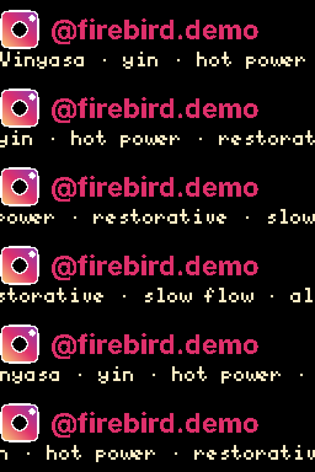
The top row is static throughout; only the bottom row moves. hold_time = 8.0
gives the bottom text enough time to complete one full scroll pass.
The :instagram: emoji renders as the 8×8 lo-res sprite here. The full-color
32×32 hi-res variant exists in the bundled emoji registry, but the 8-row top band
is too short to fit it — the renderer caps emoji height at the band size and
falls back to lo-res when the hi-res sprite would overflow. The next section
shows how to make room for the hi-res sprite.
Two-row with hi-res emoji — the hard configuration case
Section titled “Two-row with hi-res emoji — the hard configuration case”The basic two_row above renders using the default BDF 5x8 bitmap font and
gets the 8×8 lo-res Instagram sprite because the 8-row top band can’t fit
anything bigger. The polished version bumps to scale = 2 and raises three
knobs — content_height, top_row_height, and a hi-res top_font — so the
full-color 32×32 Instagram sprite renders alongside Inter-Bold text.
Why the math matters
Section titled “Why the math matters”led-ticker enforces one hard ceiling on per-section sizing:
scale × content_height ≤ panel_h_realFor the bigsign at default_scale = 4, panel_h_real = 64. With per-section
scale = 2, the ceiling is 64 / 2 = 32 logical px — room to make the
section taller than the previous content_height = 16.
For the hi-res two_row you want:
| knob | basic (above) | polished | real px (polished) |
|---|---|---|---|
scale | 1 | 2 | — |
content_height | 16 | 24 | 48 real px (≤ 64 ✓) |
top_row_height | default (8) | 16 | 32 real px |
| bottom band | 8 | 24 − 16 = 8 | 16 real px |
top_font | default 5x8 | Inter-Bold | hi-res rasterisation |
The 32×32 hi-res Instagram sprite is 32 real px / scale 2 = 16 logical px tall.
That fits the 16-row top band exactly — the band’s emoji cap rises from 8 (in
the basic version, where scale=1 so 8 real px = 8 logical px) to 16 (here,
where scale=2 so 32 real px = 16 logical px), so the renderer uses the hi-res
sprite instead of falling back to lo-res.
The config
Section titled “The config”[[playlist.section]]mode = "slideshow"scale = 2content_height = 24loop_count = 1hold_time = 8.0scroll_step_ms = 35
[[playlist.section.widget]]type = "two_row"top_text = ":instagram: @firebird.demo"top_row_height = 16top_font = "Inter-Bold"top_font_size = 22top_color = [225, 48, 108]top_align = "left"bottom_text = "Vinyasa · yin · hot power · restorative · slow flow · all levels"bottom_color = [255, 240, 200]bottom_align = "left"New knobs:
top_row_height = 16— the top band takes 16 of the 24 logical rows. The remaining 8 go to the bottom row.top_font = "Inter-Bold"— switches the top row to the bundled Inter Bold hi-res font. BDF fonts (5x8,6x13, etc.) are pixel-perfect at any scale; hi-res fonts render at physical pixel granularity and look proportional at scale ≥ 2.top_font_size = 22— physical pixel height for the hi-res font. Required whentop_fontis a hi-res font; the validator raises an error if you omit it.
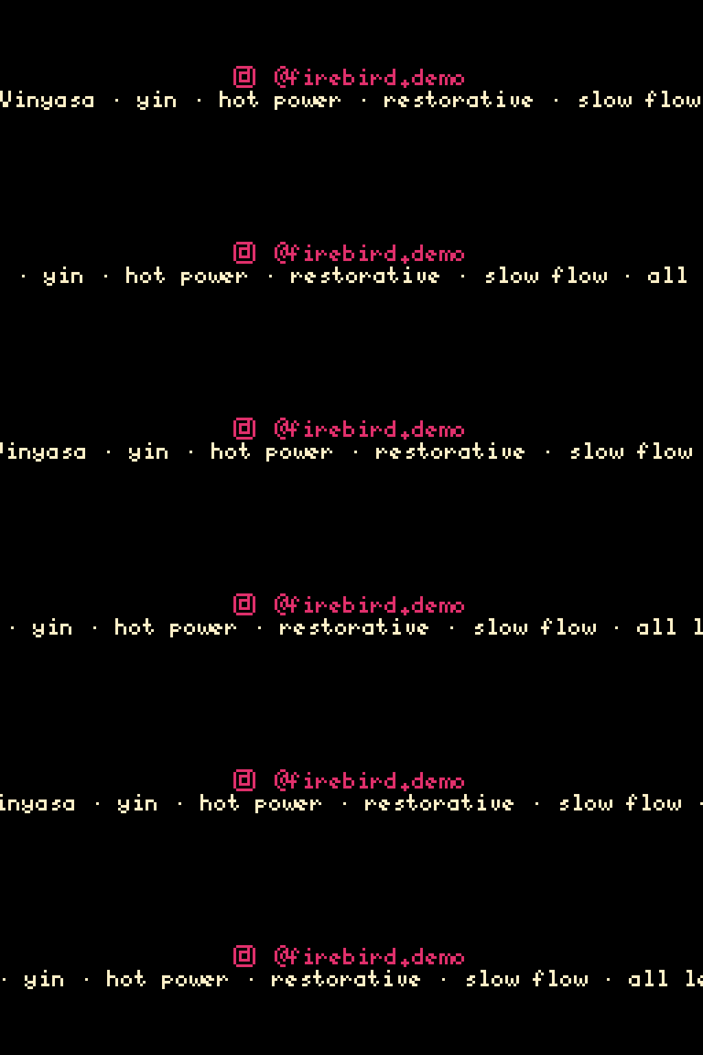
Compare side-by-side with the BDF version from the previous section:
The hi-res path activates automatically when the effective (per-section) scale
is ≥ 2 and the band is tall enough to fit the bigger sprite — you don’t need a
separate code path. It’s the per-section scale, not default_scale, that
matters: this chapter’s bigsign runs default_scale = 4 yet the basic two_row
section above renders lo-res because its per-section scale = 1. The
:instagram: slug always resolves to the correct sprite size for the current
effective scale and band height.
Seamless wrap with a loop count
Section titled “Seamless wrap with a loop count”The hi-res config above scrolls the bottom row once, end-to-end, then
transitions. That works for short content but feels abrupt for marquee-style
text. The bottom row supports a continuous wrap mode: when the text
scrolls off the left edge, the next copy is already coming in from the
right, separated by a glyph you control. Combine wrap with
bottom_text_loops to declare exactly how many full passes the marquee
plays before the section ends.
Add three lines to the hi-res config:
[[playlist.section]]mode = "slideshow"scale = 2content_height = 24loop_count = 1# hold_time omitted — bottom_text_loops = 3 below controls durationscroll_step_ms = 35
[[playlist.section.widget]]type = "two_row"top_text = ":instagram: @firebird.demo"top_row_height = 16top_font = "Inter-Bold"top_font_size = 22top_color = [225, 48, 108]top_align = "left"bottom_text = "Vinyasa · yin · hot power · restorative · slow flow · all levels"bottom_color = [255, 240, 200]bottom_align = "left"bottom_text_wrap = truebottom_text_separator = " · "bottom_text_loops = 3
What changed:
hold_timeis gone. Whenbottom_text_loopsis set, the engine runs formax(hold_time_ticks, loops × cycle_width)ticks. Removinghold_timeuses the default (3.0s), which atscroll_step_ms = 35is only ~85 ticks — far fewer than3 × cycle_width. The loops win and the section runs for exactly 3 wrap cycles.bottom_text_wrap = trueswitches the bottom row from “scroll once and stop” to a continuous chase. The text plus separator forms one cycle; copies follow each other across the canvas with no gap.bottom_text_separator = " · "uses the same middle-dot character that’s already separating phrases insidebottom_text, so the seam between wrap copies reads as part of the same rhythm. The string renders as-is — the spaces around the dot are intentional padding.""would render as two spaces (no glyph, minimum gap);"*"(no surrounding space) would butt the asterisk directly against the adjacent letters.bottom_text_loops = 3is the minimum number of full cycles before the section can transition. Only meaningful withbottom_text_wrap = true— settingbottom_text_loopson a non-wrap section is a validation error — the validator will tell you — because there’s no cycle to count when the bottom only scrolls once.
A note on the field name: bottom_text_loops follows the bottom_* prefix
convention used by all per-row knobs on two_row (bottom_text_wrap,
bottom_text_separator, etc.) — the top row is held and only the bottom
row can have cycles. If you’ve used the marquee loop count on a gif or
image widget, the equivalent field there is called text_loops (no
prefix), since those widgets are single-row by default and only optionally
become two-row when bottom_text is set. Same concept, different name —
the validator catches the common text_loops typo on two_row
and points you at bottom_text_loops.
A note on hold_time: if you set BOTH hold_time and bottom_text_loops,
the engine uses whichever produces more ticks — max(hold_time × 1000 / scroll_step_ms, bottom_text_loops × cycle_width). The validator warns
when both are explicitly set, because the dominant value silently
overrides the other depending on text length. The
“exact-N-loops” pattern in this tutorial drops hold_time to avoid the
ambiguity.
What’s next
Section titled “What’s next”Chapter 4 adds custom branding: the Atkinson Hyperlegible font for the title card and a still image widget that displays a logo.