Tutorial 5: Polish & deploy
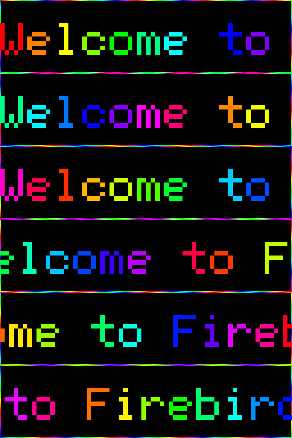
Chapter 4 left you with a multi-section config: a scrolling welcome strip, a swap section with per-day hours, a two-row hi-res brand card, and an image widget with a text overlay. This chapter adds two polish layers — transitions and border effects — then covers getting the config onto a Pi.
~10 min · no hardware needed
Picks up from Chapter 4 — continue with the config you built there (or use the reset block below). No new prerequisites; the deploy section is read-only and needs no Pi.
Reset block — start of Chapter 5
If you followed chapters 2–4 step by step, your config will have MORE
sections than this (the ticker from chapter 2, the standalone two_row,
and so on) — that’s expected. This reset block is a deliberately
consolidated starting point for the polish work, not a literal copy of
your chapter-4 end state. Either continue with your own config or start
from this cleaner baseline:
[display]rows = 64cols = 256chain_length = 1default_scale = 4brightness = 60
[transitions]default = "push_left"duration = 0.5
[[playlist.section]]mode = "slideshow"loop_count = 1hold_time = 2.5
[[playlist.section.widget]]type = "message"text = "Welcome to Firebird Yoga"font_color = [225, 48, 108]
[[playlist.section.widget]]type = "image"path = "assets/phoenix_transparent.png"fit = "pillarbox"image_align = "center"hold_time = 8.0scroll_speed_ms = 35top_text = "Firebird"top_font = "5x8"top_color = [225, 48, 108]bottom_text = "Vinyasa · yin · hot power · restorative · slow flow · all levels"bottom_font = "AtkinsonHyperlegible-Bold"bottom_font_size = 22bottom_color = [255, 240, 200]
[[playlist.section.widget]]type = "message"text = "Open daily 10am – 8pm"font_color = [120, 220, 255]
[[playlist.section]]mode = "slideshow"loop_count = 1hold_time = 2.5
[[playlist.section.widget]]type = "message"text = "Summer Camps start June 15"font_color = [180, 220, 180]
[[playlist.section.widget]]type = "message"text = "All levels · All ages"font_color = [255, 220, 0]
Transitions
Section titled “Transitions”So far the config has used push_left for everything. The [transitions] block has
two separate knobs — default controls transitions between widgets inside a section,
and between_sections controls the transition when the playlist moves from one section
to the next. You can set them independently.
Replace the [transitions] block:
[transitions]default = "wipe_left"duration = 0.5between_sections = "dissolve"default = "wipe_left"— a vertical sweep line erases the outgoing widget, then the incoming widget appears behind it. More visual punch thanpush_left; the sweeping line makes each widget boundary feel intentional.between_sections = "dissolve"— when the playlist moves from Section 1 to Section 2 (or back), pixels scatter randomly rather than sliding. The contrast with the within-section wipes gives viewers a clear signal that the topic has changed.durationapplies to both, unless overridden per-section withtransition_duration.
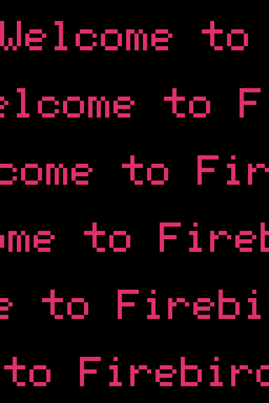
The full transition catalogue covers 30+ options organised into families:
- Push (
push_left,push_right,push_up,push_down,push_alternating,push_random) — outgoing and incoming slide together as one unit. - Wipe (
wipe_left,wipe_right,wipe_up,wipe_down,wipe_alternating,wipe_random) — outgoing stays fixed while a coloured sweep line erases it. - Sprite trails —
nyancat.forward,pokeball.forward,pacman.forward,sailor_moon.forward(each has.reverseand.alternatingvariants; the first two have bigsign hi-res variants). These ship as four packages in the led-ticker-plugins monorepo. A rolling-baseball.rollfamily ships in the baseball package. - Special —
cut(instant),color_flash,dissolve,split,scroll.
See the Transitions catalogue for per-family knobs and examples of each.
Border effects
Section titled “Border effects”The border field paints an animated ring around the panel perimeter. It accepts
"rainbow" for a chasing hue sweep, or an RGB array like [255, 100, 200] for a
static colour.
Add border = "rainbow" to the headline widget:
[[playlist.section.widget]]type = "message"text = "Welcome to Firebird Yoga"font_color = "rainbow"border = "rainbow"font_color = "rainbow" was also added here — the per-character hue sweep across the
text and the chasing perimeter ring use the same hue formula, so they feel like one
coherent effect rather than two competing ones.
For the second section’s headline:
[[playlist.section.widget]]type = "message"text = "Summer Camps start June 15"font_color = [180, 220, 180]border = "rainbow"A few things worth knowing about borders:
- The border paints at physical resolution — at
default_scale = 4it traces the real 256×64 panel edge, not the logical 64×16 wrapper. The ring is always 1 pixel wide at real-panel scale. - Border, transitions, and font effects all compose. The wipe transition runs cleanly over a bordered widget; the rainbow font sweep continues animating during the hold that the border is also chasing.
borderis accepted onmessage,countdown,two_row,gif, andimagewidgets. It raises at config-load for other types.
Polish the brand card
Section titled “Polish the brand card”The image widget currently shows the studio name in BDF 5x8 at default_scale = 4,
which gives 64 logical columns. That’s enough for the short name but not for the full
social handle: @firebirdyoga.demo (18 chars × 5 px = 90 px) would overflow the canvas
by 26 px. To show the full handle and the hi-res Instagram sprite alongside it, the brand
card needs its own section at scale = 2.
Two changes — restructure the section layout, then upgrade the handle.
Restructure. Pull the image widget out of Section 1 into its own section. This
lets the brand card use scale = 2 without affecting the welcome and info widgets,
which look right at the default scale = 4:
# Section 1 — welcome card[[playlist.section]]mode = "slideshow"loop_count = 1hold_time = 2.5
[[playlist.section.widget]]type = "message"text = "Welcome to Firebird Yoga"font_color = "rainbow"border = "rainbow"
# Section 2 — brand card (new, scale = 2)[[playlist.section]]mode = "slideshow"scale = 2content_height = 32loop_count = 1hold_time = 5.0
[[playlist.section.widget]]type = "image"path = "assets/phoenix_transparent.png"fit = "pillarbox"image_align = "center"hold_time = 4.0scroll_speed_ms = 35top_text = ":instagram: @firebirdyoga.demo"top_row_height = 16top_font = "Inter-Bold"top_font_size = 16top_color = [225, 48, 108]bottom_text = "Vinyasa · yin · hot power · restorative · slow flow · all levels"bottom_font = "Inter-Bold"bottom_font_size = 22bottom_color = [255, 240, 200]
# Section 3 — info messages (the old Summer Camps + All levels section,# plus the "Open daily 10am – 8pm" message moved out of Section 1)[[playlist.section]]mode = "slideshow"loop_count = 1hold_time = 2.5
[[playlist.section.widget]]type = "message"text = "Summer Camps start June 15"font_color = [180, 220, 180]border = "rainbow"
[[playlist.section.widget]]type = "message"text = "Open daily 10am – 8pm"font_color = [120, 220, 255]
[[playlist.section.widget]]type = "message"text = "All levels · All ages"font_color = [255, 220, 0]
What changed on the brand card:
scale = 2on Section 2 — overridesdefault_scale = 4for this section. Logical canvas widens from 64 to 128 px, leaving room for the longer handle and the hi-res Instagram sprite.content_height = 32— fills the full panel height at scale 2 (32 × 2 = 64real px). The hard ceiling. This matters because the phoenix image usesfit = "pillarbox"and looks best filling the panel.top_row_height = 16— gives the top band 16 logical rows, which matches the hi-res Instagram sprite’s 16 logical px height (32 real px / scale = 16 logical). Without this, the sprite falls back to the 8×8 lo-res variant.top_text = ":instagram: @firebirdyoga.demo"— the:instagram:inline emoji renders as the full-colour hi-res sprite now that the band can fit it. The remaining text is the full handle, no shortening needed.top_font = "Inter-Bold",top_font_size = 16— switched from5x8BDF to Inter-Bold for visual consistency with the bottom row.bottom_font = "Inter-Bold"— switched from Atkinson Hyperlegible to the bundled Inter-Bold. Atkinson works great if you’re keeping a personal copy inconfig/fonts/, but the canonical destination config uses only bundled fonts so a freshgit clonecan render it without the font download.
What you’ve built
Section titled “What you’ve built”Your config now has:
- A three-section playlist in
slideshowmode withwipe_lefttransitions between widgets anddissolvebetween sections. - A welcome card with per-character rainbow
font_colorand a chasing rainbow border around the panel perimeter. - A brand card running at per-section
scale = 2so the hi-res Instagram sprite renders at the full 32×32 next to the@firebirdyoga.demohandle. The phoenix image fills the panel; promo text scrolls across the bottom row. - An info section with three message widgets — Summer Camps (rainbow border), Open daily, and All levels — held briefly so each is readable.
That matches the destination config you rendered in Chapter 1
(config/config.bigsign.firebird.example.toml). The next step is getting it onto
a Pi.
Deploying to a Pi
Section titled “Deploying to a Pi”Your config is ready — this is what the five chapters were building toward.
Quickstart B is the complete deploy path — it takes a Pi from bare OS to a running sign, and it ends with your panels lit. If the hardware itself isn’t built yet, Building your own covers panels, wiring, and power first.
One difference from a stock Quickstart B run: at its “copy the right example
config” step, use the config you just built here instead — copy your
config/ folder (with config.toml, fonts/, and assets/) into the
cloned repo on the Pi. Already have the stack running? Copy the folder over
and run make restart.
The hardware pages below have the full bill of materials, wiring diagrams, and
Pi-specific tuning for gpio_slowdown, rp1_pio, and pixel_mapper_config.
What’s next from here
Section titled “What’s next from here”With a working panel config as a foundation, a few directions worth exploring:
- Try other transitions. Swap
wipe_leftfornyancat.forwardorpokeball.forward(thenyancat/pokeballpackages in the led-ticker-plugins monorepo) to see what the sprite-trail families look like on your hardware. The Transitions catalogue has a rendered preview for every option. - Add live data widgets. Plugin widgets pull live content and scroll it on the
same canvas —
rss.feedfor headlines andweather.currentfor current conditions (therss/weatherpackages), andcrypto.coingecko(thecryptopackage) for crypto prices, all from led-ticker-plugins. See the Widgets reference for setup details and required API keys. - Validate before deploying.
led-ticker validate config/config.tomlcatches typos, unknown widget types, and constraint violations before you restart the panel. The Validation rules page lists the most common mistakes and their fix. - Let Claude author configs for you. The
creating-a-configskill in Claude Code knows the widget catalogue, bigsign vs smallsign tradeoffs, and the constraint list from CLAUDE.md. Describe what you want displayed and it builds the TOML.