Tutorial 4: Custom branding

Chapter 3 left you with a polished two_row section using Inter-Bold and the hi-res Instagram sprite. This chapter adds the last two branding pieces: a custom font that was designed for real-world legibility, and an image widget that displays your logo.
~15 min · no hardware needed
What you’ll need:
- The config from Chapter 3 (or the reset block below)
- A brand font in
config/fonts/— this chapter downloads Atkinson Hyperlegible (AtkinsonHyperlegible-Bold.otfand-Regular.otf) from the Braille Institute - A logo image in
config/assets/— the repo shipsconfig/assets/phoenix_transparent.png, used here
Reset block — start of Chapter 4
If you need to reset to the starting point for this chapter, create
config/config.toml with the state from the end of Chapter 3:
[display]rows = 64cols = 256chain_length = 1default_scale = 4brightness = 60
[transitions]default = "push_left"duration = 0.5
[[playlist.section]]mode = "ticker"loop_count = 1scroll_step_ms = 40
[[playlist.section.widget]]type = "message"text = "Welcome to Firebird Yoga"font_color = [225, 48, 108]
[[playlist.section.widget]]type = "message"text = "Open Tuesday – Sunday  *  10am – 8pm"font_color = [255, 240, 200]
[[playlist.section]]mode = "slideshow"loop_count = 1hold_time = 2.5transition = "push_left"
[[playlist.section.widget]]type = "message"text = "Open daily"font_color = [120, 220, 255]
[[playlist.section.widget]]type = "message"text = "10am – 8pm"font_color = [225, 48, 108]
[[playlist.section]]mode = "ticker"loop_count = 1scroll_step_ms = 40
[[playlist.section.widget]]type = "countdown"text = "Summer Camps"countdown_date = 2026-06-15font_color = [180, 220, 180]
[[playlist.section.widget]]type = "message"text = "All ages welcome  *  Drop-ins welcome"font_color = [255, 220, 0]
[[playlist.section]]mode = "slideshow"scale = 2content_height = 24loop_count = 1hold_time = 8.0scroll_step_ms = 35
[[playlist.section.widget]]type = "two_row"top_text = ":instagram: @firebird.demo"top_row_height = 16top_font = "Inter-Bold"top_font_size = 22top_color = [225, 48, 108]top_align = "left"bottom_text = "Vinyasa · yin · hot power · restorative · slow flow · all levels"bottom_color = [255, 240, 200]bottom_align = "left"
Adding a custom font
Section titled “Adding a custom font”led-ticker ships with Inter Bold and Inter Regular as bundled hi-res fonts, which cover most use cases. But for a venue sign that needs to be readable from across a room, a font designed specifically for legibility at distance makes a real difference.
Atkinson Hyperlegible is a typeface created by the Braille Institute to maximize readability for people with low vision — and those same design choices (open letterforms, unambiguous character shapes, generous spacing) make it excellent for LED signs read from 3–10 metres away. It’s available free under the Open Font License.
Download it from the Braille Institute:
https://brailleinstitute.org/freefont — click “Download Now” for the ZIP.
Alternatively, Google Fonts also hosts it:
Both sources include Regular and Bold weights. Either .otf or .ttf files work —
led-ticker’s hi-res loader accepts both.
Once downloaded, place the files next to your config:
config/ config.toml fonts/ AtkinsonHyperlegible-Bold.otf AtkinsonHyperlegible-Regular.otfThe config/fonts/ directory is gitignored in the led-ticker repo, so the font
files won’t be committed if you’re working inside the repository. For your own
production config (outside the repo), treat fonts/ as a sibling to config.toml
— led-ticker finds it automatically at startup.
Using the font in a widget
Section titled “Using the font in a widget”In Chapter 3’s two_row section, the top row uses top_font = "Inter-Bold". Swap
it for the new font:
[[playlist.section.widget]]type = "two_row"top_text = ":instagram: @firebird.demo"top_row_height = 16top_font = "AtkinsonHyperlegible-Bold"top_font_size = 22top_color = [225, 48, 108]top_align = "left"bottom_text = "Vinyasa · yin · hot power · restorative · slow flow · all levels"bottom_color = [255, 240, 200]bottom_align = "left"Only top_font changed. Everything else — scale, band heights — stays the same.
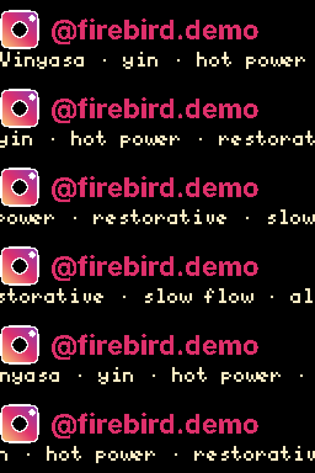
Here is the Inter-Bold version from Chapter 3 for comparison:
And the same config with Atkinson Hyperlegible-Bold:
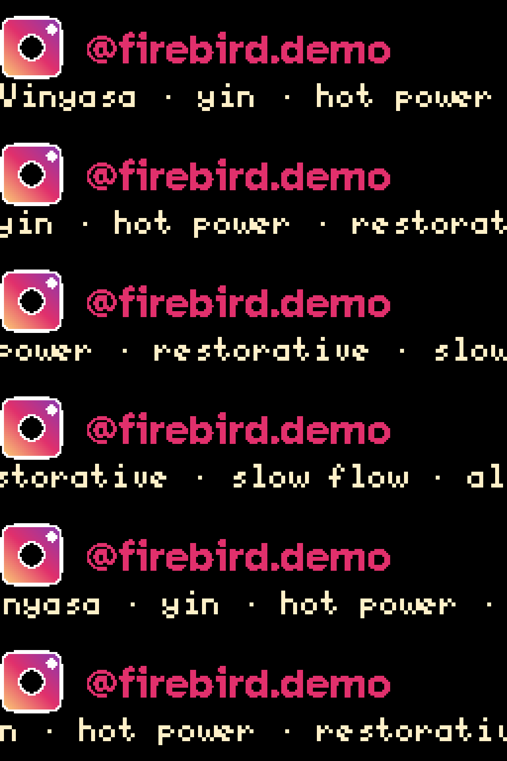
The difference is subtle on-screen but pronounced on the physical panel. Atkinson’s wider letter spacing and open forms survive the LED dot-grid better than Inter’s tighter proportions at the same pixel size.
If your font has thin strokes that wash out at the default rasterization threshold,
the font_threshold knob (0–255, default 128) lets you lower the cutoff to preserve
more of the hairlines. A value around 80 suits most thin-stroked typefaces. See
Concepts → Fonts for the full tuning story.
Adding a logo image
Section titled “Adding a logo image”The image widget displays a PNG, JPEG, or WebP still image on the panel. The
repository ships with config/assets/phoenix_transparent.png — a PNG with a
transparent background — for exactly this use case.
Add a new slideshow section after the two_row section:
[[playlist.section]]mode = "slideshow"loop_count = 1hold_time = 2.5
[[playlist.section.widget]]type = "message"text = "Open daily"font_color = [120, 220, 255]
[[playlist.section.widget]]type = "message"text = "10am – 8pm"font_color = [225, 48, 108]
[[playlist.section.widget]]type = "image"path = "assets/phoenix_transparent.png"fit = "pillarbox"image_align = "center"hold_time = 4.0
[[playlist.section.widget]]type = "message"text = "All ages welcome"font_color = [255, 220, 0]
The image widget knobs used here:
path— path to the image file, relative toconfig.toml. The bundledphoenix_transparent.pnglives inconfig/assets/.fit = "pillarbox"— scales the image to fill the panel height, leaving black bars on the sides if the image is taller than it is wide. Other options:"letterbox"(fill width, bars top/bottom),"stretch"(distort to fill),"crop"(fill and trim). For a logo with transparent background,"pillarbox"is usually the right choice.image_align = "center"— centers the image horizontally within the panel. Options:"left","center","right".hold_time = 4.0— how long to display the image before the next widget. This is the samehold_timeknob as the section default, just set on the widget: a widget-levelhold_timeoverrides the section’shold_timefor that one widget, and widgets that don’t set their own fall back to the section default.

The transparent PNG regions render as black on the panel (LEDs are off), which creates a clean silhouette effect. Opaque images fill every pixel; transparent ones let the panel background show through.
Combining text and image
Section titled “Combining text and image”The image widget supports the same two-row text overlay as the two_row widget
from Chapter 3. Setting top_text and bottom_text on an image widget layers
a held title on top and a scrolling promo line on the bottom — with the image
visible behind or between them.
Replace the bare image widget from above with the text overlay version:
[[playlist.section.widget]]type = "image"path = "assets/phoenix_transparent.png"fit = "pillarbox"image_align = "center"hold_time = 8.0scroll_speed_ms = 35top_text = "Firebird"top_font = "5x8"top_color = [225, 48, 108]bottom_text = "Vinyasa · yin · hot power · restorative · slow flow · all levels"bottom_font = "AtkinsonHyperlegible-Bold"bottom_font_size = 22bottom_color = [255, 240, 200]New knobs compared to the plain image widget:
hold_time = 8.0— longer hold to give the bottom text time to complete one full scroll pass. The engine waits for at least one full traversal regardless, but setting this explicitly prevents a premature cut.scroll_speed_ms = 35— milliseconds per one-pixel scroll step for the bottom text. Lower = faster; 35 ms is a comfortable reading pace.top_text/top_font/top_color— held top row, same knobs astwo_row. Using"5x8"(a BDF font) here means notop_font_sizeis required. Atdefault_scale = 4the logical canvas is 64 columns wide;"Firebird"(40 px in 5x8) fits comfortably. Chapter 5 adds the full social handle and the hi-res Instagram sprite, which need a wider canvas.bottom_text/bottom_font/bottom_font_size/bottom_color— scrolling bottom row with Atkinson Hyperlegible-Bold.bottom_font_sizeis required for any hi-res font;22(real pixels) fits comfortably in the bottom band atdefault_scale = 4.
This is the same two-row layout primitive as Chapter 3’s two_row widget, applied
directly to an image. The image paints behind the bottom text; where the bottom row
overlaps the image, the text renders on top. Use text_align = "scroll_over" if
you want the text always above the image (see Widgets → image
for the full overlay paint-order options).
What’s next
Section titled “What’s next”Chapter 5 covers polish and deploy: bg_color for bordered sections, border
effects, and the steps to get your config running on the Pi.